When I was a child, I used to play The Sims for hours. I would camp in front of the family computer and draw my walls.
In The Sims, your decorating options were confined by both the limits of technology and the limits of the game designers' imaginations. You could not, for example, draw on the walls, or create your own wallpaper, or make your Sim build 5,000 clay stalactites to hang from the ceiling of the office. You might want to do that, and think it would be funny, but you were constrained by the game.
Theoretically, you were also limited by money. You were supposed to send your Sim to work so they could get a job so that you could buy nice things. But I was a demon child. I was torrenting music off Limewire. I was scamming people on Neopets. I learned how to code HTML solely so I could hide my MySpace music player so no one could hit pause on my page.
As if I was going to be thwarted from my beautiful dreams by some gameplay. No no no no. I would type in the little code (Motherlode) into the secret box to give myself infinite money. I did not want to live within the confines of reality. I wanted an entire room just for sculptures of dogs!
Maybe this is why, for so long, I could not wait to have my own space. I wanted to do whatever I wanted, and if that was something deranged that no one else liked like fake stained glass on my window or mosaic on the fucking kitchen floor, well, my house my rules!
This is also why I find so many of the houses we look here so boring. No one has any imagination. It's like the owners of these homes Googled "house staging" and then handed a graywashed photo over to a contractor and said "give me the subway tiles everyone else has but make them more boring somehow."
But this week we have something interesting. We have a house that some people have clearly loved, and also those people's taste reminds me of the limited curated purchases in the Sims. Which is to say there is a lot of shit that doesn't make sense in here!
This week's house is a big boy. We're talking four bedrooms, three baths, and a mammoth 5,011 sq ft. So for its $1.3 million price tag, you'd at least get a lot of space. You would get, I'd say, a lot of everything. Just a lot in general.
John sent me this week's house. He's not sure exactly how he found it, but he lives in Flagstaff, Ariz. (where this house is), and thinks his wife found it due to her leftover Zillow alert from when they were house shopping. Thank you to John's wife! John also, very helpfully, did some research for us and learned that this is the "home of a Local Character (as opposed to the vacation home of an asshole from Phoenix)." We love to hear it.
Let's take a look.
First off, this is the sexiest outside of a house I have seen in a long, long time. Look at it!
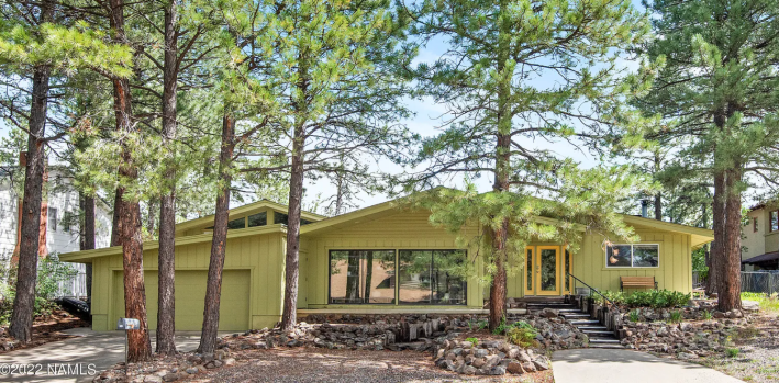
Gorg! I love it. The shape of this house is very satisfying. The windows are very nice, and the multiple levels of the sloped roof are really doing it for me. Little mid-century ranch vibes! I asked John what he would change first if he could have this house for himself and he said, "I think I'd paint the garage door something more exciting, either the same yellow as the front door or have someone do a mural—there's no HOA, so why not live a little."
Hell yeah, John! We LOVE a house without an HOA. I think the yellow would be really nice on the garage door, but I also love murals!
Let's move inside:
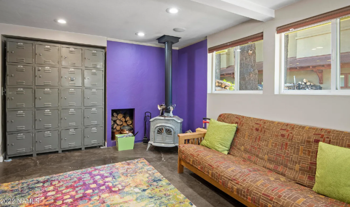
The layout of this house is a little confusing, so we won't bother with it. Here we have a non-bedroom. It's a sitting room? I'm kind of obsessed with this strange locker situation. What's in there? Do you give one to all your friends and they can keep things at your house? Why would a person need this?
I'm also obsessed with the little built in cubby for the wood! That's so cute. Usually I love an accent pop of color, but I'm not so sure about this purple. Do you see how this feels Simlish? All of these things are a very specific style that does not really belong to anyone and yet all those styles are all different from one another. The color palette is also limited, which is weird given that the people making the decisions here seem pretty liberated from any kind of aesthetic convention.
Moving on to this office:
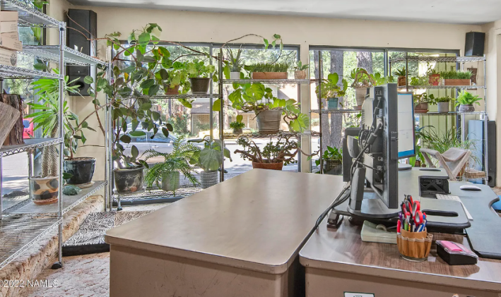
Alright, this is a room that we really must use our imaginations on. Why on earth would you choose to put a bunch of plants on wire shelves in a room that has wall-to-wall plush carpet? These people rule! They are just doing whatever they want!
All these plants look so healthy and nice because the true selling point of this house, in my opinion, is the light. There is natural light all over the place! Imagine how bright this house must be when there is snow outside! Blinding!
However I hate this desk situation. I hate this laminate. I hate whatever that cloth pen holder is, but considering my pens are currently in a ceramic yogurt container, I'm not sure I have a leg to stand on here.
Next we have this room:
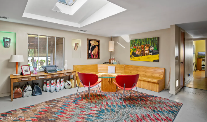
Bowling bags. Bowling pins. Fancy old typewriter. Beautiful teak bench. Swoopy red chairs. Purple lava Lamp. Sconces that look like robots? Painting of dogs? Art of.... oh my god hahhahahahaha.
It is unclear to me if that titty picture is a painting or a photograph, but it is VERY rare to see someone's titty-forward art make it into a Zillow listing, so I think it must be a painting. I need you to focus on what she's wearing for just one second. OK, got it? We're gonna look at another angle of this same room:
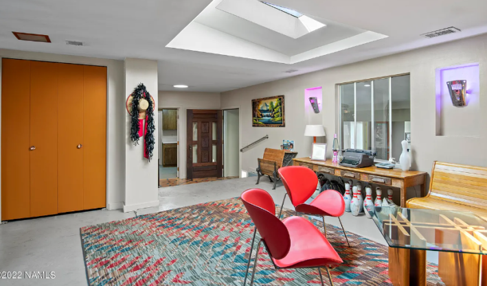
DO YOU SEE IT!!!!!!!??!??!?! The hat and the boa?! They're on the wall!!! So maybe it is a photograph!?
This is incredible. John asked me in a P.S. if I had noticed it. JOHN IT IS THE ONLY THING I NOTICED. HOW COULD I HAVE MISSED IT? I love it so much. I want this couple to have me over. I have a lot of questions for them.
Sadly, we must move on now:
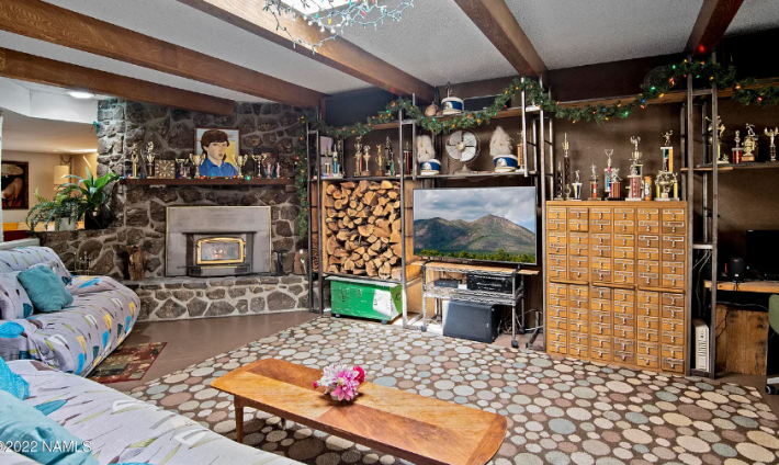
Here we have a pretty normal-ish living room. Every single rug in this house looks like it was bought at Pottery Barn Teen in the mid-aughts, which is weird because a lot of other things in this house are really fucking cool. Like this Dewey Decimal System card catalogue. I would like to have one of those. They are very expensive and hard to find! I've been trying for years!
As someone who loves Christmas lights, I also delight in this garland across the shelves. Very fun.
Here's another room:
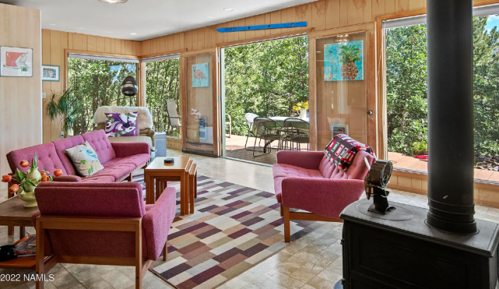
Again we have a weird rug, but the furniture in here could sell for a shit ton of money on Instagram. Look at this little stacking table! Adorable! I love these pink couches and would buy them right now. The big open doors to this giant wrapping patio are also beautiful. I imagine the air in Flagstaff (a place I have never been) to be very crisp when there is no smoke in it.
Here's another room:
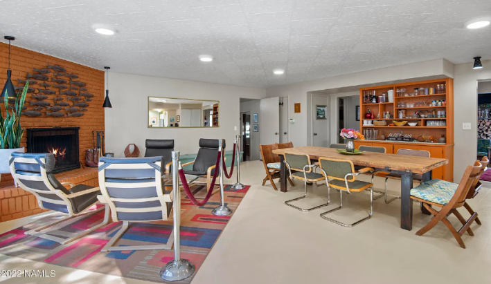
This is the room that screams SIMS to me. The fish above the fireplace in particular are a classic Simlish decorating technique. Just put 30 of the same thing on the wall! Now it's art!
This is exactly what my rooms would look like when I got tired and realized the house was too big. WE NEED CHAIRS, my mind would scream, and then I would just shove two of every kind of chair into the room like it was Noah's Ark.
The other thing is this velvet rope. Why is this here? What is its purpose?
Here's the kitchen:
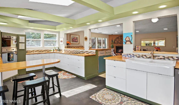
This kitchen has the style of a McDonald's in Scandinavia, which I do not hate, but is also not exactly what I'm aiming for. The labelled Trash and Recycling bins is part of the problem here, but also kind of cute? I'm not sure. I think it works. The layout is good, but also quite bad. It's so big that you can't actually have a true chef's triangle, which will make it hard to work efficiently.
This also features 500 percent more drawers than any kitchen I've ever seen, and I like that. Drawers are good. What is not good is the backsplash. That must go immediately. I do not like it one bit and it is also not tall enough to do anything. You might as well get a patterned tile since you don't really need that much of it.
Here is the only bedroom we shall observe since all the bedrooms just look like bedrooms:
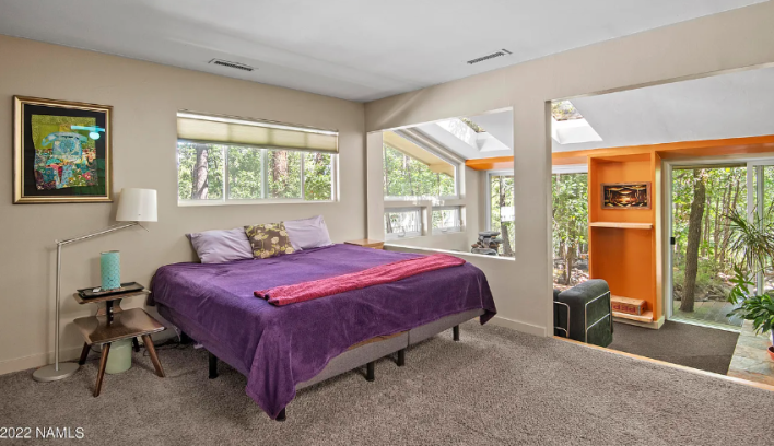
Gorgeous light. I love this sunken sitting room with a door out onto the patio. I love that it feels like a fancy hotel suite. I would make that sunken room a conversation pit and become the envy of everyone alive. I would also rip out this carpet with my bare hands.
I lied. We are also going to look at this room:
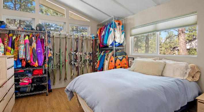
Wow! Look at all those ski jackets! I have only been skiing one time but I had the pleasure of wearing my friend's mom's jacket from the 1980s and it was bubblegum pink and everyone complimented me the whole time. It was also due to this picture that John was able to find the owners of this house and learn about their ski jackets! You can read about that here.
Finally we will take a last look outside:
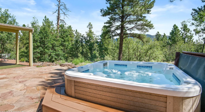
Wow what a beautiful hot tub. So relaxing! I love it here.
"This home is a blank canvas for your lifestyle and memories!" the listing says. What a lie! But it's also nice to see a painted canvas... and also the props from the painting hung on the wall.
This week's house has been listed on Zillow for $1.3 million for 25 days. If you buy this house, please allow me to make a vision board. I have many ideas and thoughts.
