I did not grow up believing in ghosts. The prairie I grew up on was vast and flat and probably haunted in some interesting, complex ways, but we were not taught about them in school. We learned very little about the people whose land that had originally been, or how they had been forced to leave. Plus, almost everything where I grew up was new. The area was still 50-percent farmland (by town law) when I was growing up, and all of the development that did exist, was barely older than me. I grew up in the "old" part of the town, where the houses had been built, according to Zillow records, in 1986. There was no palpable history, no connection, no creaky floors.
It's easy, when you grow up somewhere like that, to think that ghosts are a silly myth, a bit of popular culture. But there are some places that will force you to reconsider. The first I found was an old house that a friend of mine lived in in high school. It was creaky and spooky and the wind whipped around the corners with a ferocity that sent a chill up my spine every time. Her parents had stories of her as a baby asking them who "that lady" was and pointing at an empty corner. I believed them.
But the most haunted place I have ever been so far is New Orleans. I love New Orleans very much. It is probably my favorite American city, but I am deathly afraid of the hurricanes that will be created by global warming and so I cannot call it my home. Also it is very, very humid there. But New Orleans just feels alive. There is always music, always laughter, always air so sticky that it feels like you need to pick it up and move it out of the way to sit down.
Like Savannah, Georgia and Charleston, South Carolina, New Orleans feels haunted because it is. So much violence has occurred historically there. So many people have been killed and tortured to make a few people money, that it's hard to imagine that any of these cities wouldn't be teeming with ghosts.
Today's house is haunted for sure. It's haunted by the distant past, a more recent past, and a truly chilling future. It was found by reader Megan, who emailed it to me last week (sadly after Halloween). Megan said she "bought a house 2 yrs ago, yet Zillow still sends me 57 emails a day with houses, and this one seemed like quite the special delivery."
It is slightly unrelatable to me to only get Zillow alerts for the neighborhood in which you bought a house on account of me having 61 Zillow alerts that I check every day. But this listing sure does seem like a special delivery.
This week's house is listed for $1.3 million. It is three bedrooms, five baths, built in 1887, and was formerly a church. My Zillow alert for New Orleans has a cap at $550,000, and I see a lot of beautiful houses, some of which are near this one in the garden district, so I have no choice but to believe this is obscenely priced.
Here, let's look at it:
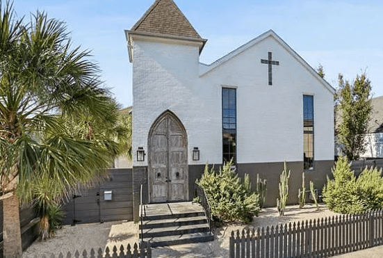
I love these tall narrow windows. I find those very exciting. And I love the pointed door. What I do not love already are some of these decisions. New Orleans is famously a wet city where it rains a lot. Why would you put desert vegetation there? Is it just laziness of not wanting to deal with a lawn? That's stupid. At least fill your non-lawn with native plants for the bees. I also do not like the stripe that has been painted on the house and extends to this very tall privacy fence. I do believe that people deserve (have a fundamental right to) privacy. But couldn't you leave it wooden? Why paint it gray? In a city with so many bright colors, why be boring?
The listing hints at a recent haunting that we need to keep in mind as we go through. "This former neighborhood church has been lovingly converted into 2 chic apartments, each with their own personality & flair." In case you are not fluent in Zillow, what that actually says is, "We renovated this church to make it into two Airbnbs." Taking a community church, which is mean to be a gathering place for neighbors and transforming it into this is a fatal sin. It's also stupid and garish, but we will get there.
However, the inside starts off pretty well.
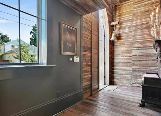
While I do not love this very thin multi-colored shiplap, I believe that you could probably hit it with a toner or some kind of watered down paint and make it look a little more cohesive. I also like this Farrow-&-Ball-Instagram-Post-Ass choice to paint all of the trim, which I must (for my own sanity) imagine was ugly and white beforehand.
Here is the rest of that room:
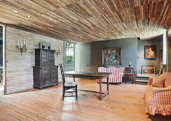
Again, I do not like the strangeness of this wood. In this context on the ceiling, it looks like it is moving which is very unsettling. I also really do not like that there is one chair in the middle of this room next to this giant table. Why is this here?
Around the corner we have what appears to have formerly been the sanctuary and is now set up as a big dining hall:
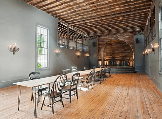
This would be an extremely cool space if they had not chopped this house into two apartment condos. New Orleans is a city with a ton of live music. I imagine if you ignored zoning laws and made some friends you could host some killer house parties in this big room. Alternatively, this room looks perfect for the kinds of dances they only have in movies adapted from Jane Austen novels. Maybe you could do that.
But because this house is now two condos, this space is rendered useless. You can't be throwing ragers while you have a neighbor who lives in your house. It's weird!
I'm also not feeling very confident in whatever the open space is at the top left of this room. Is that a balcony? Is there a window there? Or is water just going to blow into my beautiful sanctuary/atrium during a storm?
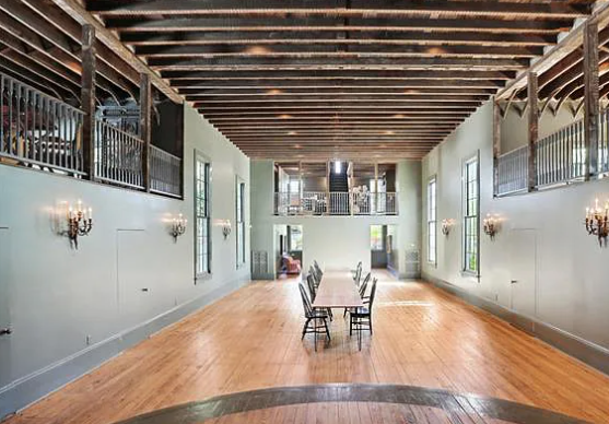
Here is a shot from the stage. Ah. I see now. These are little balconies. Here is the view from one of the balconies:
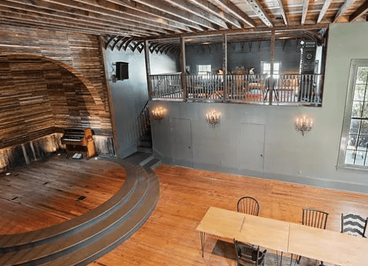
Hmm. OK. So it seems that the builders have envisioned that you would use these spaces as bedrooms for your Airbnb? Even though you can see into the other balconies from your own, and even though there is no noise cancellation. I do not really understand why the builders didn't just close these rooms in. There is no benefit—unless you are going to use these balconies as VIP bottle service lounges for fancy people—to having these open balconies even if you were to use this as a venue. It's useless in almost every form of work.
Here is one of those rooms from another angle:
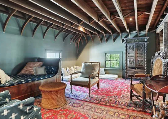
This is a pretty nice room! It would be nicer if it enclosed. The one thing that really gives me pause is the two rugs. Why are these two rugs here if not to cover up something horrendous happening beneath them? It must be either a truly ugly flooring choice or a chalk outline on top of a blood stain. Those are the only two options that make sense.
I do love this ceiling and the way it interacts with the blue paint on the walls and trim. That feels very pleasing to me.
Here is the kitchen. I have no idea where this is in the house:
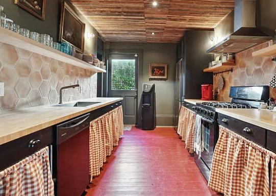
Based on my knowledge and experience in churches, I assume that this is underneath one of the balconies off of the sanctuary space.
I actually do not hate this kitchen. I have been saying for months now that kitchen skirts are primed to make a comeback, and this is a perfect use of them. With the wood floors, the textural difference is very satisfying. I also like these giant honeycomb tiles, and the red floor. Whoever was paid to decorate this place did a very good job. The only problem I have here is that it feels soulless, which is weird as this is a space that still wants you to think about your soul.
Upsettingly, from the big sanctuary, you can still see the cross window:
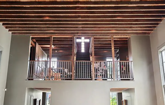
As you may be able to tell, there is a staircase leading to the cross. But there is no staircase leading from the ground floor to that balcony that I can see, and I have no idea how you would even get up there. As Megan said in her email, "I would definitely never live in this house—the inlaid cross seems like an especially bad idea for a couple who curses like two drunken sailors. The location is the only positive thing about that house. It’s a nice walkable neighborhood (garden district)."
Yikes!
Up those stairs, I think, is the main bedroom.
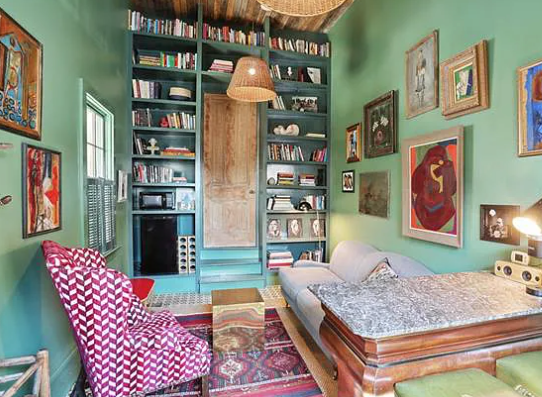
I will be the first to admit that I love this. I love the two-toned green walls and green shelves. I love these paintings. All of this is very exciting to me, as a Maximalist, but also as someone who appreciates a loved and lived-in space.
Here is the bedroom through that door:
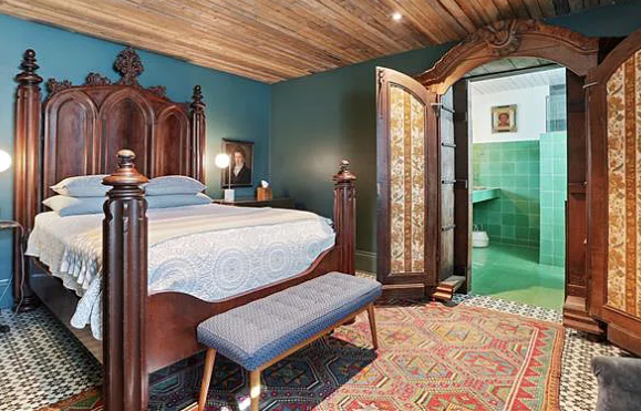
While this bed and wardrobe are not my style, I love that the wardrobe has been converted to hide the big bathroom. That is a very exciting and fun decision. I also like the dark toned walls and fun prints happening in all the rooms up here. Great choices.
Here. Let's marvel at the bathroom:
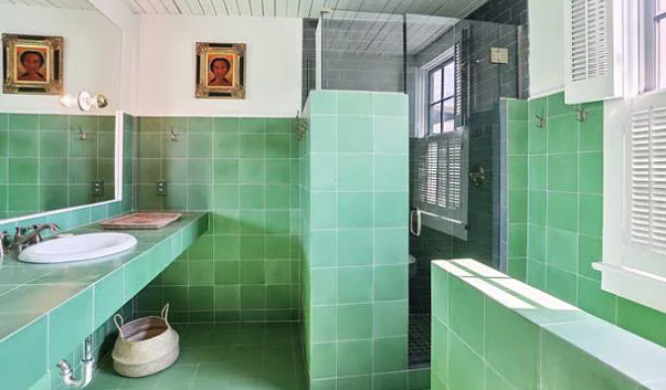
This is not my favorite bathroom in the world, but I accept it.
To get to the rest of the house, we have to go outside.
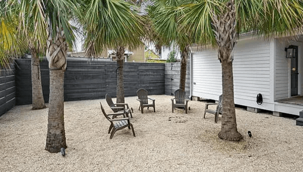
This is extremely upsetting. Yet again, I am begging the people who own this house to please do any regular landscaping. If you really must delete all sign of life from the yard, at least make this a paved patio or a deck! These sad chairs in a circle depress me.
Next we have the second house/condo/space. There were no floor plans included, so I'm not sure whether the second space is separate from the first or whether this is a kind of mother-in-law suite situation where it's a "separate condo" that is very much part of your house. I'm not sure how that works. But let's look at this condo.
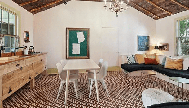
Again, we have an exciting patterned floor. This is a great room, it seems, but a very small one. The kitchen backs up to this table, that I think should be an island. The table could be used with the built in cozy booth to create more seating and use this space more effectively. Especially since if you are sitting in that booth you are already looking at the kitchen.
Only one bed and one bathroom are shown in this little second condo, but they are both cute. Here is one:
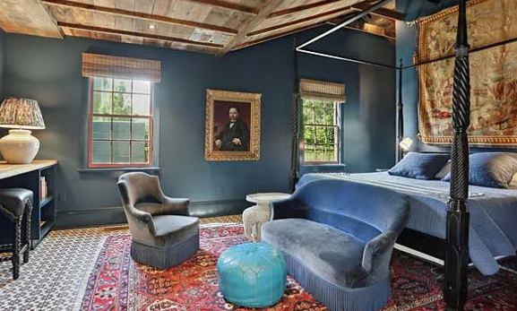
This sloped ceiling is very exciting to me, and I do love the layout of this room as a bedroom. It feels very luxurious, if also like an AirBnb.
Here is the en suite bathroom:
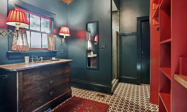
The almost split-complementary color scheme of this space (primary red, blue-green, and yellow of the light) is extremely satisfying. It feels rich and moody and fun. Whoever picked out the paint colors for this house, call me, I have some questions. I also again love the textural choices here of using the lampshades and the extendable lights. That's very exciting!
Ultimately, though, I do not want to live in this haunted house. No amount of good paint colors and excellent tile choices can overrule an awful layout, and that is the true problem with this house. For every beautiful small space, there is a cavernous terrible space that is almost unusable. 4,789 square feet in this church home and only 1,000 of them are nice? No thank you!
This week's house has been listed on Zillow for $1.3 million for 11 days. It currently has a pending offer. If you buy this house, please invite me to the New Year's Eve party.
