All week, I've struggled to write. Things that would normally take me no time to type out have resisted the impulse to emerge from the crevices of my brain. I have taken to the method of rubbing my temples until a thought appears, diving after it quickly to try and catch it, only for it to slither out of my grasp. Even this paragraph has taken me days. It's hard to believe that writing is worth so much effort when so many things are so terrible. It's frustrating to feel like I've written all of this before and it just keeps getting worse.
I write this column with fewer rights than I had when I wrote it two weeks ago. It's not like I didn't know it was coming. Texans have been fighting against this coming tsunami for decades. The death knell began to ring long ago. And yet the fall of Roe was still brutal and overwhelming: watching a fundamental right stripped away with immense public outcry, left only with a very deep and very real hopelessness. Before you ask, I'm not looking to be reassured. I know there are so many people working so hard to make this country a better place for people to live in. I know one day, the hope will return, but for now hopelessness is still a legal feeling to have.
All of this is to say that it's hard to get all that excited about a beautiful or terrible house when many of these houses are now in places that have trigger laws that have already taken rights away from millions of people. It's hard to stay focused on the minutia of a house when it seems like every day is worse than the last. But we must look at a beautiful or terrible house because it is that time of the week.
This week's house was sent in by Allison, who began her email by saying, "Check out this dumb idiot house." Great lede, in my opinion.
Allison lives in Boise, Idaho, and she rides her bike in the desert (brave) and has been watching this week's house for quite a long time. "This house is unmissably dumb looking from the outside," she said. Incredible. Hate that. Let's take a look at the outside.
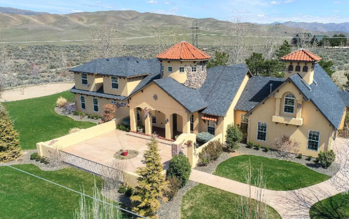
This house is the first house in the history of this column that looked remarkably better after Chris turned it into art and made it almost disappear. Look at this monstrosity! No wonder Allison had been mesmerized by its terrors.
It looks like three houses or like a church, a suburban Mexican restaurant, and a Dallas McMansion all got smashed together. It looks like it was created on the Sims by someone who wanted to tortured their characters. Almost none of these decisions go together. We've got a large open courtyard in front of the house that looks like it could reach 120 degrees on the pavement because it has absolutely no shade at all. There is a giant wall around this courtyard blocking the view of this grass (which probably requires a zillion gallons of water to keep green). The house itself is a yellowy cream, but has both regular shingles and red ceramic shingles. Only one window, for some reason, has a shade cover over it. The whole thing is upsetting.
Allison also clarified that this "house is located directly on the real, actual Oregon Trail, which is to say it is surrounded on all sides by ugly desert scrub brush," which makes the decision to have this faux-suburban lawn even more offensive. It won't even survive! There are lots of beautiful desert homes. None of them look like this. Plus, Allison says that this part of Boise sucks, that this house is as far from the good parts of Boise as one could possibly get within the city limits.
The real damning fact Allison brought, though, is the time on market. The Zillow listing says this house has only been on the market for eight days, but this is a lie. Here's what Allison told me:
It is with that important context that I say to you that this house was listed for a cool $2 million perhaps two years ago. Every other structure in Boise, from the most expensive potato baron's estate to the hollowed-out and rusting Mitsubishi Delica van carcass down by the river, has appreciated to the tune of 50% or more in that time. Here is the only home in the entire surrounding valley that has seen its apparent value decline in that time.
To this I say: WOOF! That's not good! I am extremely interested in this potato baron's estate and also the van carcass, but for now we will stay here with the monstrosity that we have.
This house is seven bedrooms, five bathrooms, 5,380 sq/ft. That is too big. It is on four acres, was built in 1995 (a bad time for American houses), and is listed for $1,550,000. This is too much money even for this much square footage. Let's go inside:
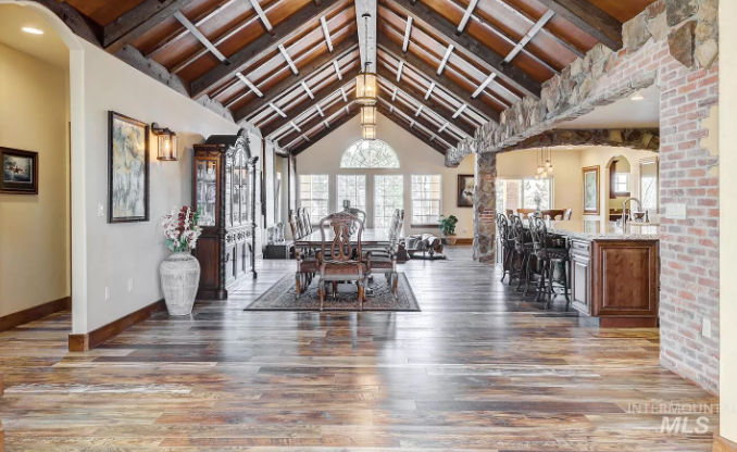
Already this is an immediate no for me.
We've got a floor that seems to be made of no less than five kinds of wood. That's impractical and silly. We've got a wood trim that matches none of the woods in the floor. The brick wall, which is certainly an intentional design choice for this space since this is not an old house, has been whitewashed. The peaked ceiling is kind of nice in a 2008-Pinterest-mason-jar-wedding-board kind of way. But even if I imagine this whole giant great room without any furniture, it's hard to imagine how it could be made nice.
When I was moving recently, I kept thinking about "charm." It's an elusive concept when you're looking for somewhere to live because it's never one thing. A funny staircase could inject charm, or a strange stained glass window. Perhaps pocket doors or a skylight could give charm. But the problem with charm is that it is difficult to inject into a space without making it obvious how out of place it is. Charm is inherent, or it doesn't work.
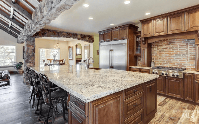
What's bad about this kitchen is that somehow it is both designed to be charming and looking like someone tried to create charm and ended up with a mess instead. What are these stone borders! Why do these clearly load-bearing columns have both brick and stone on them. Why is this island the same size as the rest of the kitchen? Also why, in a 5,000-square foot house, is this a tiny galley kitchen? You could have this kitchen in any house, because it's not special and it's small.
Here's another angle:
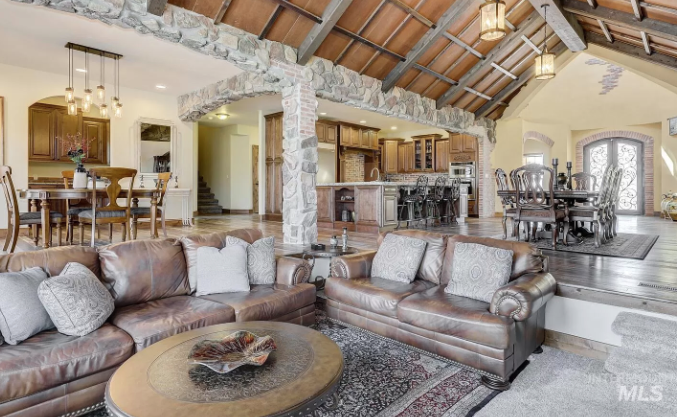
At every turn, there is something terrible to observe. Now I can see that there are also white washed bricks made to look like they are peeking through the plaster of the walls. This is stupid. You cannot fake history! You can only make something new and hope it ages into history!
The dining room is twice the size of the kitchen, so that's something. And this living room is also kind of small for this sized house. It's also a huge missed opportunity. If I'm seeing this right, those are carpeted stairs down into the couch area. This is the perfect opportunity to build a beautiful conversation pit! But that would require creating nice sofas and having some imagination, which these people clearly did not have.
Let's go somewhere else. Here is a bedroom:
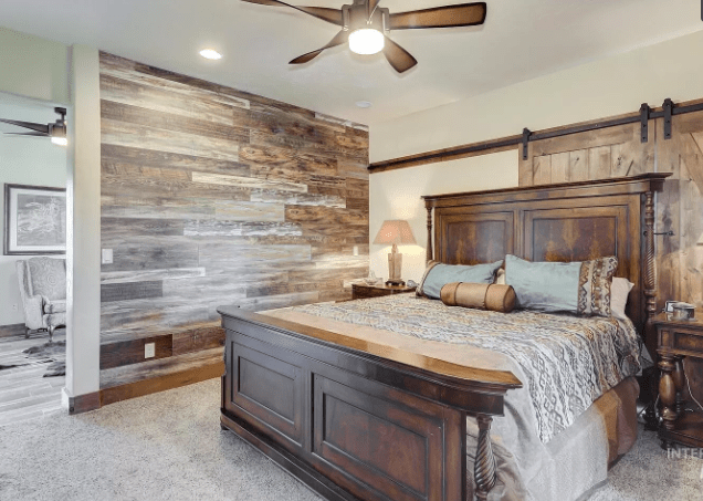
Thanks, I hate it! We have actually seen a few houses like this in this series where a bedroom has a strange dividing wall in the middle of it to separate it from a sitting area. This does not make any sense. Does no one know where walls are supposed to go? Either things should be great rooms or they should be regular rooms. I do not know what this is for. It sucks.
In addition to having the biggest bed that exists, this bedroom also has made a truly staggering decision to place the bed in front of what appear to be sliding barn doors. What's back there? A terrifying secret? I'm scared.
Here's the bathroom:
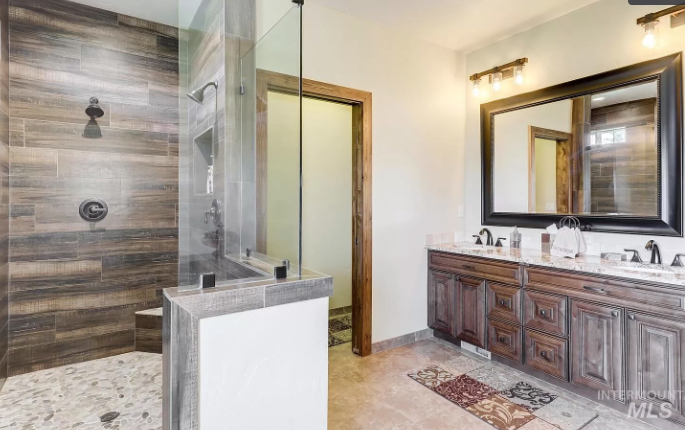
I do like that this bathroom has two shower heads and two sinks. That's pretty luxurious. But what is this obsession with grayed grainy wood? Why use this for a shower wall instead of... uh... a normal tile. The floor of the shower, for instance, is normal tile! That would be better. This is also a strange bias I have but I feel like if you are going to have wood in your bathroom it should be that nice gold wood they build saunas out of and not this weird gray wood. The vibes are atrocious.
In here, they are not much better:
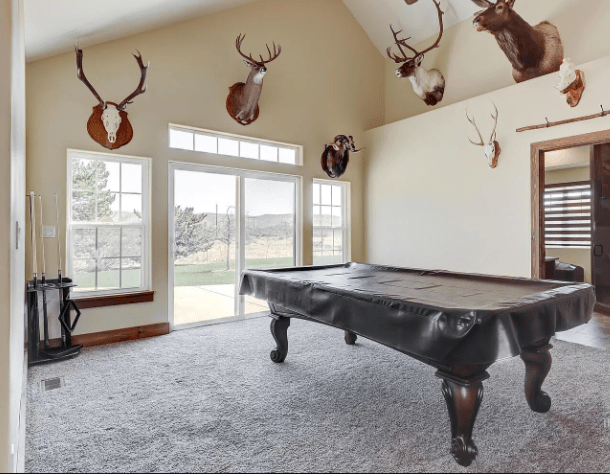
Okay, I guess if you have 5,000 sq/ft, you might as well have a pool table. But couldn't they have taken the cover off of it for this photo? I'm always wary of a house that is listed with a photo like this where one easy change could make the space so much more appealing. What else have they been cutting corners on?
I am not thrilled about the animal heads everywhere, but I don't hate them either. If this room leaned into the dive bar vibe and maybe got a neon sign, and painted the walls dark and added wainscoting, this could be a cool room. It would be a perfect place for the game Big Buck Hunter. Instead it looks like some sad "man cave" (a term I despise almost as much as the concept) that was half-assed.
Upstairs we have ... whatever this is:
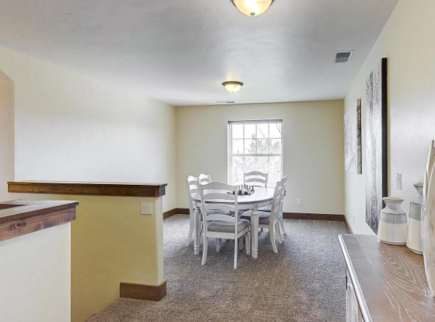
Another dining room? You should not be eating food on top of carpet if you can help it. It's very messy. It is also a very small complaint but can you imagine paying $1.5 million for a house and getting not one, not two, but at least four boob lights? Look, here are more.
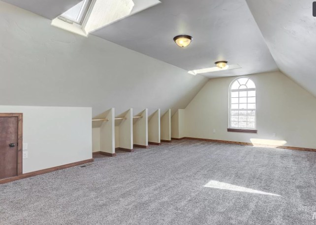
WHY!? These lights are classic landlord specials just like painting over a light switch 500 times. They exist because they are cheap and they are easy to install. They also exist, I assume, because people love suffering and don't want me to be happy.
This room also has all sorts of strange things I don't like: there is this small door, this skylight that doesn't even face straight up, these weird half closets with rods in them. Why is the top of that curved window so close to the ceiling. Who designed this house? To be honest, I've had enough of this! Everything in here is awful in an especially boring way. Let's go out back and see what we can find:
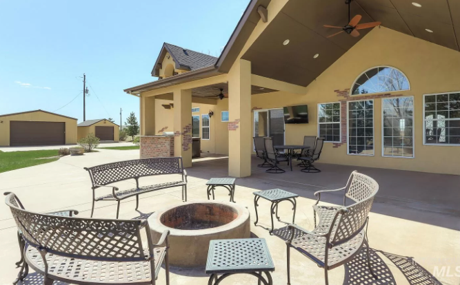
Well this is the first decent thing we've seen so far. This big patio has a brick outdoor kitchen, some weird "exposed brick" inlays, and a lot of patio furniture. But I do like this big fire pit. That's fine.
But what are those weird little garage houses over there? They are strange, aren't they?
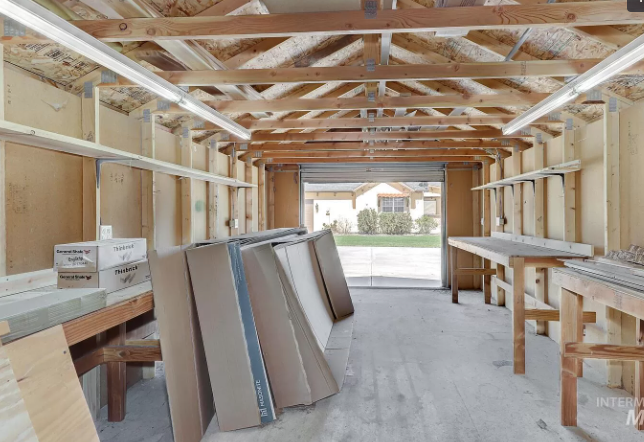
Now this is something! A wood workshop? You would think there would be more machinery and tools, but I do love the idea of these little garage spaces. Except that they aren't insulated. I assume that means there are like four months of the year you can realistically be in them. It is also upsetting that everything in here seems to be useless.
I take it back. Nothing here is good. This is a house where every attempt to inject charm during it's creation backfired and created a mess that's not only impractical but also ugly. No wonder it's been on the market for so long!
This week's house has been listed for $1,550,000 for seven days. If you buy this house, I recommend bulldozing it and starting over.
