For the first time in my adult life, I have an outdoor space attached to my living space. I knew that it would be nice to have a little outside space of one's own, but I did not realize how nice. Now, I carry my morning coffee out to the little patio. I take my smoothie out there too. I put on a sweater if I get too cold. I imagine hanging lights out here once I learn how to drill a masonry screw into the wall. Right now, as I write this blog, I am sitting out here in the shade, feeling the breeze, glancing over at my dog who is flopped over like a little cow.
Where I grew up, on the prairie under a big Texas sky, outside was oppressive most of the year. I never understood the desire to go to nature. I would have never sat outside with a hot drink and a sweater. It was unfathomable. The only outdoor amenity I craved growing up was a pool.
Everyone I knew with a built-in pool was the target of my envy. I wanted one so badly. I don't even like to swim. I just wanted the option to be outside and not miserable. To me, having a pool was the true sign of wealth. It was the goal. It was the dream. Now, you could not convince me a pool is worth it. The amount of upkeep a pool requires is beyond my capabilities, and the idea of fishing leaves out of my pool every day makes my shoulders hurt.
That said, the sight of a pool always tests my conviction. I want to sit in the nice pools. I like them. When I opened the Zillow link sent by Lance, I saw the nice pool it contained and initially thought that this house was too nice for me to cover. It just looked like a fancy million dollar home in Miami; that's not interesting at all. Whew, was I wrong.
This week's house is four bedrooms, four baths and a little under 2,000 square feet. That's a nice big house. It is listed for exactly $1,000,000. It is in Miami. According to the listing it is "near the Wynwood/Midtown area." I have been to this neighborhood once for a very fun night, but otherwise, I know very little about it so I asked Defector's resident Florida experts Diana Moskovitz and Luis Paez-Pumar.
Luis told me, "Wynwood is like the 'cool' neighborhood in the same way Williamsburg is the 'cool' neighborhood, if that helps." It does help. Thank you, Luis. Diana agreed, providing a little more context. "Wynwood is where a lot of artist used to live but someone told me all the artists got priced out now," she said.
Like everywhere in the United States, the housing market in Miami is ridiculous. People are waiving inspections. They are buying in all cash. This house, certainly looks like the kind of house that...um....someone who made a lot of all cash purchases for various unmentionable products might own.
Let's go inside, shall we?
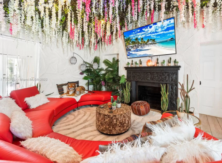
Oh. Wow. Here we are. All right, let's go one element at a time. Obviously, we will be starting with the plush tigers. This is such a silly thing for an adult to buy for their house, but who am I to judge this? I am always complaining in this column about how no one has any personal taste and so I must respect many of these decisions even though I would not personally make them. The walls are the most confusing part to me. They seem to be either layered with plaster or covered in some kind of crinkly fabric. Imagine any stain on that wall. What a nightmare.
The ceiling reminds me of the pop-up bars that are themed around things like "Alice in Wonderland" or "Christmas." I have the same question about this living room that I do about those bars: how in the hell do you dust this? My house has a lot of dust because I have many things and also a dog that sheds a metric ton of hair every single day. I cannot imagine how dusty those flowers would become. A million dollars to live in a dust storm. No thank you!
The couch, however, I love. Circle couches are very luxurious to me because they indicate that you have a giant living room. I also like the mantle, though I'm not sure why you need a fireplace in Miami. Let's move on.
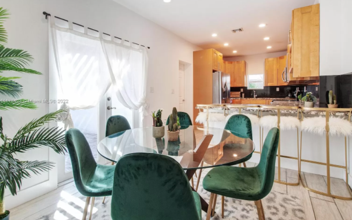
Another room, another animal print rug. To each their own. This dining room is kind of small considering how large the couch is. The table, in particular, is too small. And there are too many (very fluffy) barstools at this counter. I understand the desire to have extra seating, trust me. But people need room to use their utensils! They need space for a water glass and a wine glass. You cannot just smush everyone together all the time.
The kitchen also looks a little weird. Let's go closer.
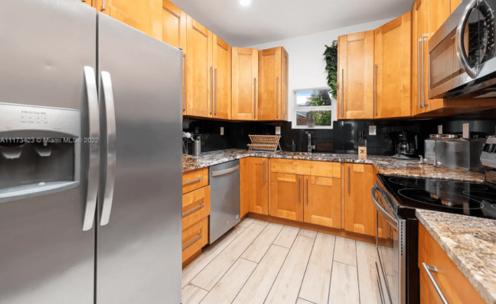
My first concern here is the size of this window. Why is it so short? Why does it look like it was made for a much smaller house? Could this window not be extended up to the ceiling to make the house look larger? It seems like it could to me.
This kitchen is mainly unobjectionable despite the floors looking a little cheap and like they belong in a barn. What confuses me is that this kitchen looks like the kind of kitchen you might find in a flipped condo. It's boring. It's lifeless. Even the backsplash (which looks like it might be a cool green tile) is dwarfed by the lack of lighting to show it off. Compared with the living room, the kitchen seems like a place the owners hated. It has gotten no love or attention.
Here's another room no one loved that much:
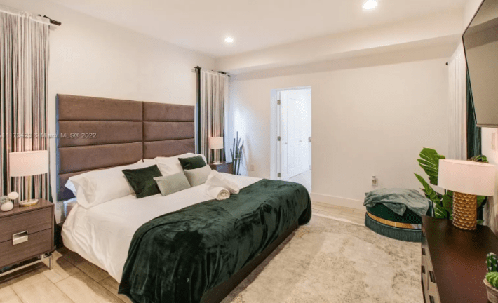
I guess it is possible that the owners were just designing one room at a time, but this room doesn't make a lot of sense to me either. It has elements of personal taste (the weird round cushion seat, the velour blankets and pillows) but there is an overwhelming blandness to the room. These people went to a mid-range luxury hotel, saw the decor of their room, and said: "yes." Maybe this is because there is nothing hung on the white walls. Or maybe it's the towels crossed on the bed like a resort that are throwing me off. After the drama of the first room, I guess my hopes were up.
Here's the primary bathroom:
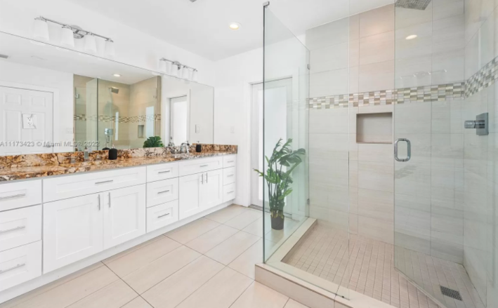
This shower is so big. The shower alone is as big as my whole bathroom in our old apartment . This, to me, seems a little wasteful, but it does look nice. Again with the all beige and white color palate though. Do you think that two people lived here, one of whom loved fun and the other might have constant migraines if forced to live in the exciting rooms? That seems the only reasonable option.
Here is the next bedroom!
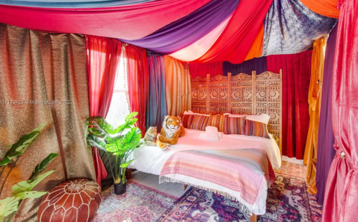
ANOTHER TIGER AND BABY TIGER!? Another Moroccan poof? Wait. Are these the same props from the living room moved into this room? Is that the same plant from the bathroom? Hmm. I'm unsure what to believe.
What I do know is that fabric is not cheap and this is so much fabric. The swooping drape of the fabric is like living in a tent, which I love, but I feel like an overhead fan is a bare-minimum requirement in Florida summers and this room not only has no fans, if it has any air-conditioning ducts, they are covered by fabric. I don't imagine the curtain tent and many rugs would stay in this room after the owners moved, which honestly isn't fair. I cannot see the room to get a good read on its shape with all of this fabric in the way, so I should get to keep the tent. And the tigers, while we are at it.
Here is the bathroom connected to that room:
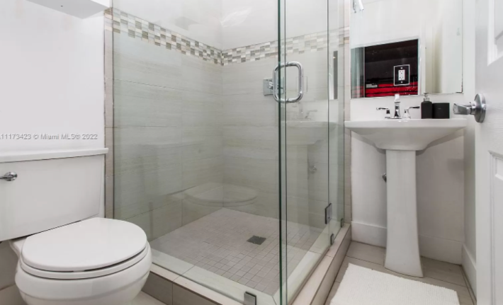
Do you see now, why I'm confused? This bathroom, frankly, sucks. Here we have the same sized shower in a much smaller room where it makes everything else awkward! This sink is crammed so far into the corner that I can already feel the radiating pain in my elbow after I slam it into that door knob trying to wash my hands.
Moving on to this:
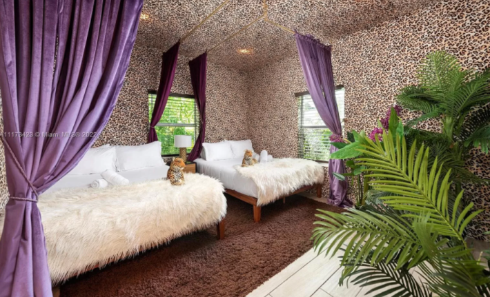
I have never seen a house that screams I WAS RENTED ON AIRBNB TO A BUNCH OF 25-YEAR-OLDS WITH TOO MUCH MONEY WHO NEED A PLACE TO DO DRUGS FOR THE WEEKEND quite as loudly as this place. The two beds in one room with curtains between them has convinced me that this is not personal taste as much as it is a stunt for cash. However, I do think it is really funny to have this wallpaper on the ceiling and the walls. It somehow makes the room look enormous and fancy. I am starting to believe that there is one tiger per bed, which means it would really be very simple for me to be given only one tiger as a gift for my time.
Okay, onto the next room:
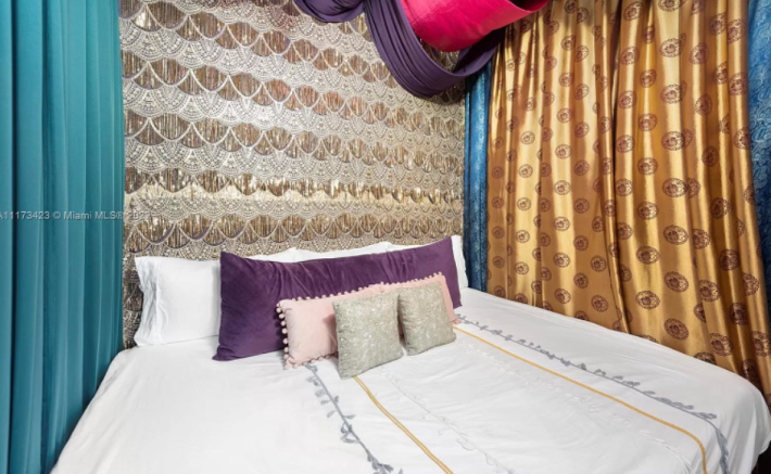
Even this wild design style becomes repetitive after a while I guess. Also, do these people have own a Joann Fabrics franchise?
Next!
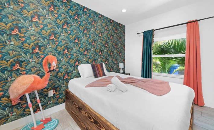
I really do not like the fact that these curtains don't match. I tried for several minutes to convince myself that it was okay, but it's not. This is a common design failure when people try to use exciting wallpaper. Maximalism (which you basically have to commit to with a wallpaper like this) does not require you to match all your colors. In fact, it discourages it. Using the same coral and dark teal of the wallpaper is detracting from the cool wallpaper! Imagine if instead, the other walls were painted that dark emerald and the ceiling had a nice pink pattern on it and then everything else was just chosen for looking nice. That would be better.
The flamingo itself I fear, but respect.
Let's go outside:
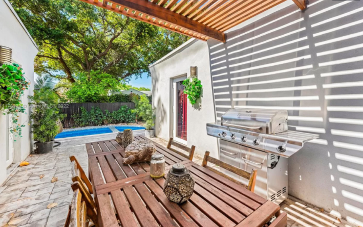
Now this is the million dollar house life. I love this. The stone patio is beautiful and looks like it would be very warm. I love the shade because I am a pale baby who will burn the second the sun graces my terrible skin. I also like that there is this long eating area separate from the pool. It's like an outside dining room!
The pool itself looks really blue and lovely. Let's look from the other side.
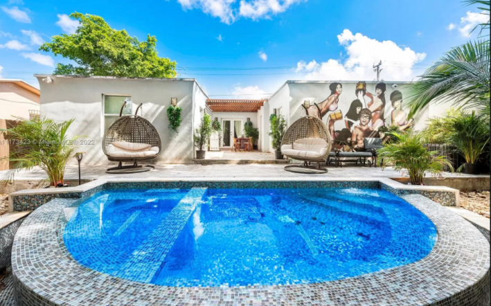
NO! NO! Nonononononononononoono. Lance, why? Why have you forced me to see this? My eyes! They hurt!
Here I thought I was looking at a perfectly nice (really lovely) waterfall pool with mosaic tiles and two giant very cozy egg chairs when suddenly, I am forced to see this terrible mural! Not only is it poorly painted with not enough contrast, it's also poorly proportioned! I do not like the content. I do not like the execution. I do not like that some weird patio furniture has been placed at the base of it to censor it in some way.
It is time for me to take my leave and return to looking at the nice white walls on my patio until my brain goes numb and this image can be dug out of my subconscious forever.
This house has been on the market for 41 days. If you buy it please do not invite me to whatever terrifying party you are throwing, but please DO send me one of the stuffed tigers.


