There are many artists who you could call strategic in their lifetime, but the ones that have always interested me the most are those that are strategic in death. To make something, anything really, is a practice and a delusion of immortality. Like Antoni Gaudi, at any moment, you could step back to admire your life's work, and get run over by a tram. But the church you were building (in Gaudi's case, La Sagrada Familia) will be talked about and visited and constructed for another century. Gaudi, of course, is an example of someone who achieved fame within his lifetime, but anyone who likes an antique store can tell you that the drawings and paintings of regular people outlive them. As a creator of any kind, your work hopefully will outlive you. Yet only some artists are capable of thinking about how their passing might be a boon to their work.
I have always been interested in the artistic work of women and always find myself reading art blogs. So my little ears perked right up in the mid-aughts when I was in high school and several Swedish art bloggers began writing about Hilma af Klint.
Hilma af Klint was a Swedish artist. She died at 81 in 1944, and in her will she stipulated that none of her work could be shown for 20 years. She left 1,200 paintings, 100 texts, and more than 26,000 pages of notes. That's the entirety of a person. Her art was first shown in public after her death in Los Angeles in 1986, but I was not alive then, so I did not know it was happening. The minute she reappeared in the blogosphere in the early aughts, I was obsessed.
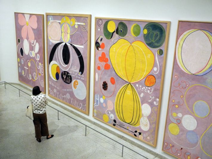
Af Klint was a weirdo in many ways. She held seances with friends. She believed she was communicating with the other side. And she made these monumental, towering paintings that are strange and vibrant and mystical. Many art historians now consider her one of Europe's first abstract modernists. When I saw af Klint's work in person for the first time (like most Americans) at the Guggenheim in 2018, I was so floored and excited that I went back the next day. I had planned to try and travel to Sweden to view her retrospective in 2020, but, well ... that didn't happen. Luckily this summer I was able to see her work at the Tate Modern in London exhibited with Piet Mondrian. It felt like a gift, to see such vibrancy up close again: to know that this was the work of a woman who built herself into history long after her death just by doing weird, special stuff all on her own.
I could write 50,000 more words about Hilma af Klint, but now is not the time for that. This is a house blog! The reason I bring up af Klint at all is that I think she stands in such stark opposition to the current American perspective on Sweden as a country. Her style is not the Nordic minimalism that has thrived in cheap showrooms across the world. It is not IKEA. It is not even the cozy Danish/Norwegian concept of hygge. Af Klint's work is complex, beautiful. Strange. It's patterns without end and without continuity and with so much meaning that they can feel painful. It's a sense of complexity that I imagine must feel stark and powerful against a barren, snow-covered Swedish landscape.
Anyway, all of this is to say that today's house is in Sweden, and it has some of the same magic that I think af Klint has.
Today's house was sent in by reader Sue, who said she looks at Swedish houses because she's on the Swedish Zillow which is called Hemnet. Very exciting! It is listed for 1,475,000 kroner, which I have sadly learned is the equivalent of $139,000. More proof that America is a trash country! There's probably not a single foreclosed house in America available for $136,000 at this point (with an 8 percent interest rate) much less one as cute as this place. This house appears to be a little bit in the middle of nowhere: nearly four hours drive from both Stockholm and Malmo. I only know about Malmo from being a Karl Ove Knausgaard head, so unfortunately I know nothing else about this part of Sweden.
Sue, who told me that she's been looking at Swedish apartments in Ostermalm since 2016, told me a little about the location of this house. "The closest major city, Jönköping, is about an hour's drive away. Aneby is near a bunch of lakes, so it would probably be a nice place to have a sommarstuga (summer home), but this particular house seems to be located in kind of a boring suburban area, based on the drone pic," Sue said. Thank you, Sue!
Let's look at this nice house Sue found for us:
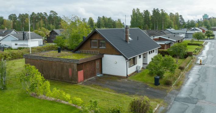
Wow! It is adorable. I see the suburbs that Sue mentioned, but I do like how adorable this little house is. I like the wood on the sides and covering the extension. I am curious about the grass on the top of this roof. How does it drain in the winter? How heavy is it? Can you go out there and lie down? I would like to, I think.
Here's a nice picture of the backyard garden:
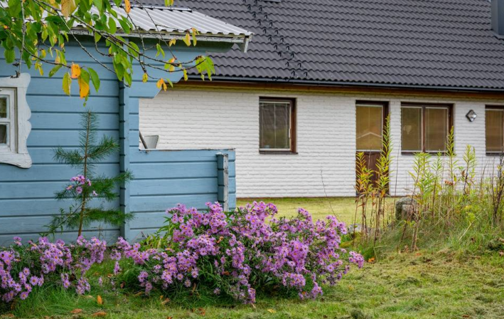
Look at all these flowers! Another Swedish creator Tove Jansson, whose books I devoured in 2020, wrote in her novel Fair Play, "It is simply this: do not tire, never lose interest, never grow indifferent—lose your invaluable curiosity and you let yourself die. It's as simple as that.” These flowers remind me of her. What a nice little house. Let's go inside:
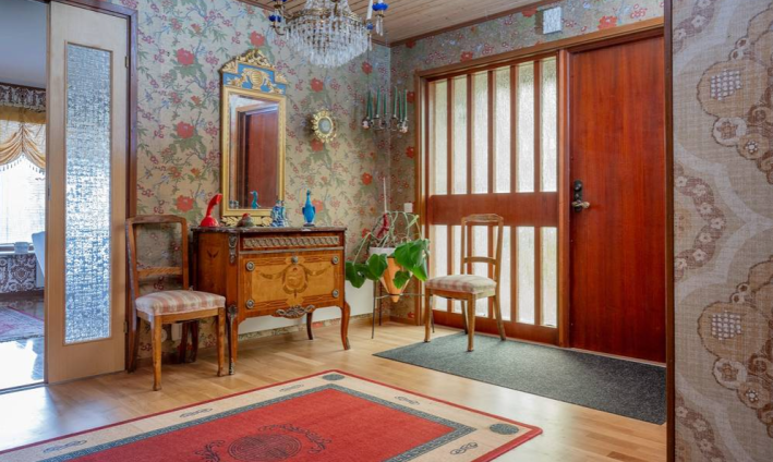
Immediately, we have an interesting combination happening. This house seems to have been constructed (or redone) in the 1970s. We see immediately some clear Mid-Century Modern elements. The paneled window nice to the door is a tell-tale sign, and so are these doors with the textured glass. If we look at another angle of this room, it becomes more apparent:
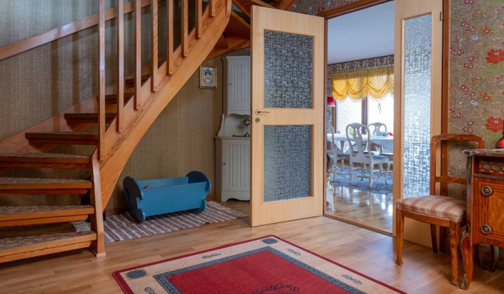
The twisting teak-colored wood on the stairs here is so mid-century it hurts. One thing immediately fascinating about this house to me is that generally people are rather closed minded about the canvases within the home they live in. If the house is ornate, they want to decorate it ornately. If it is sparse, they want to decorate it sparsely. Very rarely do you see someone inject their style onto a canvas that isn't exactly made for that style. But here it is happening! Look at this wallpaper. Look at the ornate furniture. This is fascinating.
Here's a hallway shot:
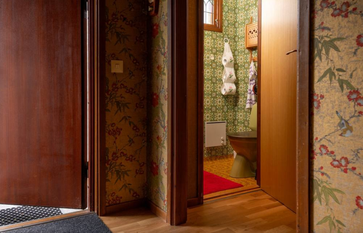
I'm obsessed with this. The subtle, almost neutral wallpaper of the hallway paired with the monochrome of this bathroom where the toilet is the same olive color as the wallpaper, all highlighted by a bright red rug that calls in the colors from the hall print. Truly, someone cooked here!
Here's a room that I would say is less cooked:
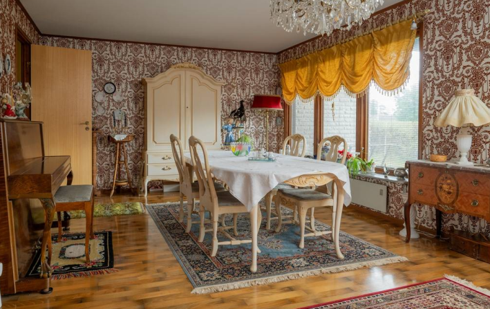
I understand conceptually the contrasting color premise that the decorators of this home are trying to pull off with the purple-tinged wallpaper and marigold curtain, not all purples contrast with yellow. And here you have a more red purple and more orange yellow, which makes not quite a contrast but a clash. That said, I'm loving these giant windows, and even the ornate chandelier.
Here's the other side of this room:
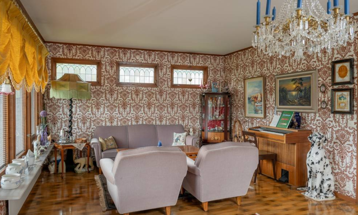
Hello to the Dalmatian statue. "The ceramic Dalmatian could stay as a kitsch object," Sue said, and I agree.
The windows in here are beautiful, and I'm obsessed with the piano bar aspect of having two pianos in the same big room. Mostly, this room doesn't hit for me, though. I'd prefer to see a rug, generally, and I think that could do a lot to keep this room from feeling so strangely empty despite having a lot of stuff in it.
Here is the kitchen:
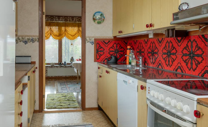
Sue hated this. "The red tile in the kitchen is hideous," she said. I'm not sure I think it's hideous, but I do think of this color as Almodovar Red, in that any time I see it in a kitchen, it reminds me of every Madrid apartment in every Almodovar movie. But the reason those kitchens work is that they are entirely this bright aggressive, stressful red. Because this tile is fragmented, instead of floor to ceiling, and because everything else in the kitchen tries to play it down, I agree with Sue that it does not work here. I do, however, really love these funky cabinet knobs. I would like to have them.
Here is a little craft/laundry room:
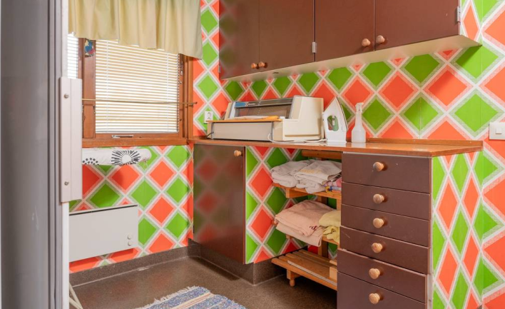
This is so neat and has so much storage I could cry. It's lovely. The wallpaper in here is a little too florescent for my taste, but it is very happy.
This wallpaper, however, I would die for:
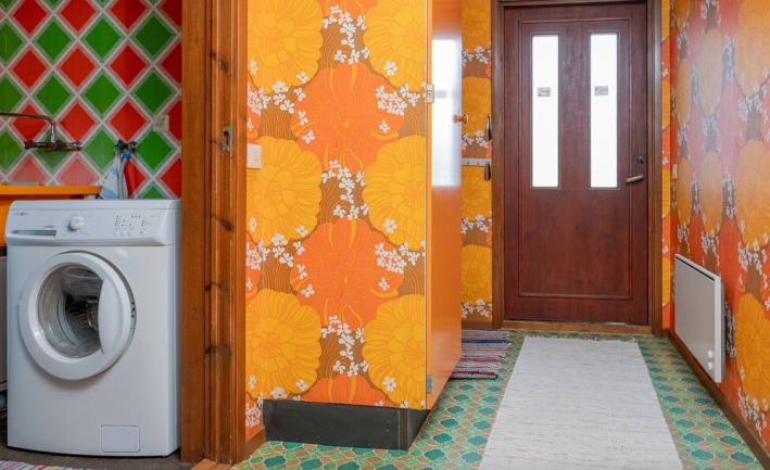
I love it! I love the bright orange flowers with the teal floor. This is what maximalism is supposed to be about! More patterns! More pattern pairing! More weird stuff!
Here's the upstairs:
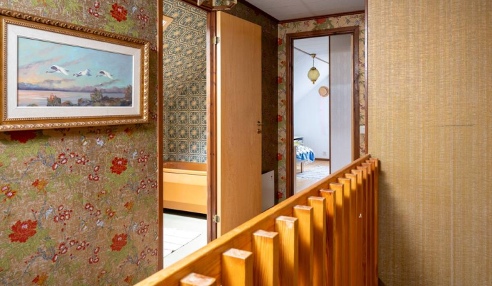
I love the wallpaper up here so much. And I love the wood. I love that there is so much natural light in this house. But ... what is happening with this tub?
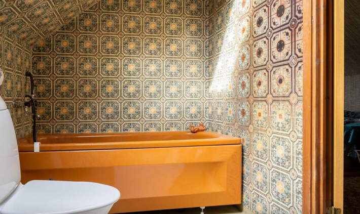
Oh. It's an amber tub! That's exciting! The bidet, which is not pictured here, is also this same color. This is very strange. I am not a huge fan of this color, and I do wish that the toilet matched. But I like the color choice.
I put the listing notes through Google translate, and learned they say, "Imagine keeping some of them and adding some white and it will be like new." I will NOT. Absolutely not! This house is a gem! And it should be purchased by someone who recognizes its value and loves it for what it is. It should be honored, like Hilma af Klint, for being exactly what it wanted to be despite its era and position!
This week's house is listed on Hemnet for 1,475,000 Kroner. If you buy this house, please invite me over. I want to touch the wallpaper.
