Everyone in real estate is always talking about re-sell value now. Don't paint your ceilings, because buyers don't like it. Don't rip up your carpet and install a weird tile. What if the future owners don't like your choices? Definitely don't paint something big and strange and exciting. That's not universally beloved. Think about the people who might live there in the future!
This is stupid. It's some of the stupidest shit I've ever heard. Houses aren't for investing. Houses are homes! Rich people ruin everything fun. Literally the whole point of owning a house is that you can just nail things into the wall willy-nilly and no one can stop you! You could punch holes in the drywall as an aesthetic choice, and that's you're right. But to believe that a house is not an investment is also to accept that your goal of living is not to simply turn money into more money.
But home ownership is no longer a thing that people with regular jobs get to do unless they are very lucky or have family wealth. Home ownership is more and more a hobby rich people have that ruins the market for everyone else. So often now, when I look at Zillow, I see the same three design choices from two years ago. When you look at the property history, you see that the house has turned over two, three, four, times in the last six years, the price increasing by 30 percent each time.
It is so rare now, to see a house like the one that reader Chris sent to me. This week's house was built in 1974 and had a single owner. That means that one family's taste and ideas and vibes have infiltrated this house fully. I love that! It's fun! Someone, you can tell, definitely lived here: for better or for worse.
"Do I like the house? That's a good question. I mean, the short answer is no," Chris said. So that's something.
Let's take a look at it:
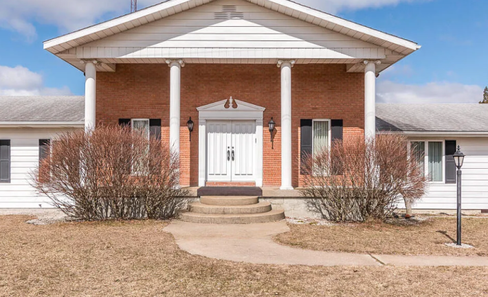
Boring! Chris warned me about this. In his first email he said the house was as, "absurd inside as it is boring outside." Incredible lede. I love it. Let's do the specs first. We have: two bedrooms, four bathrooms, and (wow!) 4,174 sq/ft. That's so many square feet with so few bedrooms.
The house is located in Hartford, Michigan. I asked an expert on Michigan (my coworker Lauren) and she said that Hartford is a little too far from the lake to be a tourist town, and in a more concentrated area of rural Michigan. This is, in my opinion, a bad vibe. Whatever! Let's go inside:
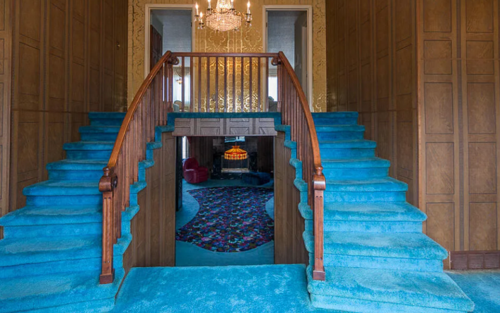
OK, I am understanding why Chris hated this in that this house has a LOT of personality. I wonder what it must feel like for him to be so wrong, because this slaps! Do I like carpet? No. Do I like this carpet? Unfortunately yes.
I also like whatever is happening on these walls, but not the one that looks like Christmas paper. That will have to be replaced.
Moving on!
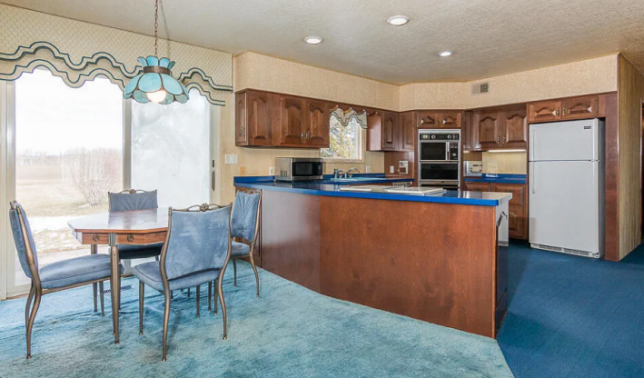
OK, absolutely not! It's wild how sometimes you can be very right in one room and very wrong in another. Why is there textured wallpaper on the ceiling? What is this church window shape cabinet design? Having carpet in the kitchen is actually a war crime, so that must be why they are selling the house (they were arrested).
That said, I do think I could fix her. I actually love this blue countertop and find it very exciting. I think if you're going to have something like this, though, the move is to play it up instead of playing it down. Get colorful appliances! Hang patterned wall paper! Add a funky tile! It's salvageable, but this is not good.
Next we have the great room.
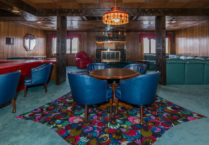
Lotta weird things happening in here, but I think all of them are kind of cool. I'm not sure how to feel about this cut-out carpet design. I think I hate it, but it is possible that actually I love it. I feel like if I lived in this house for a week, I would be ready to defend this design choice on account of it being interesting, funny, and very mesmerizing.
There is also so much seating in this room. It's kind of astounding. Do I want to know what kind of parties were being thrown at this house in mostly rural Michigan that necessitated this amount of seating? Kind of!
I do like the wood with red accent bar and buntings. That feels like it has alot of promise to me. But I'm not sure about the texture of whatever this dividing wall is. It looks like very distressed brass to me?
Another problem is the bar:
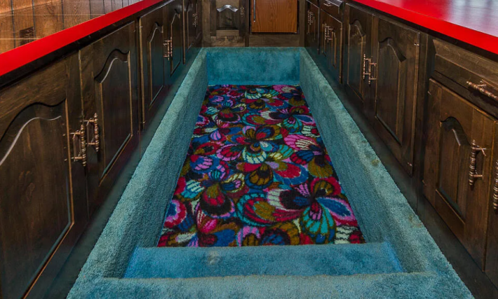
Usually, I am all for having a bar in your house because it's funny and why not?! But I think it should be ... uh ... bar height. As you might have noticed in the first living-room picture, this bar is not bar height. It is table height. Which is weird.
Chris has done some reporting about this bar, and he says we must take what he has to say with a grain of salt, but I choose to accept it fully as fact. You may do as you please. Here is what Chris learned: "Apparently the owner [made the sunken bar] so he could be at eye level with guests while they were sitting at the bar and he was standing behind it. I would be deeply uncomfortable sitting at a bar where the bartender was at eye level with me and it brings up lots of issues with the logistics of pouring and mixing drinks for your guests."
Thank you, Chris. I hate this information.
Also, this is literally why bar height was invented!!! So that when you are sitting at the bar, you are at the same eye-line almost as the bartender. Why does the bar need to be low and the bartender descending into the ground to achieve this? I do not like.
Here is a bathroom:
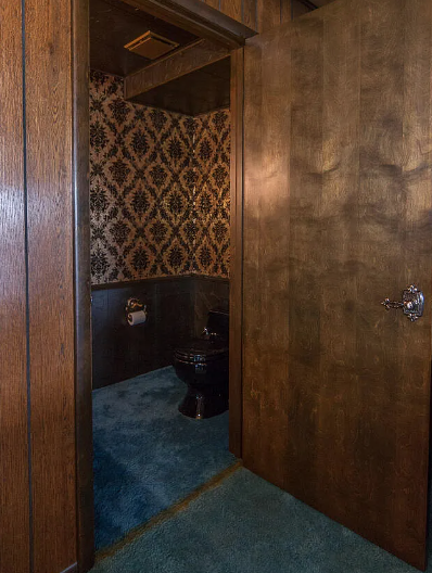
Hell yeah. Moody, but yet again, the carpet must leave. Kitchens and bathrooms must be tiled or concrete. I will accept hardwood floors, but even that I do not love. Carpet? No!
Here is something:
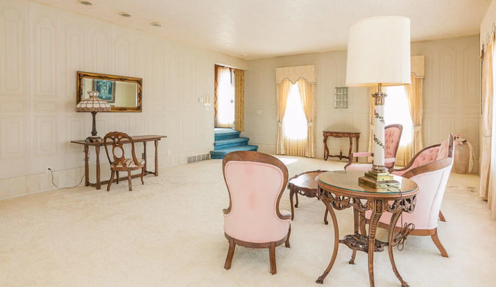
This room does not fit with anything else in the house and therefore, I hate it. Why does it look like a mock-up of a boring version of the White House? Why is it so muted? Why is it so feminine when the rest of the house is so masculine? Is this the gender-swapped version of a man-cave: a strange useless room with pale tones and nothing to do?
Also imagine spilling wine in here. This is a room made for a carpet cleaning commercial. Unlike this room, which is cool:
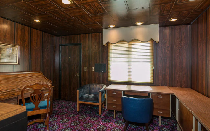
Unfortunately, on account of me having tacky taste, I love this carpet and wood vibe. It's very exciting, and I think a lot could be done with this room just by removing one of the four desks and adding some art. I like it in here. This room is for me.
Unlike this room, which looks like a doll house:
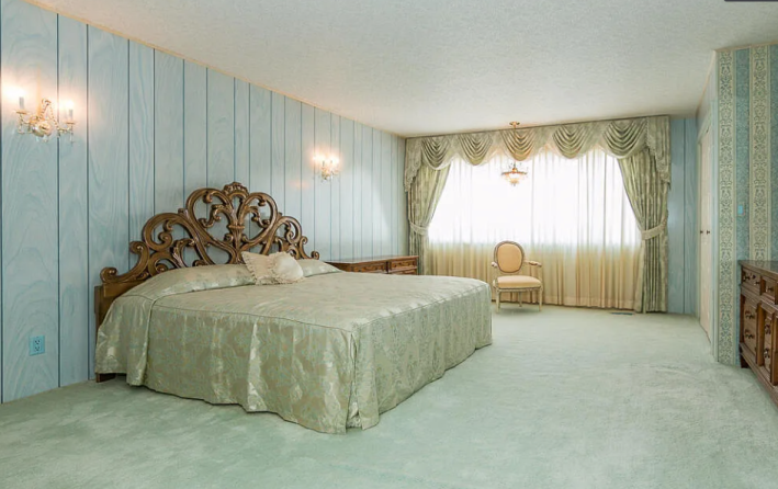
I would really like to know more about who lived here. Did they divy up the rooms for their own styles? It's kind of fun to imagine having your own quarters designed exactly how you want.
The bathroom, though, is very exciting. Look at that blue!
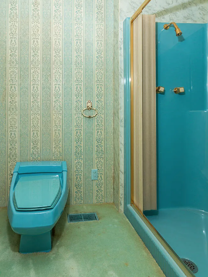
"I can smell the carpet in those bathrooms wafting through my computer screen, but I do like the futuristic toilets! Oddly-shaped, colored toilets should make a comeback!" Chris said.
I agree, Chris! What I really appreciate in this room is the attention to detail. Look how the heating vent and the electric outlet cover have been painted to match the toilet and the shower! That's sick.
Do not look at the color of the carpet near the shower or the corner. That is very upsetting to see.
Here's what's going on downstairs:
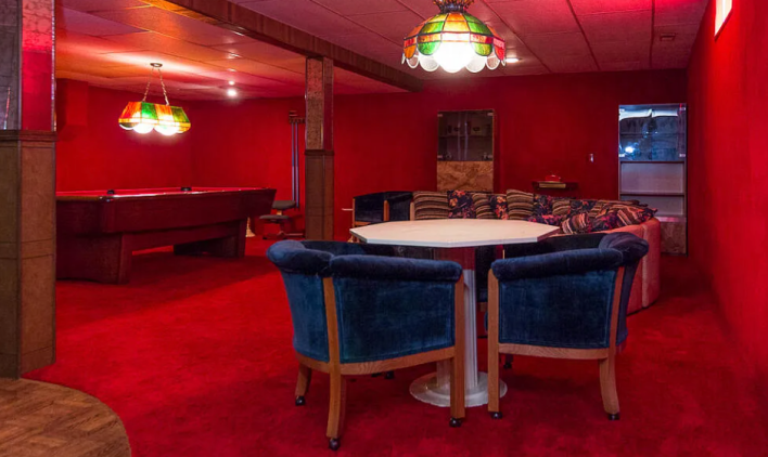
Unlike last week's terrifying basement descent, this one has a fun payoff. The pool table here does not scare me. The chairs look comfy. The walls padded with carpet remind me a little bit of a skating rink, but not necessarily in a bad way. This is a cozy basement, if very, very red.
I think if we lived here for 60 years, we could expand on this idea, buy some vintage furniture, and really make the place shine. But we will absolutely have to hire someone to remove some of this carpet.
This week's house has been listed on Zillow for $315,000 for six days. If you buy this house, call me. I have some good ideas for you.
