The hardest thing about moving, in my opinion, is the mental labor. Not only do you have to pack all your things, but once you've arrived you need a new place to buy groceries, a new favorite bar, a new understanding of the outdated liquor laws in Pennsylvania, or whatever. All of those new things take thought work, and because you are in a new space, your brain also does not know where things are.
Because I am clumsy and because I lived in my other apartment for eight years, I forgot about the constant bruising that appears when you take corners you thought were wider a little too tight. I was always ramming my toe into something, or catching my hip on the side of a desk. I kept moving furniture and changing things, so it only got worse. This all takes brain power because your brain must learn where everything is. Once you know, you don't have to think about where the stairs end, or where the coffee table juts out because your subconscious takes over. That's easier, preferable even.
It's how you know you're at home, in a way, when you don't have to think about where the doorway ends. That can be a bar, or an office or whatever. But today's house? I'm not sure I could ever feel stable and unbruised here!
Today's house is sent in by reader Alex, who found it while looking at property in Maine. It's listed at $389,000, which is cheaper than many houses we have seen in this column. This home was first listed in September for $458,000, so that's not a good sign. It also has a very worrying stat line in that it is 3,000 sq/ft but only has one bedroom and one bathroom. That doesn't seem good.
"I was intrigued because I saw this on what I would call a rich summer person coastal island, but it was priced like it was on an inland lake," reader Alex said. That is intriguing. Let's take a look:
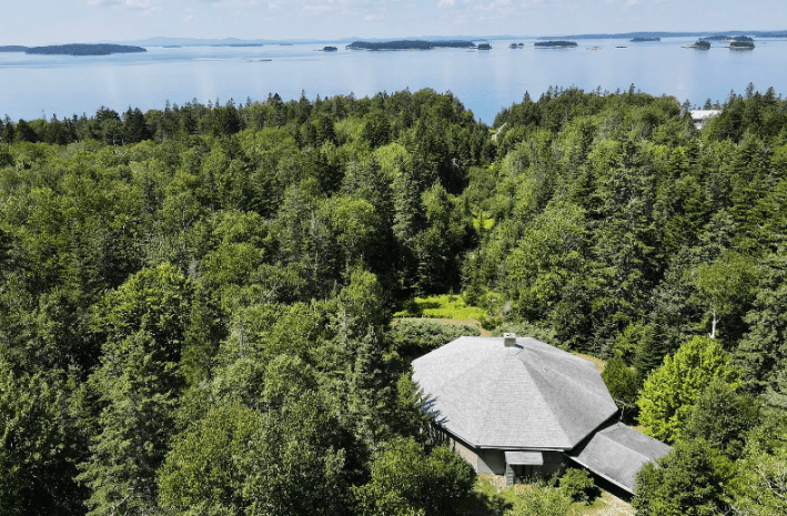
Oooh la la! Look at all that gorgeous water! So gray blue! So pretty. I looked at this house on a map, and it seems to be about halfway up the coast of Maine on an island called Deer Island. I like deer, so this is fine by me.
From this aerial view, we can also see that the house is an octagon. It has what appears to be either a connected garage or a strange addition. Here's another angle.
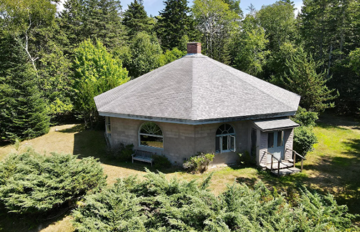
Something about the chimney coming directly out of the center of the house is pleasant to the eye, but it does make me worry about leaking. Water is an enemy inside a home, and having seams at the very top of the house seems bad, but what do I know! I'm just a blogger.
Let's go inside:
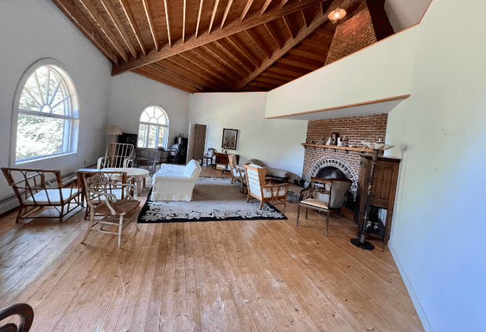
OK. Things that are working here: I like the repeated half circle motif in the windows and the fireplace. I like the two-story bricks a lot, but I do not like whatever fucking plaster beam has been placed across it. This ruins the majesty of the giant brick fireplace and makes the room seem shorter when it actually has this giant soaring ceiling that is very pretty.
The floors look like shit, to be honest. They need to be at a minimum stained and sealed! You cannot just leave raw wood floors! If you spill red wine, it will be there forever!
Here's the angle from the fireplace:
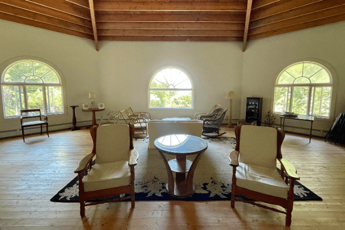
Photos like this are always strange in listings. No one is ever going to stand in this position. This is not an accurate portrayal of this room, though it is quite lovely.
One question I have is: why are there so many chairs? This is a lot of chairs for one room! Who is coming over?
Moving on:
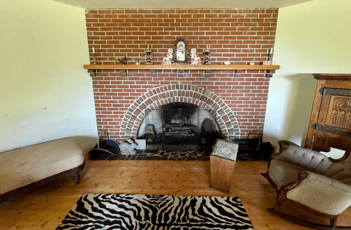
Here's another fireplace, I guess. Already at this point, I was confused about the layout of this house. This is a problem that Alex also had. "Do you have to walk around the perimeter to move from room to room? It seems like you walk in the one exterior door directly into a wall," he wrote. "I think you go left to get to the "great" room with the fireplace and zebra print rug. Great view, though. Then you move on to an oddly shaped bedroom (the only bedroom!) from that room, with the only bathroom in the building attached. "
After much consideration (flipping back and forth between photos very rapidly) I think that Alex is right. Here is the bedroom:
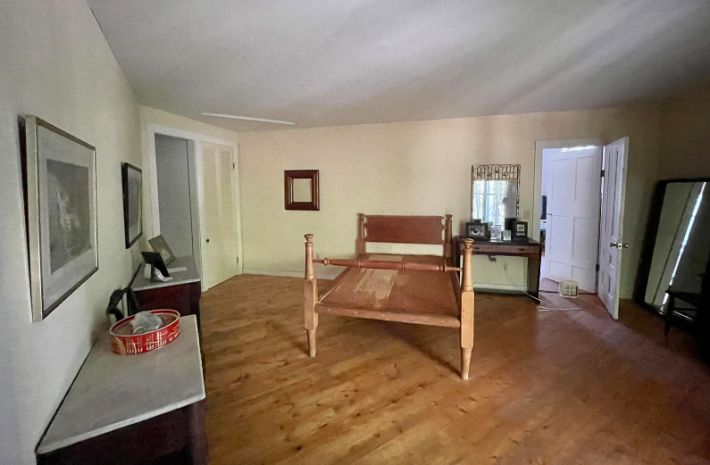
Yikes! Nothing screams haunted more than a bedframe without a mattress, with a mirror pointed right at it, and lace curtains on the window. No thank you! I do not like it.
Otherwise, this room is extremely bland. Why can't you see the vaulted ceiling in here? Why are there all these desks? What is happening in here?
Let's look at the attached bathroom:
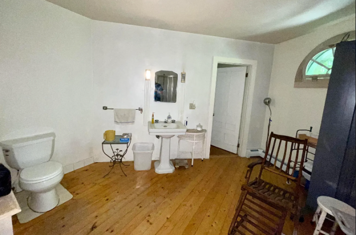
That sound you hear is me smacking my face on the desk repeatedly.
Imagine building on a bathroom to your octagon house and making ... these choices. First off, bathrooms should really be tiled because they have so much water. Second off, all these fixtures look like they are from the Sims game in 2004. Why are they positioned so far apart? Why is there this creepy recliner? Why, in a 3,000 square foot home, is there no tub? Stupid!
Here is the kitchen, which is .... somewhere. It's unclear where.
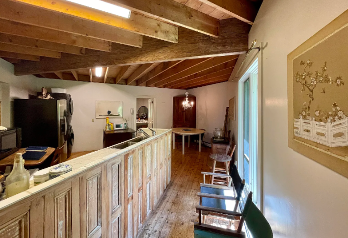
Jesus Christ. This is one of the worst kitchens we've ever seen, I think! But luckily there are plenty of chairs here for people to look at it! Go ahead take a seat! Look ... uh ... directly into the bar in front of you, which seems to be made of salvaged cabinets that do not open. Cool!
Over here we have more awful stuff:
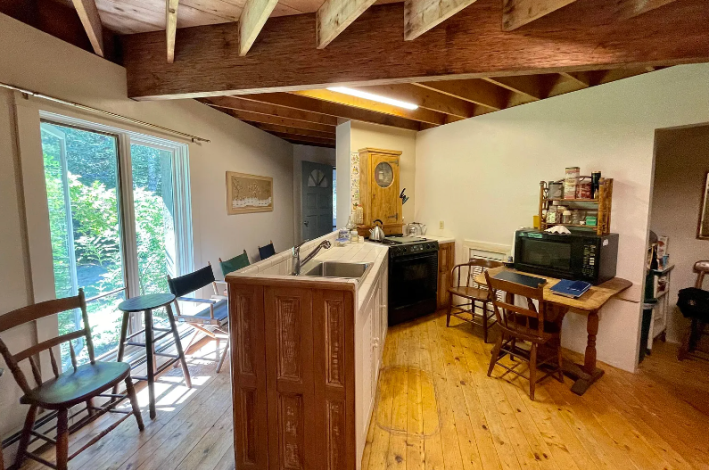
YIKES! I'm not even sure if this is a full-depth sink. It looks narrow. Luckily, though, there are more places to sit over here! Thank god!!! I was thinking we would die from all this standing!
Imagine how many bruises I would have just touring this house? None of the angles make any sense at all. 3,000 square feet and the kitchen is IDENTICAL to the one I had in my 700-square-foot apartment in a city! That's stupid! What a waste! Here's ... another room:
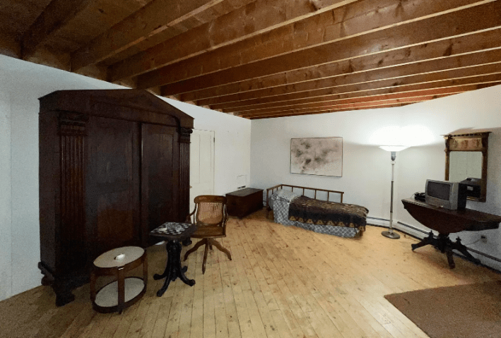
I'm not exactly sure why this doesn't qualify as a bedroom. Probably because it doesn't have a window or a closet. It's very silly to not have a window in a house with EIGHT SIDES. What is truly funny about this room to me is that in a house full of chairs, we must sit on this weird end table to play chess. That's beautiful to me. Surprises everywhere.
The listing promises the "Opportunity to finish upstairs room and loft to make a lovely main bedroom." But I see no stairs, no ladder, no way to get to presumed loft, and no photos of its existence currently, which leads me to believe: it sucks.
Here's another semi-purposeless room:
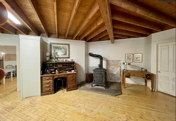
This house is a first for me, and perhaps an only in that I am going to recommend the destruction of walls. Readers of this column know that I love walls. I love to have little separate rooms that can be painted different colors and decorated with art. There is no way all of these walls are structural, and because there are so many walls, the house feels claustrophobic and small instead of expansive and lovely. There are such good views from the front room. Let it shine!
"If you are going to build a 3,000 square foot octagon on 3 acres with water views on an island off the Maine coast, there have to be innumerable ways to better use the space," Alex said. "Conceptually, I think I hate the lack of thought behind the interior the most. You have so many possibilities and this is what you chose to do? You have the creativity to think 'I'm going to build an octagon!' but then haphazardly chop up the interior?"
I agree!!! What an uncreative, sad little haunted space full of chairs! Our shins will never survive it!
This week's house has been listed on Zillow for $389,000 for months. If you buy this house, I have many, many ideas for you. But please get rid of the chairs before I arrive.
