This weekend, I went to a very funny event. As a celebration of Halloween, one of my favorite restaurants in Philadelphia decided to dress up as ... another restaurant. Specifically, the restaurant transformed into SUR, as made famous by the show Vanderpump Rules. Everything was pink. Everything was tacky in a campy way. The menu had the weirdest collection of things on it: crudo, fried goat cheese balls, enchiladas, truffle gnocchi. Because this was fake SUR and not real SUR, everything was very delicious. I had a great time, and laughed the whole meal.
I had never considered that a space could dress up for Halloween and pretend to be something else, but the idea of it is very charming to me. Imagine a putt-putt course dressing up as a fashion show, or a coffee shop dressing up as a museum. I found the whole thing very enchanting, this morphing of the boundaries of what Halloween could be.
I was in this enchanted and optimistic state when I opened an email from a reader named Alex titled "Zillowing Out on two pyramids in NC." A house dressing up as a pyramid!? What fun!!
Unfortunately, my optimism was misguided. Reader Alex sent in this week's home with a terrifying warning: "Found this gem while hunting for what will hopefully be our retirement home. This will not be it."
When asked for more details, he said, "I'm searching for an eventual retirement home, preferably waterfront on a lake or a large river. Zillow's filters take a VERY broad view of 'waterfront' so I sometimes wind up seeing homes or land that has a small creek or the even less useful 'community dock access.' If it wasn't for this flexibility I never would have seen this property. Now I can't unsee it."
I too have noticed that Zillow tends to categorize any property that has ever thought about water as "waterfront," but never have my waterfront searches brought me something so terrible. Before we get into it, let's look at the strange stats on this house.
This week's house is listed for $675,100. This already is deranged. Usually houses are listed for something like $674,800 so that anyone whose price range is $675,000 will see it. This price choice means that only people with higher price ranges will see this, but whatever. That's not even the weirdest stat. This house is listed as three bedrooms, seven bathrooms (????) and 3,687 square feet.
Here, let's look at the house:

I am having a rather visceral reaction to these pyramids. It would be too mild to say it is a "negative" reaction. I like pyramids, generally. Pyramid is a cool shape, it has an exciting history, and they are fun! I have visited the pyramids outside of Mexico City several times and each time has been a delight filled with wonder. But these pyramids do not seem to hold any inherent truths. They only hold fear.
The listing says that this house was, "designed in 1987 by architect James Kluttz" and "features two livable areas connected by a breezeway with sun room, screened porch and covered deck on an 18 acre parcel that has 6 pastures"
"Designed," I will warn you, is an optimistic choice for what is going on here, but it does seem that there are six pastures. Here's an overhead shot included with the listing:

I would never make it down this driveway. If you tried to take me down this driveway toward these pyramids, I would barrel-roll myself out of the car and make a run for it. Awful!
When I asked Alex if he could live in these pyramids, he said, "HAHAHAHA! No." So that's not encouraging.
Let's go inside:
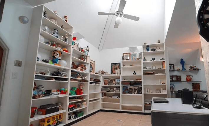
Hmm. This looks like a sad, picked-over thrift store. Everything on the shelves on the left seems to be for children, but some things are up too high to reach. Everything on the shelves on the right seems to be weird framed photos. I fear them, so I won't be zooming in.
I also do not love that this was the first interior photo in the slideshow. I am remiss to say that despite looking at these photos for hours, I still have no idea where the rooms in these pyramids are. We will have to use our imaginations.
Moving on to this:
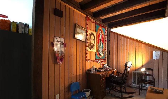
One particular beef that I will take to my grave is that religious art used to slap and now it sucks. You see La Pieta in the Vatican, and could weep. The church used to have better priorities: paying good artists to make sick shit. Looking at any Bernini is enough to ruin me for a week. Looking at this weird middle-school level drawing of white Jesus, though, is so boring. The Mary iconography is a little better, but not much.
That's a digression but I had to make it because otherwise this room is boring. wood paneling, like other wall textures, is a choice that must be coupled with good design. Here's a living room:
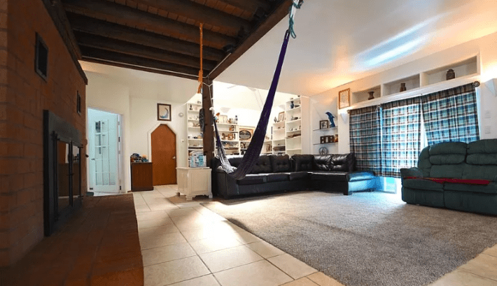
Hm. I hate that the tiles on this floor do not match up in their grout lines. It is the same tile. Why not ... line them up? Who installed this?
I also do not like this hammock. Why is it here? When we look from this angle, we can understand:
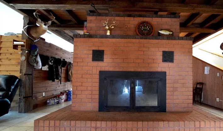
The hammock is in front of the fireplace. That's cozy, I guess. What's less cozy is that all of these walls appear to be half walls, which means that all that heat is just gonna rocket upward and outward and dissipate.
Despite disliking mounted animal heads, I do kind of like this deer that appears to be tied to a wooden support pole with three ribbons. He looks nosy. I like that in a deer. Here is the dining room:
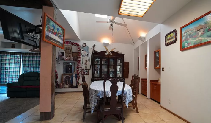
More ugly religious art! So wonderful! Very faithful. "A fine example of why staging a house is important: You want the buyer to imagine themselves living there, not the whack-job religious commune that might have," Alex said in his email. Great point, Alex!
I did expect (silly me) for the pyramid houses to have more vaulted ceilings, so I'm happy to see one here, but the fact that only half of the ceiling is vaulted makes it somehow feel more claustrophobic.
And speaking of claustrophobia, what is happening with these built-ins on the right that look like they are stuck inside voting booths? Do the built-ins need privacy?
Here's the kitchen, I guess:
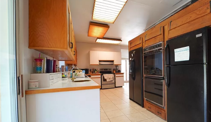
Nothing screams $675,000 home price like ... checks notes ... matte black appliances and hone- oak cabinets? Hm. That can't be right. But here we are.
I am, however, fairly entranced by these light boxes. They remind me of what I imagine it would be like to look up from one of those sidewalk grates that goes down to the subway. I find them fun.
Here's another angle:
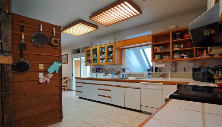
I hate the kitchen less from this angle. I know that many people hate this kind of cabinet, but I like it. It seems supremely easy to wipe down these cabinets, and I like the wood trimming, even though some of it appears to be missing.
I feel in my heart (though I have no proof) that tiled countertops are about to make a huge comeback, so this is also fine by me.
Let's observe a bedroom, shall we?
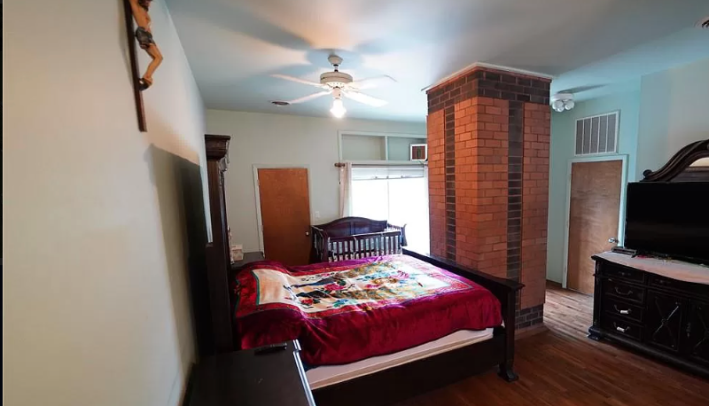
I just ... this is deranged. I have been laughing about this photo all morning. Because this column is far too large to have anything to do with the structure of the pyramid, and because it is made of brick, I assume that this is actually the chimney from the fireplace downstairs. It is the largest chimney known to man.
I cannot get over how bad of a design this is. You might as well divide this space into three closets, that's how bad it is.
Theoretically, there are seven bathrooms in this house. Here's one of two pictured:
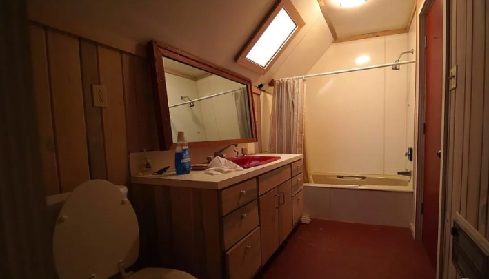
I am a girl who loves low lighting, so that does not bother me here, but I do find it a little scary in a house listing. WHAT ARE YOU TRYING TO HIDE? Is it mold from the choice to have so much wood in a bathroom? It feels like it might be mold.
Here's another weird room:
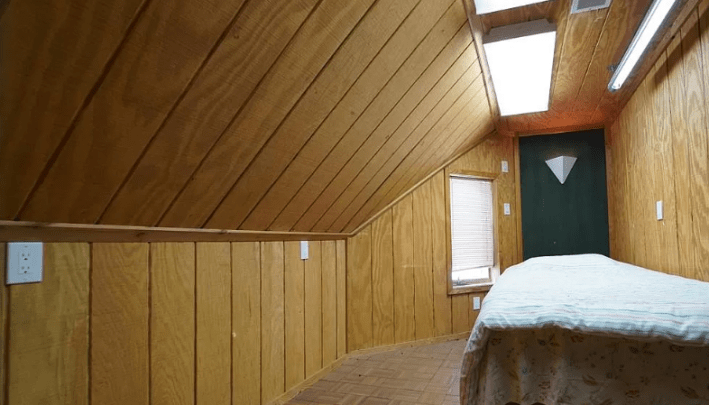
These box lights I do not find enchanting. In fact, I hate them almost as much as I hate that there are six visible outlets in this room and only one of them is in a normal spot for an outlet. What do you need all these outlets for in a room that looks like it has either a massage bed or an operating table in it? No thank you!
Here is another room:
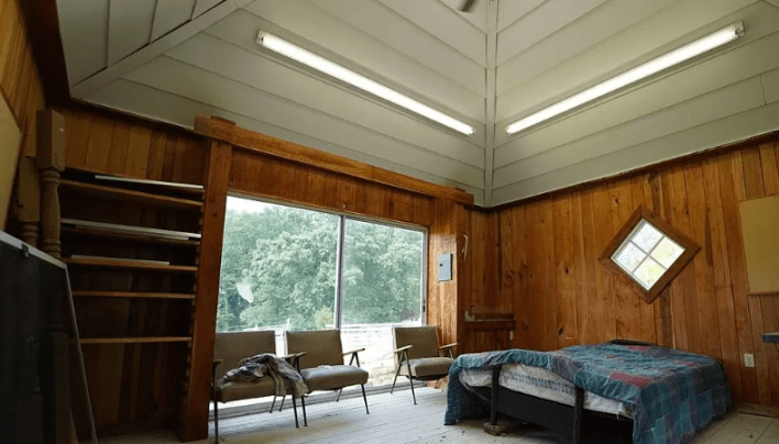
Wow, see, this is what I expected this house to look like. There's a nice big window to the outside, and a huge vaulted ceiling. This screams pyramid, which you would think would be a desired outcome when ... living inside a pyramid. Again, though, the florescent lights will be the death of me. With a pyramid, I would assume, there should be plenty of opportunities for skylights, but there are not very many in this house, so perhaps that is a delusional dream.
All of these rooms are from the first pyramid. When you read the description, it is clear why. "The other pyramid is unfinished and can become whatever you dream, a mother-in-law suite, airbnb, even a man cave," the listing says. Ah, yes, a 1,600 square foot man cave or an Airbnb that could scare even the bravest of souls.
Here is a room that I think is in the other pyramid, but could be in the first pyramid. Either way, I do not like it.
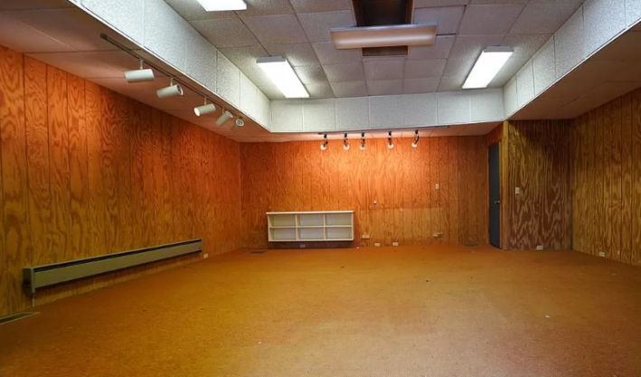
The track lights pointed at the walls make it feel like this is supposed to be the worst museum to ever exist. I do not like being in here one bit. The elevated drop ceiling is a crime against design. The architect of this pyramid should have his brain studied for science. Someone let him cook too long, and now we have this weird terrible burnt place that no one wants.
Here's a hallway that may be int he unfinished pyramid or the finished one, who is to say?
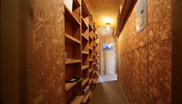
While it is good to have storage, I do not know that this is where I want it to be. It looks like any of these shelves could reveal a hidden room, and god knows what's back there!
Finally, here is some kind of work space?
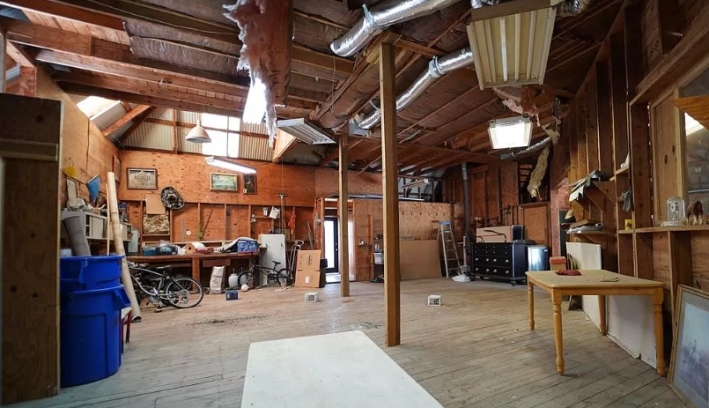
Sure! At this point, who can really be surprised that we have insulation hanging from the ceiling, and windows covered with some kind of weird corrugated stuff, and walls made of plywood? That's just how it is when you live in two pyramids connected by a breezeway!
This week's house has been listed on Zillow at $675,000 for 477 days. If you buy this house, please be careful in the second pyramid. I fear the reason it remains unfinished.


