It is the time of year again when I become very jealous of everyone with generations of family money. In the winter, I do not care about rich people going on their little adventures. I did not enjoy skiing the one time I tried it, and live in a place with seasons already. Going to a chalet seems cool, but it doesn't cause me to boil with envy. The months of June, July and August, though, when rich people disappear off to their second homes, make me want to cry out of jealousy.
I read Virginia Woolf's To the Lighthouse in college like every depressed white woman, and like many of them fell in love with it. It's a perfect book. Every character is a menace. Death lurks in every nook. The child is insufferable. A few years ago, during a very bad depressive episode in the middle of summer (the most embarrassing time of year to be depressed), I downloaded the audiobook version of To The Lighthouse read by Nicole Kidman and lived inside the book for a month or two in order to survive. That summer was bad, but the book remains great.
To The Lighthouse takes place on the coast of Scotland. I have never been to Scotland, and have very little reference point to imagine it, so in my American-centric brain, To the Lighthouse actually takes place in Maine, another place I have never been, but I know is full of big old family money houses that rich city people run away to for a few months every summer. It seems unfair to me that I do not have an invite to the type of houses that show up in To The Lighthouse, because I think I would be extremely good at relaxing in a big house on a summer day. I can paint! I can carry a tune if someone else is playing the piano! I am a very good companion for long walks! I love wearing a light jacket in the summer evening! Yet, still I do not have a Maine house!
All of this to say that when I opened Derek's email this week and clicked on the link to this house, I could already envision myself packing my bags, loading my dog in the car and driving up to spend the summer months. I mean, LOOK AT IT:
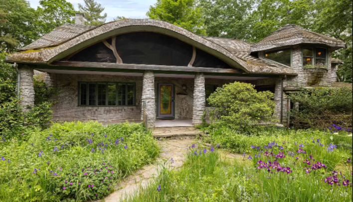
Wow. Aren't you intrigued already? Look at that curvy roof. Look at how the columns of the porch look like birch trees because they are wrapped in shingles. Look how wavy the roof on the tower is! It has a tower! It's also so green. I want to wander through this overgrown yard and pick some flowers for the table. Do you want to come? Do not tell me about ticks. I know, and I don't care.
This week's house is listed at $679,000. It is four bedrooms, three baths and... 4,478 sq/ft. Hmm. That's a lot of square feet. "This home is just waiting for a new steward with creative vision, deep appreciation of craftsmanship, and a toolbelt, and offers so much opportunity to those who see the potential of this incredible location," the listing says. Well. That could be us, probably.
The "incredible location" the listing speaks of seems to be "on the river." You know this house is right by a river because its address is 4 Rivers Edge Lane and also because this photo is included in the listing:

Something about this font choice with the arrow reminds me of action movies where the movie director thinks the setting is more important to the plot of things exploding than it actually is. The nearness to the river here is actually scary to me because all I think about anymore is how the warming earth is going to change everything. But whatever! It is very lush. Verdant even.
From the outside, I love this house already. I love that it's so quaint. I love that it feels really cozy. I love that it's so green! I really love that it doesn't feel like a cookie cutter house. But rarely do any of you send me houses that are uniformly good, so I am also a little nervous.
Let's go inside.
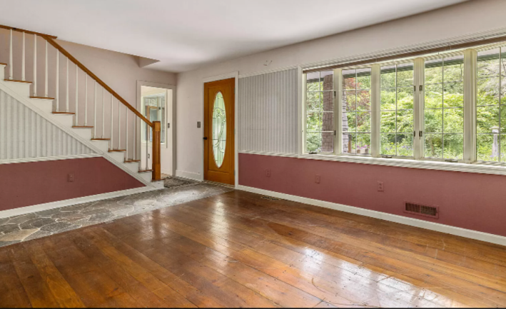
It seems being nervous was the right call. This door looks like it belongs in a suburban cookie cutter house. This little hobbit house deserves a big hefty door made of a single giant tree. It deserves a big iron door knocker. The entry room, too, is boring. It is decorated like a posh nursery. Why is this wallpaper only in two spots? Why is it painted the color of a television therapist's office, but only around the bottom third of the walls?
The wood floors are gorgeous, but they are interrupted by this laid rock path, which seems to go nowhere. It also belongs to an entirely different type of house. I don't hate the rock path. I hate the stairs. Let's move on.
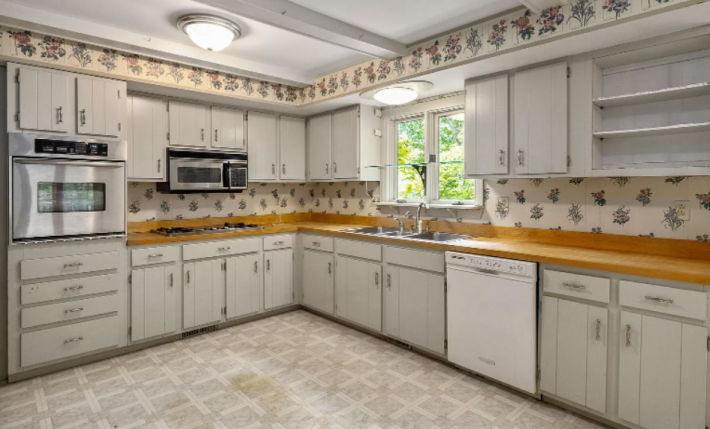
The interior vibe is consistent at least in that these two rooms suck in the exact same way. This pale, desaturated color palette is a terrible choice for a kitchen, which famously, is a very messy room. A lot of this could be fixed with a coat of paint. If these cabinets, for example, were a very dark green and the floors were a nice wood or terracotta, this would feel much more consistent with the outside of the house. Instead it feels somewhere between grandma's house and a Joanna Gaines knock-off.
"Kitchen wallpaper screams MURDER HOUSE - get out now," Derek said in his email. Oh no. It does kind of, doesn't it?
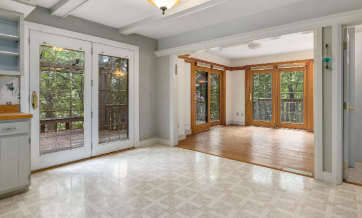
On the other side of the kitchen we have another shot of these terrible floors. Gross. I hate laminate, and I hate this square pattern, and yet, this room exists next to a very beautiful room! Look at that dining room! That's what the whole house should look like. Big ceilings, wood floor, wood trim, huge doors that open out to this big wrap around deck. With a big table in there, it would be mesmerizing. I'm imagining some flowy curtains and a big rug and smiling. I do not want to move into another room where different terrors may await, but for all of you, I will.
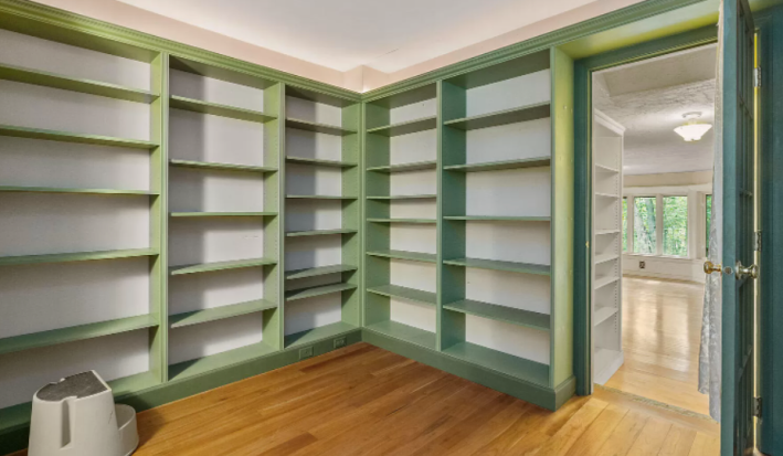
We are upstairs now. Here we have a library. As someone who just spent three weeks painting her book shelves, I can tell you that these would look a lot better if the backs of the shelves were also painted the same color green. I do however, like this little library room. If all the shelves were even it would look like a real library! Obviously, we will have to replace this step stool with a real sliding ladder like in Beauty and the Beast. That little dream might be worth the rest of the work this house needs, to be honest.
Next we have a room I don't understand.
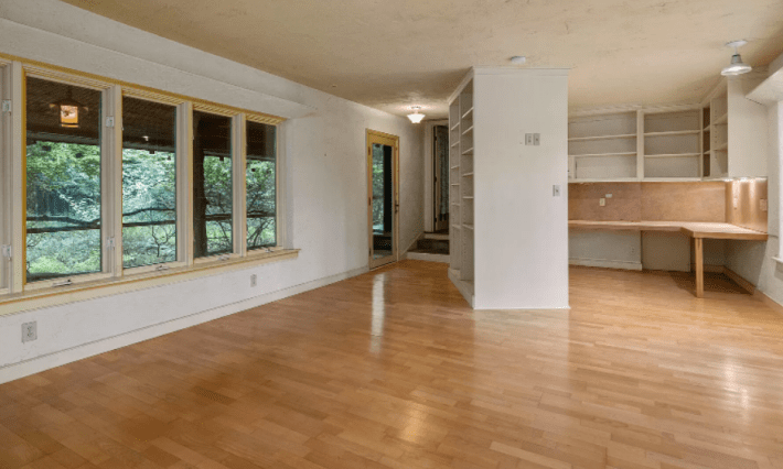
The little library, I think, is up those stairs in the back corner. There are more shelves in this room. I have a lot of books and knick-knacks and stacks of paper, so this seems good to me. But the layout here is a little confusing. The angled shelf opens up into this big room with a bay window, but then around the corner is a little nook with a large l-shaped desk. I personally do not like to be in spaces where I cannot see the door. I would be scared every time anyone showed up behind my desk! That's not a good atmosphere for writing!
I also do not like how these floors look so shiny. This house is in nature! It should look more like nature!
There is plenty of natural wood in this house! Just not in every room for some reason. See! Look at this.
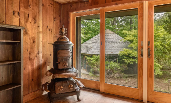
Am I little afraid of whatever this weird metal thing is? Yes. Very much. Am I also afraid of these doors which appear to open onto the second story at a part of the house where there is not a wrap around deck? Also yes.
But for every room that is appropriately designed for the forest, we have this:
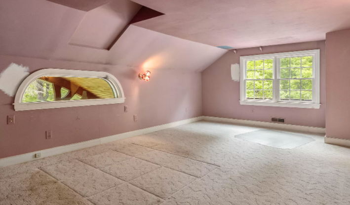
There are so many unfortunate things happening here. The stained carpet, squares of carpet samples, white patches of paint on the wall, blue patch of paint on the ceiling. All of this says one thing to me: WATER DAMAGE. This is bad. There are lots of design problems that are easy fixes, but do you know what will ruin all of your hard design work? Water! If water is dripping into your house it doesn't matter how hard you've tried to make a room nice. Water is an enemy of nice things!
I do, however, like this strange window. It's fun! Moving on to... uh... this:
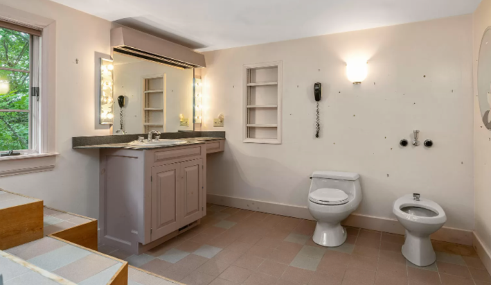
Whew. There are a lot of problems here. The first is that either there is an hundreds of nail holes all over that wall that should knock some money off the list price of this house immediately, or someone has chosen a very unfortunate wallpaper. Either way, we will have to arrest someone for this decision.
I also really do not like how this tile does not have a consistent pattern but instead looks like the previous owners just replaced a few tiles with a completely different tile. Was this a water issue, too? Don't like it! Everything is so pale! Everything is so boring!
Next, we have this weird vanity that has a big gap in the corner perfect for collecting dust. Derek was very concerned in his email about the corded phone, "Everyone who visits your house is going to realize that half of your calls have been taken from the can. Also, the phone should be between the toilet and bidet? so that you can use either while on the phone."
While I personally think the toilet phone is funny, I do not think it should be between the toilet and the bidet. Talking on the phone while using the toilet seems bad. The phone should be over here... by the bathtub.
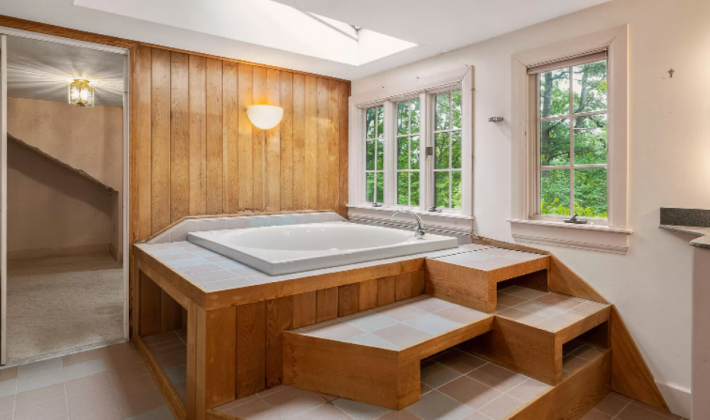
Oh jesus, what kind of death trap is this? I do love this giant tub. Giant tubs are, to me, always a bonus in every house. I want to sit in the big tub. I want to be in there for hours while it rains outside. It would be so warm in the tub, but the windows would let in cool air. That would be nice.
What's not nice are these scary, slippy stairs. First off, I'm not really sure how you're supposed to climb them because they aren't directly in front of one another. The top stair also goes directly into the spigot for the tub. That doesn't make any sense.
Again we have these big empty spots in the steps for spiders to hide. Don't like that. But mostly what I think of when I look at this is how many stitches I would have to get after trying to get out of this tub, slipping on that shiny tile, and hitting the back of my head on that step. No, thank you. I'll have to die in the tub. The tub is my home now.
Over here we have... uh... whatever this is?
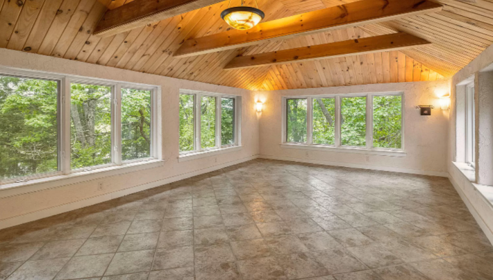
I have no idea what this is for. The stone floor makes me feel like maybe this is for dancing? But this house was built in the 70s. Maybe it's for doing drugs? Maybe it's a place to hold a yoga class or a book reading? It seems like some kind of event space. The windows are nice.
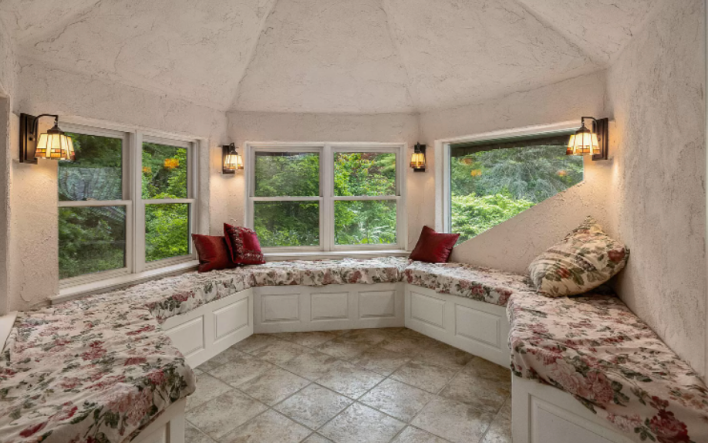
Now this! This is something that I like. I do not like the upholstery or the white base, but imagine if all of that was wood and some nice dark color like burgundy. What a cozy little room to read a book in. I like the little stained glass lamps, too. That's a fun detail, though the room's current design diminishes them by making them seem out of place. I would accentuate them.
I've had enough of the inside of this house. Let's go outside.
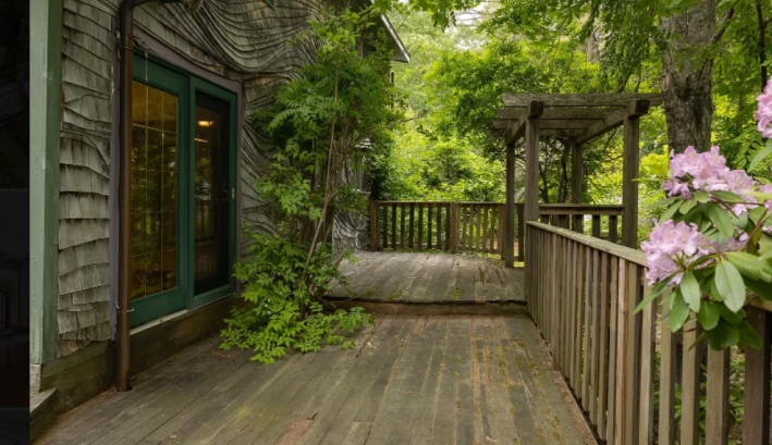
That sound you hear is me clapping. I love this! Look at this cool Gaudi-esque wavy shingle wall! Look at this beautiful tree canopy! I would never go inside if I lived here. The outside is too beautiful.
If we walk around a little bit on the more than three acres of property that come with the house, we will encounter this:
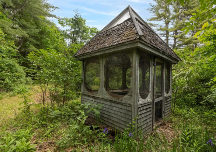
Derek and I both have many questions about this photo. Derek wondered, "is this the small outbuilding that's not a gazebo? Is this where you put unruly children? Maybe this house isn't for Hobbits, but the witch from Hansel and Gretel?"
But when I look at it, it looks like a portal. If I go in there, where will I end up? Where will it transport me to? I hope to a better house in Maine, where I can relax on the coast and re-read To The Lighthouse and not die trying to get out of the tub.
This week's house has been listed on Zillow for $679,000 for an unknown number of days. It has a pending offer. If you bought this house, please fix it and then invite me over. I think it has a lot of promise.
