There's a kind of popular influencer that I find very annoying. These people call themselves "trend forecasters." They post little videos on TikTok and Instagram Reels and YouTube. They are almost always young, almost always rich, and almost always saying things like, "Grunge-core is right around the corner." It is very hard to be wrong as a trend forecaster because the future is always before you. Actual experts, like say an interior designer who predicts what paint colors will be popular in 2023, are often also wrong. No one can see the future. And now that trends in fashion and culture are no longer dictated by a bunch of women who don't eat in a Conde Nast board room, anyone's guess is as good as anyone else's.
All of this is to say that there is no reason to believe me here. I have no credentials, and am almost always wrong, and fully believe that the only trends you should follow are the ones you personally enjoy. That said, the death knell for mid-century modern's second hey day in the sun is tolling, and I hear it everywhere. I say this with sadness in my heart and an atomic era coffee table in my living room, but the future is no longer the past of wooden walls and subway tiles. Once something becomes common enough for poor people to have it, rich people move on. Where they will move is a mystery: To Scandanaivan home design? To Maximalism? To Boho? To Arts & Crafts? I have been meaning for months to write something longer about how the focus on interior design is growing just as housing insecurity is spiking, but for now it is enough to say that because you can buy mid-century knock-offs at Target, it's smart to assume that this trend will end soon.
To me, this is a shame, because I love mid-century modern. I love the warmth of the wood. I love a conversation pit. I love a house that's so long it's shaped like a cigarette. So when Steve sent in this week's house—a gorgeous mid-century modern house that's been on the market in Duluth, Minn. for 115 days—I pored over it with glee.
Steve sent some important context, that I think I should share before we get into the house. He said, "Duluth was once considered a rival to Chicago in terms of being a midwest powerhouse and had more millionaires per capita than any other in the late 1800s. So there was a lot of old money floating about and the eccentricities of the rich have never really left." Wow. Weird vibe! I love it. Steve also (very helpfully) included a link to a story about the history of the house!
This house, according to the Zillow listing, was built in 1959. It's listed for $698,000, has three bedrooms, three bathrooms, and is 2,452 square feet! Wow! Let's look at it from far away first:
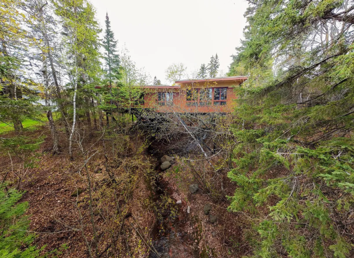
Wow! Look at that! It is on top of creek! I recently became obsessed with this other house that I saw suspended over a creek, but that one is new and looks like the set of a slasher film. Because this house is built on more of a suspension bridge than a suspension system, it also feels a little less scary to me.
Here's another look:
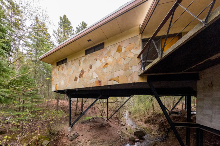
Nothing screams "stable" like trusses. Look how stable this house looks. I love it. But I also love the attention to detail happening out here. This stone wall is gorgeous. I love how they all fit together like a mosaic but each rock is the size of my torso. I also love how even outside we have a confluence of textures (my favorite thing!). The earth is soft, the trees are soft. The stones are shiny. The cinderblocks are rough. The steel seems cold, the wood seems warm. Beautiful.
Here's what the house looks like from the little bridge!
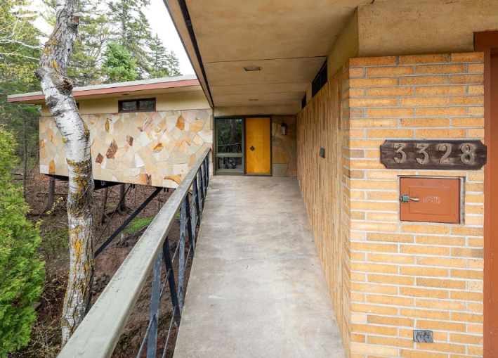
Something I have recently learned is that small, simple things are very expensive when they are for a house. That door, so beautiful and wooden with the big diamond doorknob, is probably worth more than my paycheck. Houses are like that. It's always the things you don't want to spend money on that cost a million dollars.
I'm not sure what this strange little locker is for. I hope it's for mail so that the mailman doesn't have to go all the way to the front door. Even though it is ugly, I like that we can see the outlets out here, too. We already know we can plug in our Christmas lights. One future problem, easily solved.
Here's the entry way:
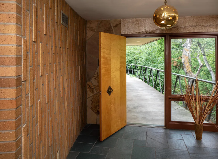
See. This is what mid-century modern is supposed to be. Not West Elm furniture made of teak and misery. Look at these fired clay tiles, too long to be bricks, but brick in spirit. Look at the size of these slate tiles, and the stones on the wall behind the door. The golden orb! I love it!
There is no floor plan included on the house, but I think this is what you see when you enter:
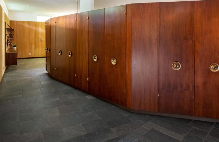
My instinct is that this is not very welcoming on its own. I feel like we need a rug, and maybe a sculpture, just to break up the eye visually. But I LOVE the knobs on these doors. It's so strange that they are centered and recessed, and I would die for them. One problem many modern design ethoses have is a lack of storage. I understand that the ideal of these spaces is that you would simply not need to put toilet paper anywhere because it does not look pretty, but I have already bought it in bulk and need to hide it somewhere! I also imagine it is rather cold in Duluth, so it seems good to have a coat closet that is big and close to the front door.
Here is the big open-plan living and dining room:
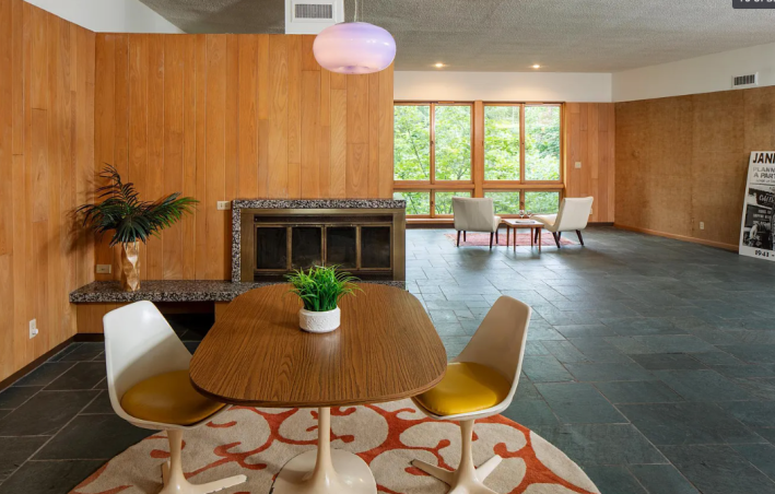
Everyone here knows that I am anti-open-floor-plans. But sometimes, we allow it. Here, we allow it. This room wants to be open! It has this multi-sided fireplace! Its floor is so shiny. I accept it. Do I want to live in it? Not really. But it is beautiful.
Here is what is around the fireplace on the other side:
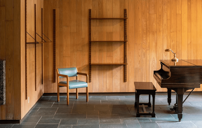
I find it frustrating that no one bothered to stage these shelves. But luckily I have a good imagination, and can imagine all of those shelves with little trinkets and books and plants on them, and guess what? I love them! I'm not really sure about this chair sitting in the corner staring at the back of the pianist, but that's not my business really.
Here is the kitchen:
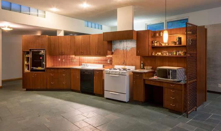
I'm not really sure what happened here to make so much of this kitchen look like shit, but I do love that the whole thing looks like a desk. There's something very satisfying and fun about that to me. So many drawers!
We would have to replace the appliances immediately. In my opinion the move here is to replace them with either Big Chill appliances or an AGA cast iron set in some kind of fun color. This room is on its knees begging for any color to be added.
One thing that is curious is that I'm not sure where the fridge is. Oh well! We will put in an island, and maybe when we do that we can move the stove to the island and put the fridge on that wall. That would work fine.
Here's a bedroom:
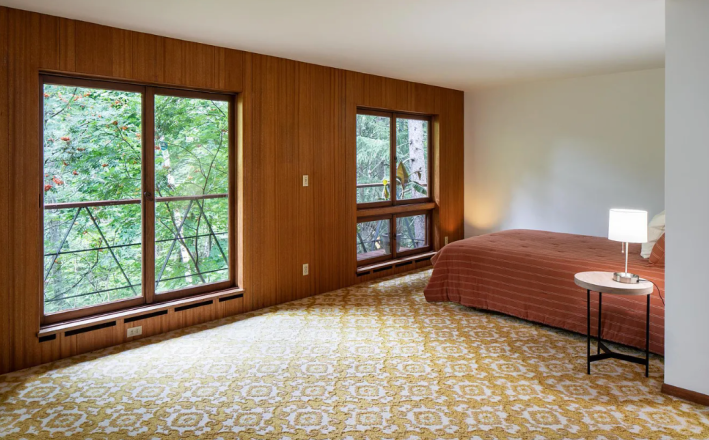
Mhm. Yes! I love it! While I am personally a hard wood floors and rugs girly, I respect and honor the patterned carpet. I love it even. Look how fun it is! It's like having a rug that never gets bunched up! This bed is too small for the room and facing the wrong way but whatever, let's look at this little patio:
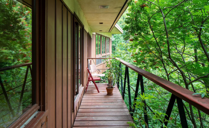
Yes, I love it. Very nice.
Here is a bathroom:
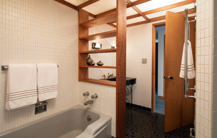
"There is one photo of a bathroom that has built-in shelving above the tub that I like and would enjoy, but I can't live in the tub," Steve told me. I have no choice to agree, except that I very much could live in a tub. Just not this tub. I could live in a clawfoot tub, no problem. But this one is too shallow.
I'm very interested in these tiles. They seem to be 1"x2", which is a size that is not very common anymore on the sites full of tiles that I often frequent. I think they look really good, and that they pair very well with the black tiled floor! Gorgeous. I can't tell if the grout is just really dirty, or if it is colored yellow. I hope it is the latter. While I'm in the habit of trend forecasting, I do believe that colorful grout is about to make a raging comeback. All these subway tiles are going out of style, but colorful tile is very scary to many people. Colorful grout? That's easy! Why not.
Here's another bedroom:
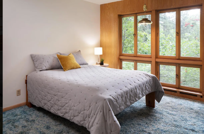
Sadly, this house does not come with any of these hanging light fixtures, as I am going to break in and steal them all!!!!! A lamp like that would be sold in a worse, more boring version, for like $800 on a little retail website.
This carpet, however, I do not like. Maybe this was what Steve meant when he warned me in his first email that, "As you scroll through the pictures, you are thinking, 'Okay, well this looks like an odd architectural home that's rather modest and boring.' But then you see it towards the end. The one picture that makes you nope right out of there. "
Oh wait. No. He meant this one:
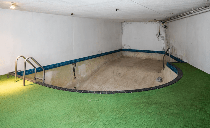
This is a huge, huge no from me. Over and over again in this column, I have been over why you should not have water inside, so there is no need to rehash that here, but who chose this!!!!!!??? This is a nightmare. The tile is pretty but what are you even supposed to do with this room? You clearly cannot refill that haunted pool.
I am also unreasonably upset by the fact that the shallow end of the pool is way back there in that dark corner! I'm supposed to go into the corner, with my back to the rest of the room to enter the death pool? Absolutely not!
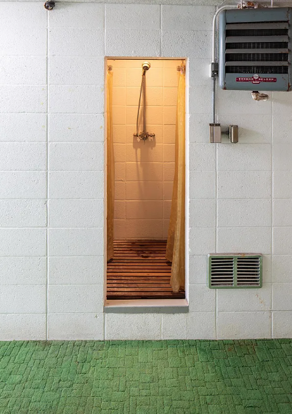
Oh. Here's another place we could die: in this cute little shower. While it is very convenient and smart to have a shower next to the pool, I do not crave this in my home. This angle has also forced me to realize that it IS NOT TILE. IT IS CARPET. What kind of mold maniac made this choice?
Well, at least we know now why this house has stayed on the market for so long. No one wants to pay three quarters of a million dollars for a moldy indoor pool room. After all that was nice about this house, I will have to pass on it. Sadly, the pool is just too much for me.
This week's house has been listed on Zillow for $698,000 for 115 days. If you buy this house, please let me know the minute the pool is gone and I will be right over.
