I have been thinking a lot lately about the bones of houses. I have the kind of memory that remembers the shapes of things. I don't remember names or faces or facts or really anything that would be useful and helpful in my life. I don't remember players I've cheered on for years. That is not how my brain works. I would love to change it. The way my brain works is by remembering every single space I have ever entered.
I am never lost. Some part of my body innately always knows which way is north. Sometimes I dream of being born 20 years earlier so that people wouldn't have iPhone maps and my skills would be useful. I think part of what draws me to houses is that they work with this memory. I can't remember what I write about them, but I remember how they are laid out. I could draw you a floor plan for almost every house I've ever been in and most offices, schools or stores. I've always been like this. Even as a child I was very good with directions.
But because this skill is fairly useless and annoyingly not common among my close friends, no one ever knows what I'm talking about. "This road is straighter now," I will say, and everyone will look at me like I am crazy. But then I will look it up and, sure enough, it was repaired and made straighter. When looking at houses, I am looking for something that even I can't describe: some aspect of intrigue and charm, some haunting in the bones of the house to draw me in. But it's hard to know what is charm and haunting and intrigue and what is just a paint job.
I've been thinking a lot about Maggie Smith's poem "Good Bones," which went viral a few years ago:
Any decent realtor,walking you through a real shithole, chirps onabout good bones: This place could be beautiful,right? You could make this place beautiful.
Maggie Smith, "Good Bones"
This is true. You can make a place beautiful. Up to a point.
But you can't change what something is fundamentally, can you? It makes more sense to me that the bones of a house are stuck that way, that in the same manner that I cannot make myself three inches taller, you cannot imbue a house with charm. But that's almost not true. You can almost completely change a house. You can tear out walls and put new ones in. You can scrape hundreds of pounds of drywall off the building and be left with exposed brick. You can relocate the stairs, paint the ceilings or add a roof deck. All of these things cost money, sure, but they aren't impossible. What, then, are you buying?
This is the thing that has been haunting me the last week as I've worked on this blog: What really is a house? What is it that makes somewhere a place you want to live if you have the luxury to choose? Why, if you are going to paint a canvas, does it feel so important what size and shape the canvas starts out as?
I've been thinking about all of this as I've been gazing for weeks at a house that a reader sent me. Kelly sent me an email in mid January promising a house that some of his friends had sent him. "I don't know if it has enough pictures for your consideration or not, but the ones they have show the owner was... bold," he promised. Kelly did not lie.
Here is the house from the outside:
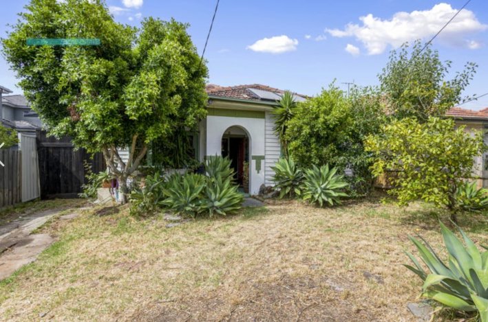
Okay on first look, I'm thinking ... Tampa? It definitely seems hot. There are big agave plants everywhere and these trees look like they might be citrus trees. (I don't actually know what citrus trees look like but I imagine them to look like this.) The vibe of the house is kind of American Southwest. I have a lot of questions already. But I had more when I learned that this house is, in fact, in a suburb of Melbourne, Australia!
Wow! Down under? Kelly told me that the friends who sent him this house are Australian and that he met them on the early Internet through a webboard and chatroom for a game called "Exit Velocity." "I've known them really since the Internet started taking off in the late '90s and we chat about basically everything and anything," Kelly wrote. "They both live in the Melbourne area, and as you might know it's one of the highest priced housing markets in the world."
Ah, yes. I, of course, knew that Melbourne is the most expensive housing market in the world. Didn't need to look that up! Not me! I already knew that the houses in Melbourne are ... surging $660 A DAY. What? Okay. I lied. I did not know this. But I looked it up and the median house price (median!) in Melbourne is $1.1 million (AUD). That's a MEDIAN of $770,000 in American money! That's almost identical to New York City. There's a reason we never have NYC houses on this blog and it's because the options suck!
This house is three bedrooms and two baths; a great size. For some reason I do not understand, the Australian site where Kelly found this does not have a regular price like Zillow. It instead has a link to a "price guide" which says that this price is worth somewhere between $860,000 and $940,000. To me, that seems like a pretty fucking big range. But I guess it's not that big if you have enough money to seriously consider buying this house.
"The space of the house seems reasonable enough," Kelly said. "Obviously the decor is the attracting feature of the ad. 'Bold' doesn't really do it justice." Decor, he says! We gotta go in. Let's see this decor!
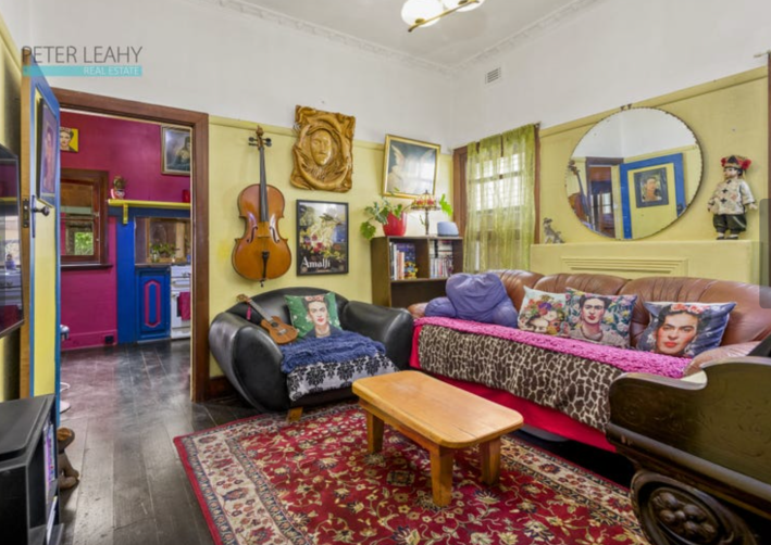
Oh wow, okay. He was not kidding. There is so much happening in here. The couch seems to be covering a mantle to maybe a fireplace. It is also adorned with not one, but three of the four Frida Kahlo pillows in this room. I like Frida Kahlo too, but I don't know about these pillows. The curtains are the same putrid yellow/green as the walls. Some of the trim, but not all of it, appears to be painted primary blue.
How do we look at this room? How do we see its truth?
The floors are nice, wide wood planks, though a little darker stained than I usually prefer. The ceilings are extremely high and even have some nice moulding way up there around the top. That's pretty. The natural trim around the window is gorgeous, though a different stain of wood than the floor. Without all of these decorations, though, what is special about this room? It's hard to tell. We will have to see more.
We walk through this door and now we are in the kitchen:
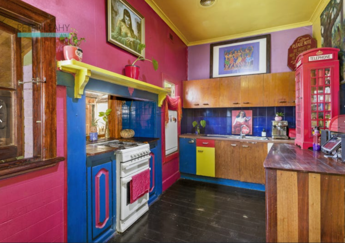
Wow. There is some PAINT in here. This left wall appears to be partially tiled with hot pink squares. The backsplash is primary blue with matching tile. The accents are primary yellow. There is one small purple wall. There is something kind of comforting about this triangular color palette: the true primaries of blue, magenta, and cyan. All are special. All of them together, in theory, I should hate.
Have I been Stockholm-syndromed by this house? It seems like yes because I do like this kitchen. I like its energy. I like this weird window above the stove and the wood cabinets. I find the paint fun somehow. When I first saw this, I hated it, but it has grown on me. That said, it is a small space. I think that is a little fridge. That, to me, is untenable. I need a big fridge; I have so many snacks.
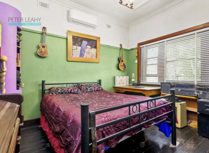
Okay, here is a bedroom. It has many amps. This is the second piano we have seen. I love that you can imagine how much music there must have been in this house. But this room is kind of nondescript. I think that column with shelves on it is interesting, but what I mainly like are the ukuleles. What a fun instrument! So small. So cute.
Next room!
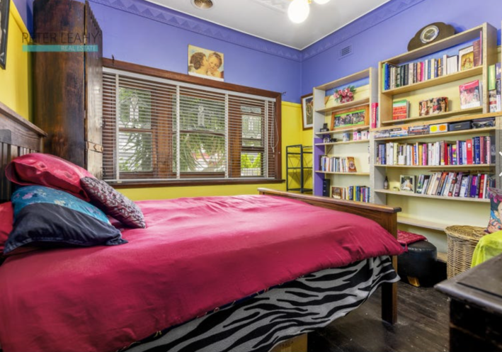
Hm, okay. I do not love the angle this photo is taken from, which makes it seem like I am a very spooky person crouched in the corner. This room is similar in that it is cute and has nice detail work and is also SO BRIGHTLY COLORED. This also has a zebra-print bed skirt. I do not care for animal prints in general. The zebra and the magenta bedspread reminds me of the bedrooms of rich girls I knew in the early 2000s. But the vibes in this room are grown up: lots of books, not as much art.
What else can we see? Oh! Another bedroom.
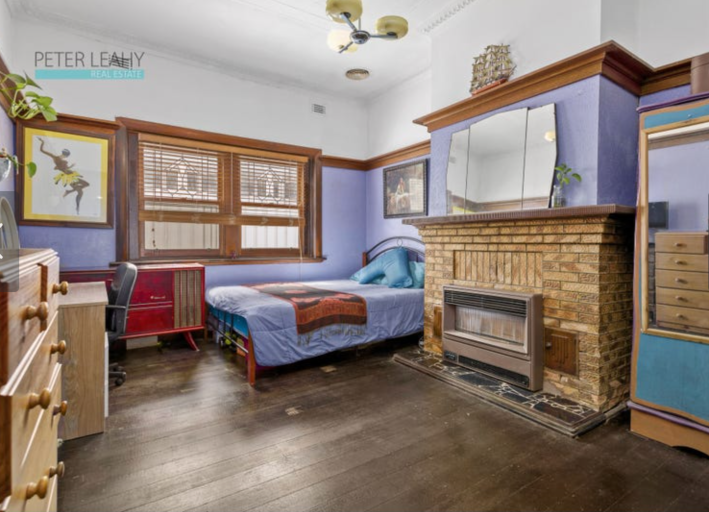
As someone with one bedroom currently, who would like to have more than one bedroom, the idea of three bedrooms is the height of luxury for me. And this is a great main bedroom. It's so big! It's hard to tell how big it is because for some reason all of the furniture in this room is pressed up against the wall so that no wall space shows. What are they hiding? Is there something wrong with the baseboards?
This room has many details I like. I like this fireplace even though it has some kind of heater that looks like if it so much as brushed a piece of fabric it would light the whole house on fire. The trim is gorgeous. I recently learned that you can stain brick, so I guess you could make those bricks red if you wanted. And you can barely see it, but look at the nice detail work on those windows. It's stained glass but subtle! Think of the rainbows it would make.
Okay, what else is there to see?

Yet again, I am concerned about the size of this room. Where is the toilet? How big is this tub? I do like that the spigots are on the wall instead of at the head of the tub where I want to lay, a common problem in most houses. I love these windows too. What's weird about this room to me is the tile. Something I have noticed in many houses is that no matter how strong a design sense a homeowner has, or how cohesive it is across rooms, people really do not like replacing tile. This tile to me was clearly here before these owners. It's so suburban. It makes absolutely no sense with every other decision in the house. This makes me kind of sad. It must have been so frustrating to the owners: the one sore spot in their perfect house was this weird trim.
The very helpful floor plan included in the listing tells me that we need to go outside to get to another room. It is nice that this house is not full of hallways. So many hallways are just space you can't use, the walls too close together even for art. Here, every square meter is put to use.
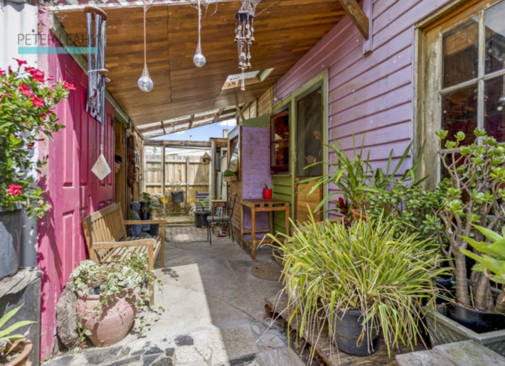
This outside is adorable. I like this little covered porch with its skylight. This explains a lot, too, because I was wondering where you might eat in this house. While I personally have no problem with eating on the couch or floor or bed, it's kind of rude to ask guests to do this and what's the point of having a house if you can't have guests over? Now, I see that you could eat outside under this nice roof.
But where is the studio? The floor plan said there was a studio. Oh! Here it is:
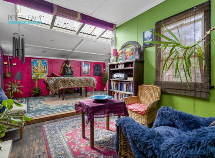
Yes! I love it! Look at all this space. Look at those nice skylight windows. Do they look like they will leak? Yes. I looked it up and Melbourne does get thunderstorms so this doesn't seem great. But I'm impractical. I like the nice diffused light. This room also gives us a clue that this person used to be some kind of beauty technician. The table in the back is high off the ground so it could be for massages or eyelashes or brow threading or tattoos. It seems like a very nice room to go to for those things, and it seems like a very nice room to work in. It's bright like the rest of the house, but what I'm so impressed by is that these colors somehow work. Is it magic? Is it my melting brain? We'll never know.
"I think whomever owns the place is probably a very interesting and flamboyant person, and definitely made it their own," Kelly said when he emailed me. "They certainly don't seem to care much about convention."
That seems true to me. But that's also what's so fun about looking at houses, I think. People make decisions that I would not make all the time. And those decisions are not inherently good or bad, but because they are not what I desire they are impossible to imagine without already existing. I don't really know what the bones of this house look like. I cannot imagine it painted gray and staged with boring furniture. And I don't really want to. I'd rather see a house that has been loved and decorated in a style different from mine than a home that has had its heart ripped out in the hopes of selling a few thousand dollars over listing. It is a delight to see a house that has been loved, even if you can't exactly understand its bones.
This house has been listed for an unclear amount of money for at least two weeks. If you buy this house, please make it your own and then send me the photos.
