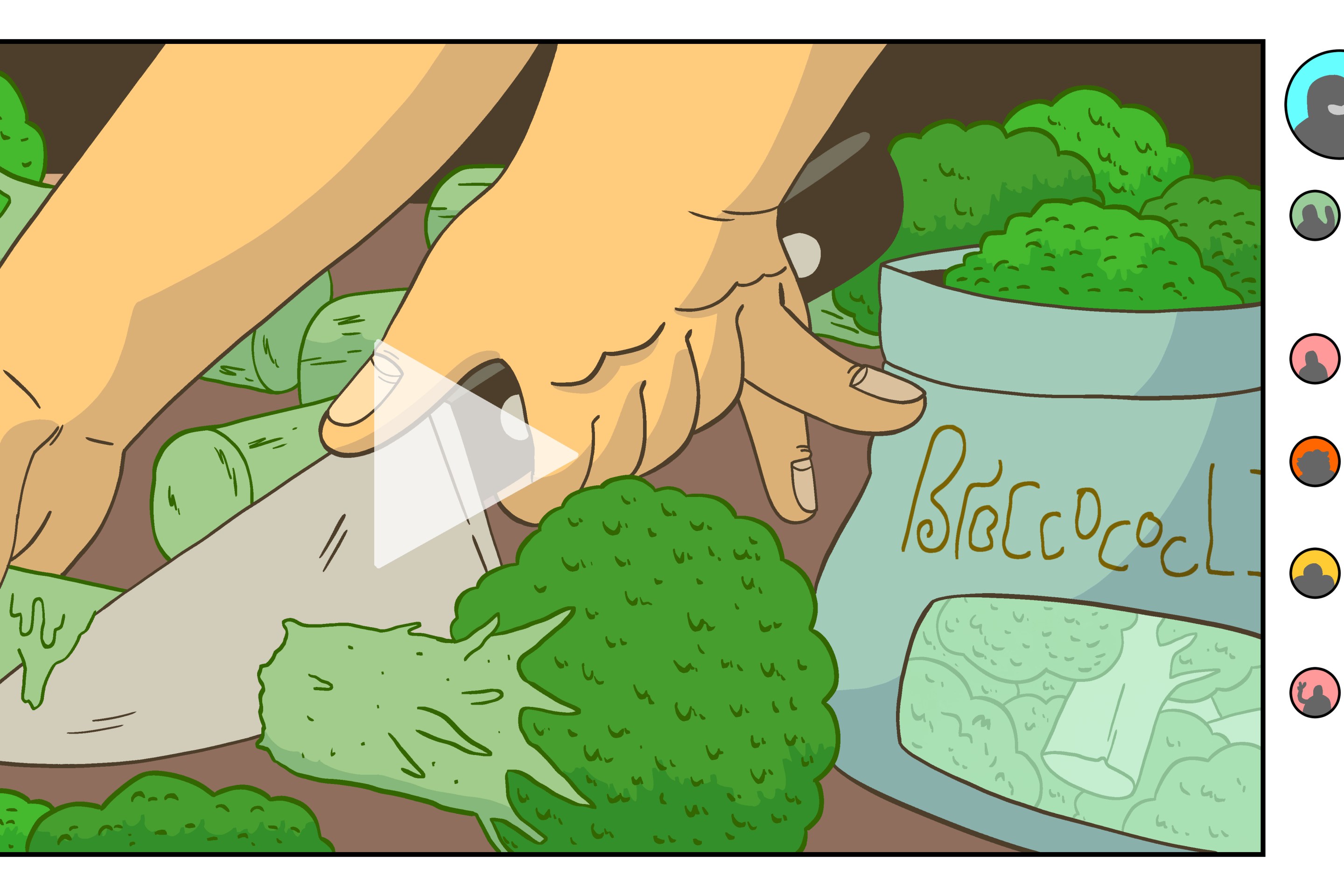
The Myth of Narcissus, like all myths, has multiple versions. After being told by so many people in so many different forums for so long, who is really to say for sure whether Narcissus was the son of a river god and a river nymph, or the lunar goddess and her mortal lover. Not me, that's for sure! But the versions that we have (which is to say nothing of the many we do not) have drastically different endings. In Ovid's version, Narcissus falls in love with his own reflection, and melts away due to his fiery passion for himself. In the older version by the poet Parthenius of Nicaea, Narcissus sees himself in the pool the same, but is so distraught that he cannot love himself that he commits suicide. There's a whole other version where he falls in love with his sister instead of himself.
Anyway, all of this is to say that every time I think about my reflection, I think of Narcissus and how it is unclear how tragic his death was, and how we should sit with it. Lately, I have been thinking about him a lot because I took the (ugly) mirror in the bathroom down last week and have yet to hang the new (very beautiful) mirror in its place. Because the mirror is missing, I realize how often I look at it, because I keep glancing over trying to catch a glance at myself only to look at a flat wall.
We are all Narcissus now, confronted with ourselves in mirrors and photos and across social media. We are inescapable, our deaths perhaps inching closer in all these moments looking at ourselves, whether with scorn or love.
This week's house is filled with mirrors. I imagine that living there, you would become so accustomed to the sight of yourself that you would lose intrigue in it, but maybe that's impossible. Today, we are going to Pittsburgh, where this three-bedroom, four-bathroom house is listed for $899,000. Now, that might seem like a lot of money for Pittsburgh, but consider that the house is 4,300 square feet. That's a lot of space!
The house was sent in by reader Jason. I was very behind this week, so I sent him questions with very little time to respond, which is my fault, but I will paste his answers in the comments if he responds!
This house has one of the most insane sentences in its bios that I have ever seen. Here is the sentence: "Just like Fallingwater, the house emphasizes the connection between the interior/exterior spaces."
And here is the house we are talking about:

Here's another angle:
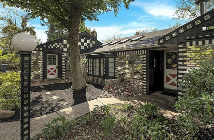
So in case you are blind or the shiny, shiny exterior has now blinded you: this house is covered in mirrors. Specifically, the bricks have mirrors on them. The mirrors are shaped like bricks? The mirrors are bricks? It's all a little bit unclear. My secondary concern, after the aesthetic one, was that this was a bad structural choice and that the mirrors could hurt the bricks in some way, but I asked my partner Trey, and he said that bricks are rarely used for structural support anymore anyway so they are already just aesthetic. The more you know!
IMAGINE COMPARING THIS TO FALLING WATER, a triumph of work that blends into its surroundings perfectly. This house is not blending! This house is standing out! There is nothing wrong with being bold, but let's work on our comparisons!
At first, I hated this exterior, but unfortunately, the more I have looked at this house, the more like Narcissus I am becoming. Do I love it? It's unclear.
There are 50 photos uploaded for this house, and we do not have time for all of them, but I recommend scrolling through. There are so many things I did not have time for, and all the photos are out of order, so I'm still not really sure where the front door leads you, but here are the stairs that lead you to the living room on the left.
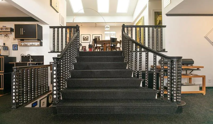
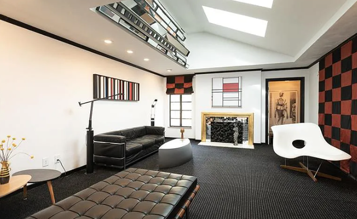
Here the mirrors serve a helpful purpose: reflecting the skylights into this sunken living room. And the repeated motif of the bricks in the fireplace being mirrored is funny, if a little ridiculous.
Then directly in front of the stairs we have this kitchen with built-in bar. I do not like the way this chandelier interacts with the 80s coke-head vibe that this house is trying to employ. That must go. I also don't like the art above the window. That's not the vibe!
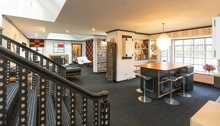
This is the kitchen. We are looking through the cut-out at that little dining room with the bar.
As you can see the chandelier looks bad from this perspective, too. There are so many atomic-era lamps that could go here!
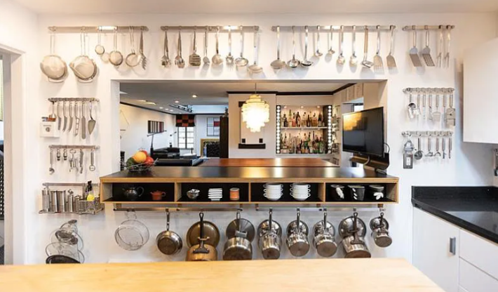
This is also a deranged amount of cooking utensils. Perhaps I do not understand this on account of using basically wooden spoons as a replacement for every cooking utensil, but what is this, a William-Sonoma? Why do you need five different kinds of sieves? What on earth are you doing with TWO fish spatulas? Why do you need so many little cheese knives? How many ladles is the right amount of ladles?
Also, if all of these things are on the wall, aren't they getting greasy if they aren't used enough! Isn't this a cleaning nightmare?
Here's another angle, where you can see there are even MORE things hung on the other walls:
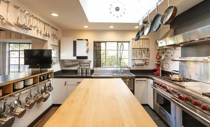
From the other angle, you can see that the INDUSTRIAL FRIDGE AND FREEZER are behind where this photo is shot from. That rules. I love that. I want a fridge the size of a queen-sized bed. It's ugly, but it rules. The dishwasher is beneath the industrial sink, which I also like.
It's kind of funny that there are no mirrors in here, as if the owners wanted to show some restraint amongst all of the stainless steel objects.
Here's the little wet bar in the hall next to the kitchen:
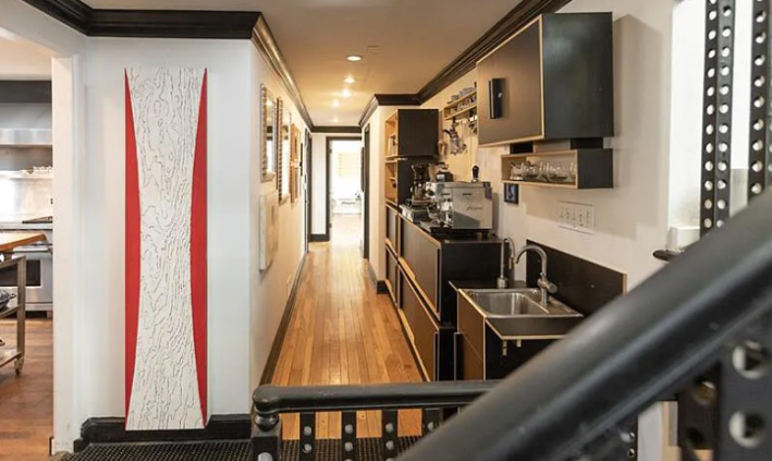
This, I unabashedly love. I love the little coffee station. I love that people can still get all kinds of drinks while other people are cooking. I like this long hallway. I even like this strange art.
Here is the dining room:
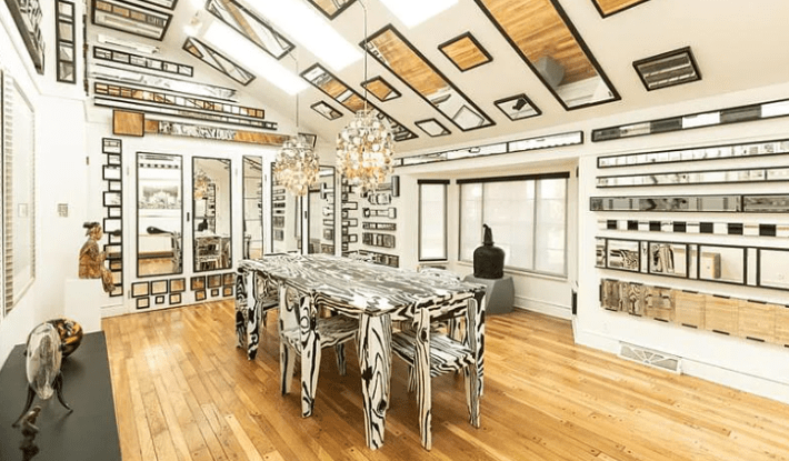
Wow. This is really something. Imagine having dinner with someone and they can't focus on you because they can see that your hair isn't brushed in the back because there are 500 mirrors that display every angle of you. That's no good. But I do appreciate the consistency in this gaudy design. I would not personally like to own this table and chair set, but I like it! It's fun! It's weird as hell.
But yet again, I am begging these people to choose better lighting, and to consider: one color. If these stupid sand-dollar lights were a big modern red light, it would be sick! Or even a Calder-esque mobile that would make the mirrored images kind of confusing and mesmerizing.
Here's another room:
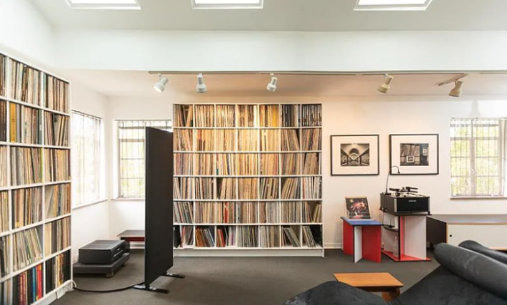
One thing I must admire about the people who lived in this house is that they loved physical media. I also love physical media, so this is relatable to me. Look at all those records! That's great.
It's interesting how many rooms in this house have very subtle design. I cannot tell if that is intentional to give the more obnoxious decisions some room to breathe, or if they just have not had time yet to go wild.
Here's a bedroom:
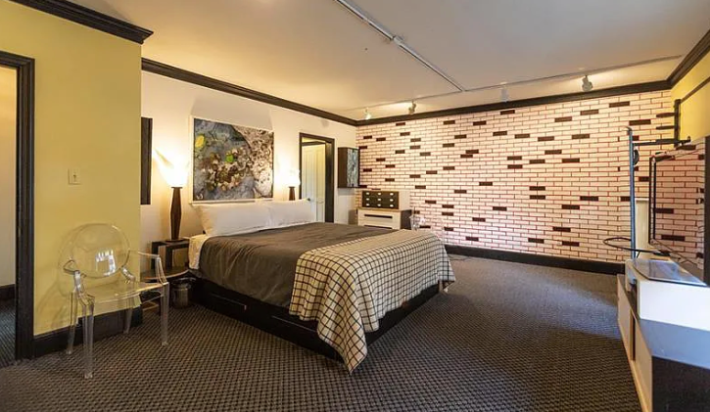
I mean this with full offense: this looks both like a teenage boy's dorm room and a $400 a night hotel where they don't have room service. Awful.
Here's a bathroom:
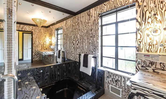
The whiplash of this house is the most interesting part.
This pattern makes me feel crazy, but I do find it interesting that it's repeated in that tile or vinyl or whatever that is. Someone really cared for this house!
But is that a tub in the floor? What is that? How am I supposed to get out of there? I feel skeptical of this.
Here's a room for movies:
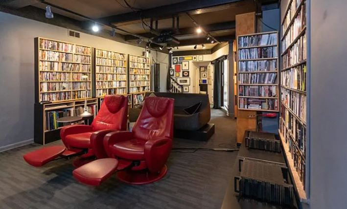
Hell yeah! I like all these DVDs, but with the amount of money this house cost, these could easily be built-ins that would look better and more uniform. I do love these weird red chairs and would like to sit in one, but they completely block the couch.
Here's another giant room for record playing?
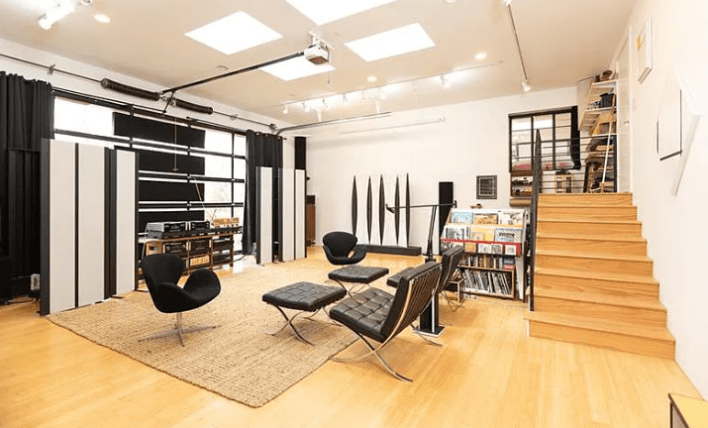
These people love art, I guess! This room also seems to have a sliding garage door. Also of all the rooms, this one seems the most primed for mirrors and yet there are none? Who is in charge here!
These chairs, if you were wondering, are very, very expensive. I know because I like them but will never be able to afford them. What a waste to have them sitting down here in this purposeless room. Let them shine!
I've had enough of this poorly managed wealth! I don't want to look at myself anymore! Back outside we go:
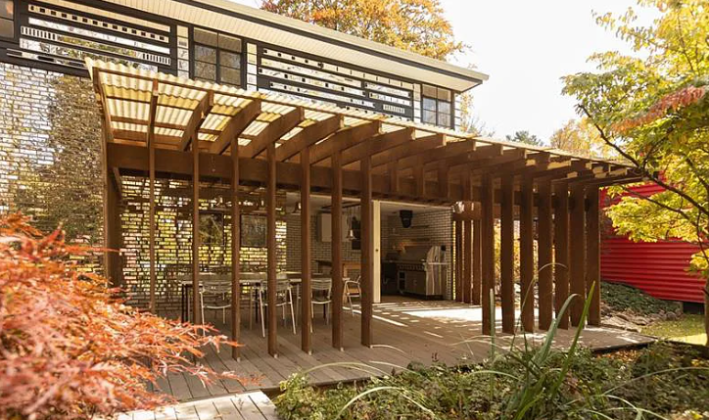
There is no escaping ourselves! The walls out here are mirrored brick too! We will never escape! The mirrors are our destiny now!
Ultimately, though, I'm surprised by how much I don't hate this house after looking at it a bajillion times. I think you could learn to love it, and while I personally would not compare this house to Fallingwater, I do think it has charm and character and a lot to give. Sure, it's gaudy, but at least it's not boring!
This week's house has been listed for $899,000 for twelve days. It is under contract. If you bought this house, please email me. I have some good ideas for you.


