I have begun drawing on the wall of my house. We have lived here now for more than six months, so the newness has worn off enough for me to begin doing very stupid things like tacking 100 plastic bats to the outside wall, and buying paint pen markers. No one can stop you from drawing on the wall when you are an adult. It is a fun hobby because it is forbidden, but also because it takes a very long time to adorn an entire wall. I expect that this hobby shall keep me occupied for half an hour every day for at least three months.
Part of why I'm drawn to projects like this (painting patterns on the ceiling, building little decorations, creating mosaics) is because stylistically I lean toward maximalism. But the other part is that I love when a house can tell me who lives there, and I want my house to do that. I don't want it to feel like an immaculately designed showroom. I want it to project who I am, and to make me feel like myself inside of it, the way a great outfit might.
It is also, of course, an over-correction backlash against the gray obsession sweeping American interior design. I have been going on a tirade in this column and in bars for months now about how everyone should design their house exactly how they want, and make it a place that brings them joy. I still believe that, but let me tell you this week's house was a real test of faith. It is designed for someone, that's for sure. But who, exactly? I'm not sure.
This week's house was built in 2016, so it's pretty new. It is listed for $1,599,000 Canadian; that's $1,089,443 in American dollars. The house is located in Sooke, British Columbia. I looked this up, and it is directly across the San Juan Straight from the Olympic Peninsula. Olympic National Park is one of the most beautiful places I have ever been in my life, so that's a good start. It is pretty remote, around a 45-minute drive from Victoria, B.C.
The description starts off well enough: "Breathtaking views over the JDF Strait nestled in the trees w/ multimillion dollar homes, backyard is a 3500 acre park w/ trails throughout." Wow, 3,500-acre park! That's a dream.
What the description does not include is the whales. This week's house was sent in by our pal Conni (who also brought us the Marfa Monstrosity). She said very succinctly, "I do not like the Whale House." So let's see what she means.
Here is the outside of the house:
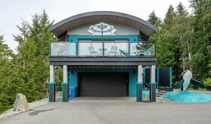
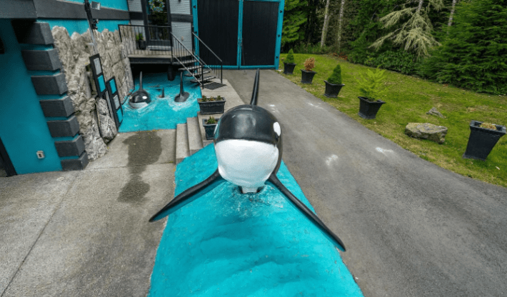
First off, I hate when garage doors are so prominent in the design of houses. If you have a million-dollar home, you can afford to put your garage somewhere else! And I am already having a visceral (negative) response to this shade of blue. It reminds me of every pre-teen white girl's "Paris" themed phase where everything is that shade of blue and black and white and they are obsessed with Audrey Hepburn.
And of course, there is the whale. Look at him over there on the left, emerging from that asphalt that is painted blue. What a choice. Let's find the entrance:
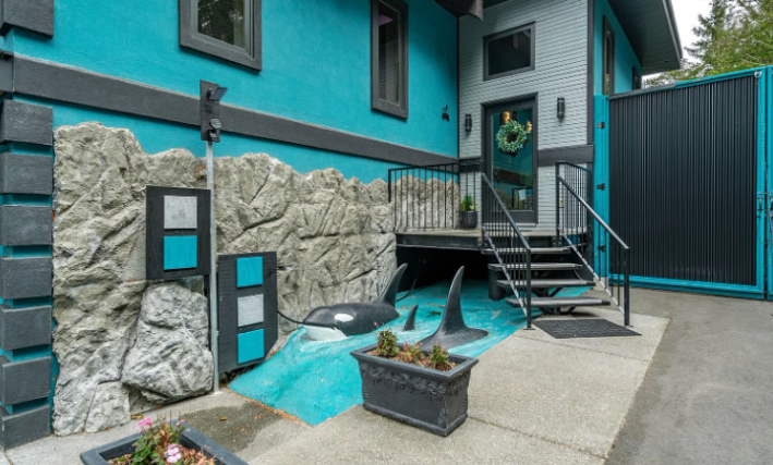
Wow. Would you look at that? More fucking whales. What's weirdest to me about this is that the water and the whales are so cartoony, but then they are not placed in an environment that makes sense. Why, for example, aren't these two pods of whales connected together?
Should we go inside? I guess we must.
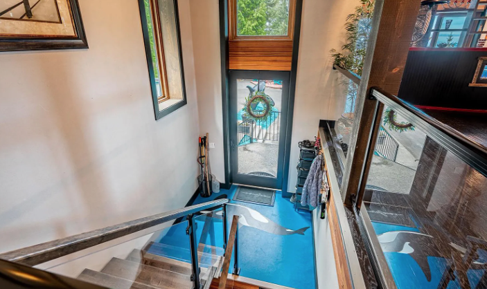
OK, OK. Let's try and see some nice things. I do actually think this mural of a whale is well done. I like the colors, but the blue here is a completely different (better) blue than the one outside, and the whale has much more movement in its body. This is at least consistent, and I do like that there is this concrete mudroom space to take off your boots and raincoat. The windows with that wood trim are also very lovely.
What's up here?
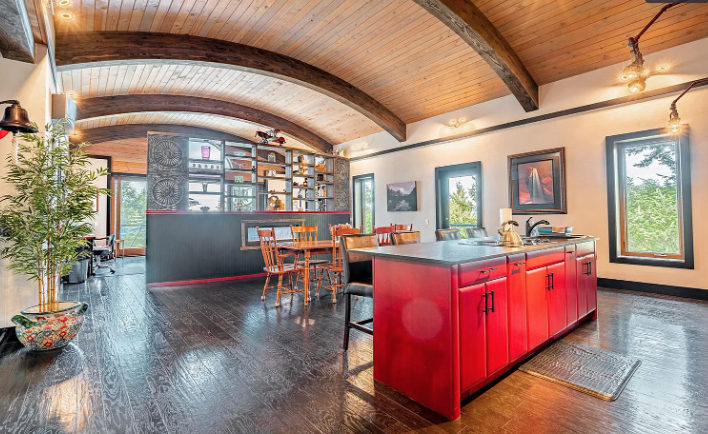
OK, all right. We've got very shiny dark wood floors. I hate these. I do not love wide planked wood floors in general, but I really do not love having three different tones of wood in one room. The ceiling, for example, is beautiful. Imagine how much better this room would look if the floor was the same color and shade as those the cross-beams.
In terms of layout, obviously, I don't love it. Open plan is my enemy. But as far as open plans go, this one is pretty well done because the spaces are still distinct and clear. Kitchen, dining, living on the other side of that weird wall with the fireplace inside it.
Here's a better shot of the kitchen:
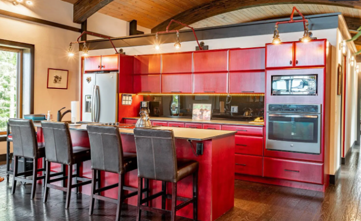
This kitchen is completely out of place here, but I think it's kind of sick. It reminds me of the kitchens in Almodovar movies set in Madrid where like someone's mother was dead but now is alive again. It's so red! The only thing I don't like about this vibe is that I think the red should be high-gloss. Red is already so intense. Why not just go for it? I also dislike the barstools, but luckily they will take those with them when they leave.
You would expect some of this faux-modernism to continue on the other side of the dividing wall, but it does not.
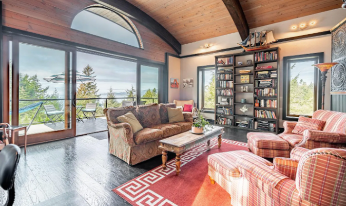
Instead we have this weird space where everything is open and the rug is not centered. While I didn't love the whales, I could at least respect them. But now I am upset. Are the same people who bought that boat on the shelf responsible for the couches? That's hard for me to believe.
Conni said it better than me, though: "I think a choice needs to be made to either be the weird Whale House Or The vaguely Indigenous decorative accents but specific enough to feel Bad™ house and this house has seemingly done both. Should have just stuck with the whales." Yeah! What Conni said!
This porch is very nice, though.
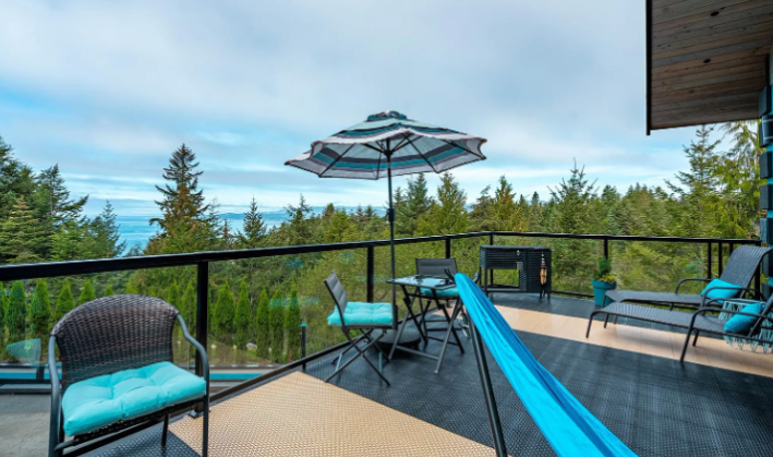
Again, the furniture makes no sense, but the view is beautiful. Imagine this same deck with some heavier furniture to balance out the glass. Imagine sitting out here in the morning to watch some real whales in the strait. That would be a privilege and a joy!
But we must go back inside and see some more things.
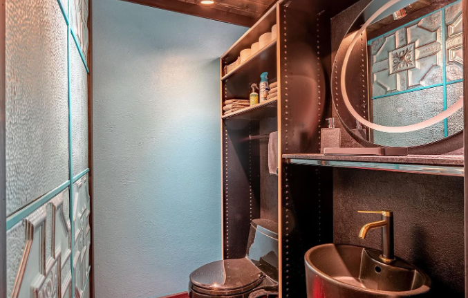
This bathroom is very small. So small. I hate it when the bathrooms have these tiny little sinks that splash water everywhere, and I hate it when people cut easy corners. Fill in those peg holes on that Ikea shelving unit! Stop adding lots of patterns to a room where your knees are going to touch the wall when you sit on the toilet.
I'm starting to think the true "theme" of this house is "colors." This room is copper and brown, for whatever reason.
Here's a bedroom:
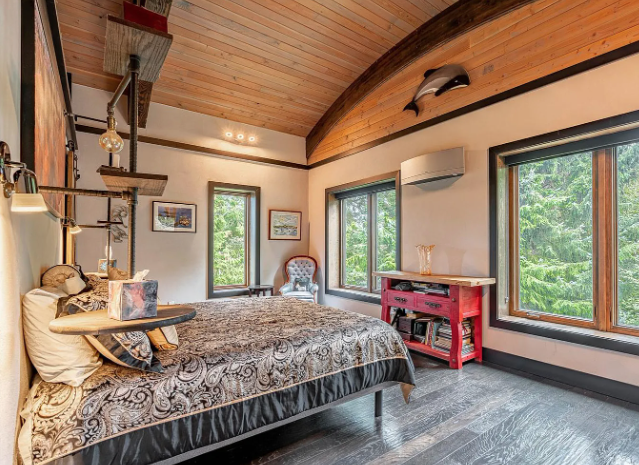
Wow! Here's another whale! And also a red table? And also a side table from the bed that descends from the ceiling at just the right height that you could absolutely knock your face onto the shelf and give yourself a black eye. Wonderful! Just what every girl dreams of. The ceiling and the windows are gorgeous, though.
Oh god.
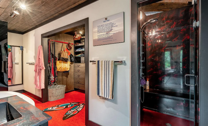
No thank you! The amount I like all of these design elements individually is zero percent. The amount I like them all together is minus 500 percent. We've got wooden ceilings again, which is not a great idea in a bathroom. And these are a different color for some reason. We've got what appears to be CARPET that is bright red. Practically, these are mold decisions. You should never be trying to increase your chances for mold.
The feathers are not only kind of offensive, they are ugly clip-art style. And then there is this shower of death. Do you think when you get stabbed in there the walls absorb your blood, and that's why they have that pattern? This bathroom is connected to this terrible hallway:
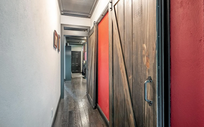
Why is it so narrow? Well, because of the garage. This is what happens when you make space in your home for your car but not for your people. You end up with Joanna Gaines barn doors from Amazon in your whale home that could have doors with porthole windows instead! What a travesty.
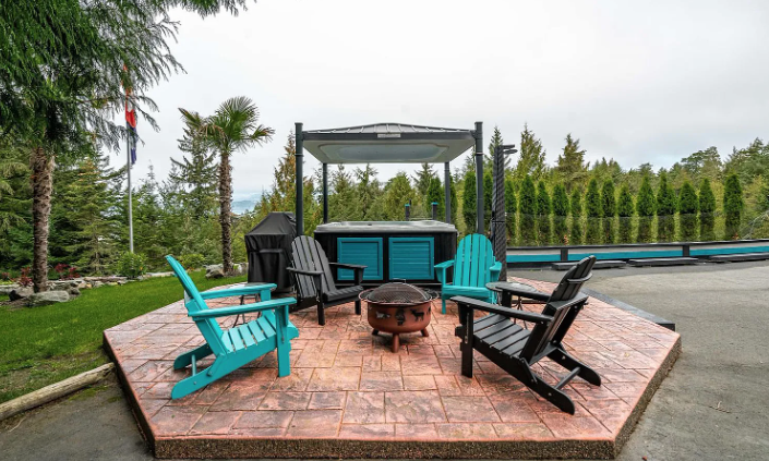
Back outside we can feel far less claustrophobic at this lovely fire pit right next to a hot tub! I used to think that hot tubs were gross, but then a few weeks ago I got into a hot tub for the first time in 10 years and realized that they are both gross and they absolutely rule. So I like this.
That's all for the whale house! Goodbye whale!
This house has been listed on Zillow for C$1,599,000 for two days. If you buy the whale house, I have a lot of terrible whale-themed ideas I will give you in exchange for sitting on the deck to look at whales.
