I did not grow up in a place where it was pleasant to be outside. I have almost zero memories of living in Texas and being outside comfortably. It was always 100 degrees and humid. It was always either so sunny you had to shade your eyes, or pouring rain like someone upstairs had knocked over a bucket on top of you. People used to joke (and by people I mean dads) that Texas had four seasons: early summer, regular summer, late summer, and not summer. But even the not summer was hot. Because of this there were some things that people did that absolutely confounded me. I did not, for example, understand why women in movies were always putting on beautiful shawls to go and sit on the porch at night. In the part of Texas where I grew up, it does not get cooler when the sun goes down, so I thought this was an aesthetic decision solely for beauty until I was 20. I did not know the heat could relent. I did not know that outside could be anything besides harsh.
Right now, it is terrible outside. Washington, D.C. is so hot and humid the sweat isn’t even evaporating anymore. This used to not bother me because of my decades of training in the heat, but I’ve lost my edge. I’m weak now. But I want to be outside anyway. There are a lot of things I learned in the last year, but one of them is that I genuinely enjoy being outdoors. I like to hike, and I like to see nature, and I like to be able to hear every word my friends are saying at dinner. During the pandemic, I became infatuated with weird houses more than weird apartments. I wanted to see space: yards and vistas and plants. I wanted to imagine a life where I had that space instead of the small apartment with bad light that actually existed around me. That’s what we do in this column, isn’t it? Imagine ourselves somewhere else. Imagine what life might be like if we took a risk, made a change, broke away?
I’m thinking about this because the house for this week was sent to me by reader Nick, who said he found it because he and his wife have been imagining an escape from their expensive Los Angeles house to one where the mortgage calculator in the top corner of the Zillow listing rings in under the rent check he already pays. “I’ve been compulsively Zillowing for a couple months now,” Nick wrote to me. “This happened to be a completely random click on the map, but I knew immediately that you needed to see it.” Well, well, well. I know a lede when I see one.
This house is in New Berlin, Wisconsin, which I have learned through googling is a suburb of Milwaukee. It is enormous. We’ve got five bedrooms, SIX bathrooms, 5,254 square feet, an almost 18-acre lot, and an attached garage. This baby will run you $995,000, which may or may not be a good deal because the price has been slashed $205k.
The outside is very lovely. We have a nice tiny bridge that crosses a creek as you approach the house, and large flat stones bordering its shores. There is a big patio made of stones, and all of it is shaded by some trees that let enough light through their foliage that grass and ferns still thrive. Around the bend is a fire pit, which is excellent because fires are fun and fire pits are controlled fun. The house also includes a private “spring fed pond.” I don’t know what this means, but the little dock is very cute and I’m sure if you douse yourself in bug spray, rowing a canoe out on the pond would be pleasant enough.
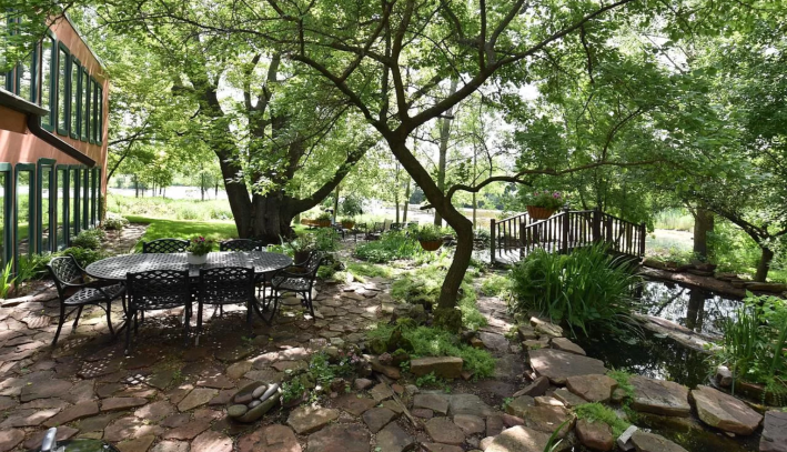
Let’s pause for a moment here to look at the first line of the included description of this house. “This home should grace the cover of House Beautiful.” Excuse me, what? This stunned me because I did not know that House Beautiful was a real magazine but apparently it is. House Beautiful. Lol. It’s like a magazine called Car Fast or Food Tasty.
The outside of this house is intriguing, but I would not say it is beautiful. There is an A-frame section on the left, some kind of hallway in the middle, and a large flat box shape on the right. The box shaped part is two stories tall and has a bunch of windows that look like iPhones. Let’s journey inside.
Immediately, from the first photo, something strange is happening here. By the windows, we know we are in the right iPhone window side of the house. But the wall is made of big flat stones? Or decorated with them? It has the effect of making the dining room look a little bit like a cave. That, combined with the heavy wood chairs of the dining room decorated with plant fronds, is bringing a little too much of the outdoors indoors for my taste. It’s a semi-open concept room with a high-top bar dividing the kitchen and the dining room, so let’s go in there first.
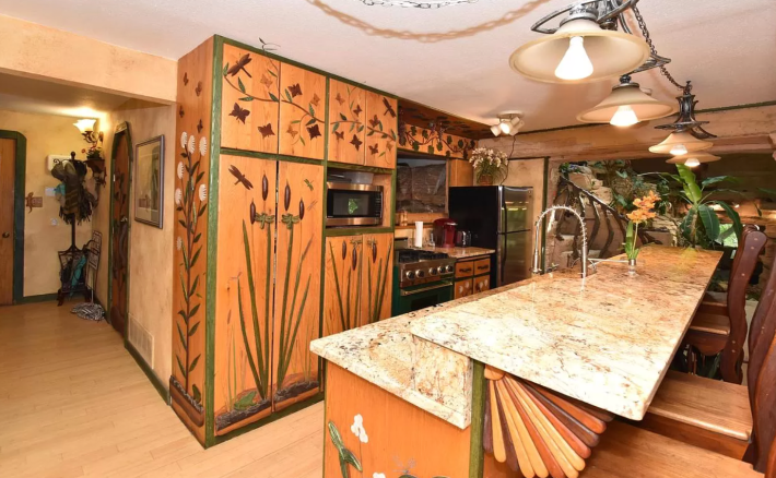
Hm. This is ominous. The cabinets are flat and decorated with painted vines and leaves. “I knew something was amiss when I saw the carved foliage detail work in the kitchen,” Nick warned me in his email. This is a little concerning. The kitchen is also, forgive me for being so blunt, extremely shitty for a million-dollar home. It is what looks like a former galley that has just been opened on one wall to create a bar. There are not very many cabinets. To be honest, this looks not that dissimilar from my apartment kitchen except that I have not adorned my cabinets with plants and dragonflies. The one thing I do like about the kitchen is the weird woodwork fan placed underneath the bar top.
OK, next we have a bedroom. It is boring. Then we have a full bathroom that looks boring at first until you realize the tiles have been specifically cut (it seems to be made of two of the same tiles but with one in a slightly darker shade) to look like lily pads. This is weird but in the scheme of things not THAT weird. The very upsetting part about this bathroom to me—a person who both knows how to paint and knows how to apply painter’s tape to a wall—is that whoever decided to paint the top half of the wall blue above the wood (?) trim did a very bad job of it, so instead of blending the outlet into the surrounding decor it becomes a focal point of the whole photo. All I can see is that 3/4ths blue outlet. WHY!?
But here we fucking go. This next photo is a doozy. Why don’t you take a breath before you look at it. OK. Are we ready? Here it is. This is the living room:
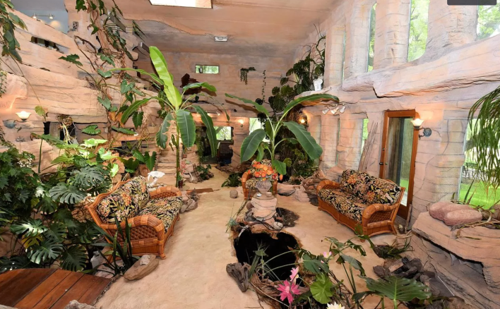
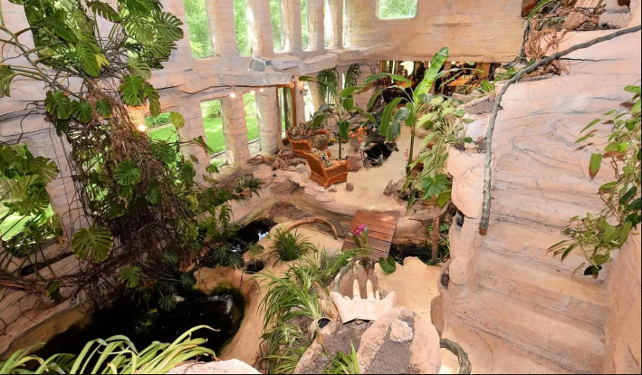
It’s just. I am truly at a loss for words here. It seems that the iPhone windows are meant to make this main two story living area into a … jungle? Greenhouse? You would be forgiven for thinking that these are actually just holes in the wall to jump through to the outside, but they are not. They are real windows with panes of glass in them. I cannot understand, though, if there is supposed to be more water in this room. There is a small pond in the middle of the room that is so dark it looks like it could be a portal to hell, but we can tell is water because it is reflecting the window. Some of the rocks look like they could be a waterfall, and also there are several bridges across what should theoretically be a kind of creek?
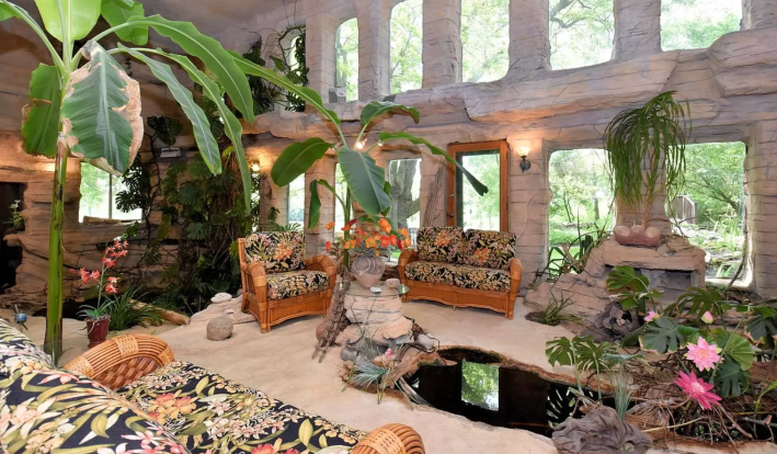
WHY DO YOU NEED THIS INSIDE!? This led me to a terrible Google search: Can mosquitos breed inside. What I found there is …. uh … yes they can and they fucking will if you have 1) standing water (check) and 2) “organic material.” I am assuming all these plants, these thousands of plants, count as organic material. This is a mosquito living room!!! You are going to be bit to death!!! What’s worse is that from another angle we can see that some of the rocks have been arranged so that they create a stairway up to the second floor of the house. The only “railing” this stairway has looks like a stick my dog would pick up and fail to fit through the door, so I’m pretty sure that after I’ve been stung by the 10,000 mosquitos living in this room which I was forced to interact with by walking over an indoor bridge(???) I will simply be stung in the eye on my way up the stairs, topple over, and fall to my doom into the mosquito pit. This will only create MORE organic material for the mosquitos!! Awful awful awful.
Unfortunately, it does not get better. The next room is … I think upstairs? It’s unclear. In here a lot of decisions were made and almost none of them are cohesive. The floor is tile. The walls are horizontal wooden planks. The ceiling is plaster, and in the corner we have a lofted bed (?) made out of the fattest bricks I have ever seen. These bricks are not the regular kind that come with the holes in the middle. These are big bricks. They are also much more organic in shape. This leads me to believe that these are bricks that were made by hand somehow. Or made to look like they were made by hand. There are so many expensive decisions in the house and every single one of them makes the house look worse.
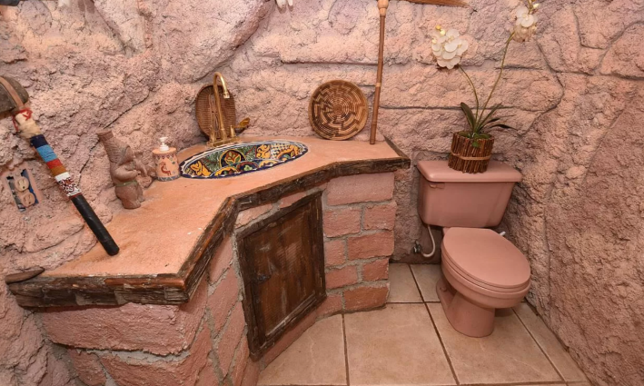
The bathroom is decorated in a similar style, and this I do not hate. It reminds me of a house I stayed in once in the Southwest. Everything (even the toilet) is the same consistent color of me with a sunburn. Even the toilet! The decorations in here are pretty and also interesting individually. What I don’t understand is the display. Most of them are just sitting on the counter. Usually, it is good to hang art on the wall both so it is easier to view and because then you can’t knock it off onto the ground.
Up next we have another bedroom. For the most part this is normal except for the shape of the doors. At first I thought the doors were common square doors with a scalloped trim but they are not. The doors are square at the bottom and coffin shaped at the top. The trim, amidst all of these angles, is curved. The doors are adorned with lily pads and bugs.
The next bathroom is really exemplary of the whole problem with this house.
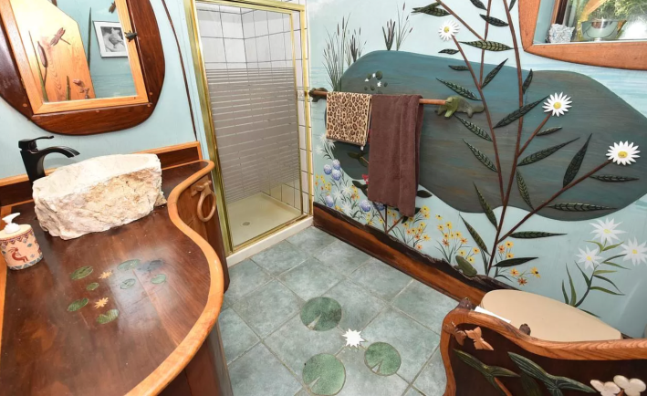
In this bathroom, you can see that there are custom made lily pad tiles on the ground, but there is also what looks like two custom built in woodworking pieces. The counter around the sink has some very delicately designed lily pads on it, and the half wall between the door and the toilet has 3-D, wood-cut bugs on it. The flowers on the wall here aren’t painted but emerging from the wall. Their leaves look like they are cut wood, too. This bathroom made me feel a little bad for ragging so hard on the mosquito room because it made me realize that this was someone’s dream home. The amount of money and effort and specific individual taste that went into making this house a mosquito heaven is immense. Unlike so many of the houses I scroll through on Zillow dot com, this one hasn’t been stripped of all personality, gutted, and rebuilt to look like a blank canvas made of cheap plaster. It doesn’t have a shiplap wall. It isn’t all gray. This is a house someone really loved. And because it was designed so specifically to one person or family’s taste, it is unapproachable and unappealing to me, and apparently to other buyers. The home has been continually listed, reduced priced, and unlisted since mid-2015.
Don’t feel too bad, though. I did some research and these owners (obviously) are very rich. They will survive my gentle criticisms. Let’s continue.
There are a couple more bathrooms and a couple more bedrooms that all continue in the same vein and therefore are not worth talking about but then we get to this:
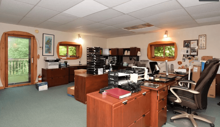
The drop ceilings make this home office look just as miserable as a regular office. That is the exact opposite of the point of having a home office. This room makes me sad. Click away, and what do we find but this terrifying image:
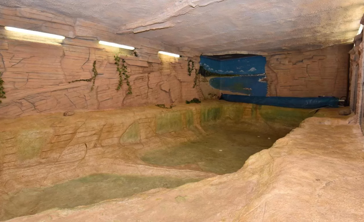
WHERE THE FUCK IS THIS!?!?!?! Is this … under the living room?? Is this bottom part supposed to be filled with water? The green algae on the walls certainly makes it look like it's supposed to be filled with water. There are no details about this weird cave in the listing. This is a huge NO from me. I do not want to be here anymore! How do we get out? Are there stairs out of this room? Do I have to climb the jagged rock wall that looks like it might cut me? Is this popcorn ceiling going to collapse? Honestly, that would be preferable to the mosquito death: being crushed by a floor full of plants. I’ve had enough. That’s enough outside inside for me. Let’s leave. Let’s run away forever.
This week’s house has been listed on Zillow on and off for five years. It is currently listed at $995,000. If you buy this week’s house, good luck! I will not be visiting!
