Somewhere along the line, filmmaking shifted. An inherently technological art form, cinema was for a century or so defined by a constant tug-of-war between the filmmakers’ vision and the technical ability to realize that vision onscreen. Animation was, from the beginning, a key weapon in that war, serving as a foundation for all manner of special and visual effects. Think King Kong, in his original form a work of brilliant and evocative stop-motion animation. Of course, animated films themselves were a showcase for the fantastical, a medium almost entirely unencumbered by the realities of live-action photography. And then CGI was introduced and everything went back to the beginning.
Compare computer animation in its earliest days, even through to the first feature-length CG film, 1995’s Toy Story, to the early days of hand-drawn animation and you may notice similarities: artists at once challenging the bounds of new technology—digital rendering still isn’t the easiest thing in the world, of course—and also learning their new toolset almost from scratch. In the pioneering decades of computer animation, that sense of adventure and discovery was part of the selling point. Toy Story was like nothing you’d ever seen, and each successive film pushed the boundaries further and further. Studios like Pixar would even advertise the way each movie had at least one key advancement (the fur rendering in Monsters Inc., the water in Finding Nemo, the human character animation in The Incredibles, the photorealism of Wall-E).
Eventually, though, the advancements stopped becoming notable or all that impressive. You can do anything with a computer now if you’ve got the time and money. We know. What else have you got to show us? This feeling hasn’t been limited to animated films by any stretch. Where once Peter Jackson’s The Lord of the Rings trilogy augured an exciting future for CGI to realize onscreen what had only previously been possible in the imaginations of readers, by the time his Hobbit trilogy arrived a decade later, audiences were complaining that it had too much computer animation. Never mind that the effect was worse than Jackson’s earlier combo of cutting-edge digital animation and compositing with on-set special effects trickery and incredibly detailed miniature models. The real problem with the new trilogy’s front-and-center CGI was that it no longer held any mysterious allure. While countless engineers and artists may have worked day and night to achieve the effects, the audience simply responded, Great, you did it on a computer. Cut to the Marvel Cinematic Universe and its ugly sludge of barely comprehensive digital bullshit, and sometimes it really can feel like there’s nothing new under the sun. Even Avatar: The Way of Water, incredible as it looked, felt more like an evolution of familiar styles and technologies than the creation of something truly new.
As CGI became the only market-approved option for big budget animation at studios like Pixar, Disney and Dreamworks, the newness wore off, and the magic evaporated. What was left was a slew of family movies, occasionally laudable for their narrative and thematic complexity, but devoid of meaningful differentiation in style—all bobble-headed characters in semi-photoreal environments. No wonder, then, that animation fans for years have been hoping for the return of traditional, hand-drawn movies, which at their height achieved incredible levels of sophistication and expressiveness, even in the mass market products delivered by the Disney Corporation.
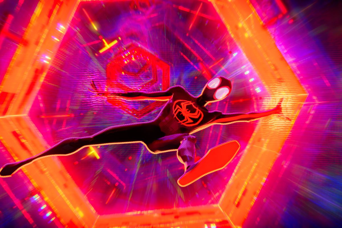
Enter: the Spider-Verse. In 2018, something of a sea change occurred with the release of Spider-Man: Into the Spider-Verse, written by Phil Lord and Rodney Rothman, produced by Lord and his The Lego Movie partner-in-crime Chris Miller, and directed by Rothman, Bob Persichetti and Peter Ramsey. Combining computer animation with hand-drawn techniques, the superhero movie blew the socks off critics and audiences alike. Telling a moving story about teenager Miles Morales becoming Spider-Man and saving the world alongside Spider-people from other dimensions, on narrative terms alone the film was a success. But it was the animation that really brought the film home and won it the Oscar for Best Animated Feature.
Designed to mimic the varying styles of comic book art, the film’s visuals, which played with 2D and 3D planes in a manner never quite achieved before, was genuinely astonishing to behold. The level of detail in each frame was evidence of the animators throwing all their energy and passion behind a work that was, once again, pushing real boundaries. Those boundaries were in part technological—plenty of engineering went into figuring out how exactly to make the 2D/3D combination work—but they were also stylistic.
Plenty of films had combined CGI and hand-drawn animation before, going as far back as The Great Mouse Detective in the ‘80s. In Japan, where the art of animation is more generally accepted by the adult moviegoing audience, CGI was often a tool to assist some of the most jaw-dropping feats of hand-drawn work ever put to screen in films, like Rintaro’s 2001 epic Metropolis. But Into the Spider-Verse was something different. The film had artists literally drawing over frames of computer animation, picking up the mantle of the 2012 Disney animated short Paperman, which demonstrated the possibilities of such a technique. What the filmmakers of Into the Spider-Verse understood was that in the combination of technologies could be found something pathbreaking, not simply in the technique itself, but in the stylistic possibilities it allows.
Suddenly, rather than looking like a bunch of detailed 3D models, a computer animated film could look as much like a comic book panel, or a painting, or an etching, or anything really. The filmmakers took advantage of that freedom to create an animated movie that looked like nothing anyone had ever seen before. And it felt like just the beginning. For once, a superhero sequel felt like a real opportunity instead of an obligation.
Five years later, Spider-Man: Across the Spider-Verse has arrived, the first in a two-part saga that sees Miles Morales re-team with Spider-Gwen, his counterpart from an alternate universe, in a multi-versal adventure that makes the antics of the live-action Spider-Man: No Way Home or DC’s upcoming The Flash look like, to put it mildly ... garbage. Along with a grander story (and a heftier running time before its cliffhanger ending), Across the Spider-Verse delivers on the stylistic promise set forth by its predecessor.
The first film used its technique to emulate the look of a comic book. Impressive, sure, but also liable to become a parlor trick. Getting an animated movie to look like another medium is all well and good. The recent Puss in Boots: The Last Wish went ahead with a similar style more evocative of oil painting than comic panel. The TV series Arcane won praise for using the same techniques. Hell, even the more standard CG work in The Super Mario Bros. Movie earns some kudos for looking exactly like the video games, surely a big part of the reason the movie earned something in the neighborhood of a bajillion dollars at the box office. But mimicry is old hat for the minds behind Spider-Verse.
In Across the Spider-Verse, even more styles appear: everything from Renaissance sketches to brightly colored Indian comic book art from the ‘70s. In a heartwarming story, one quick segment animated to look like Lego blocks was actually done by a 14-year-old from Toronto discovered by the film’s producers. The character of Hobie Brown, a.k.a. Spider-Punk, is a style-shifting wonder, meticulously designed by animator Spencer Wan to look like old punk collage and magazine cutouts.
I think this early Spider-Punk test ended up being my main contribution to #AcrossTheSpiderVerse
— Spencer Wan (@SpencerWan) June 7, 2023
I was concerned that having him change looks so often would be too disorienting for an entire film, but the directors told me they wanted to do it anyway. pic.twitter.com/YJQ8O4IDi7
I drew a quick pass digitally and printed it out, rendered it more realistically in pencil, recaptured it by taping an ipad to the side of my desk, blasted it with filters, scribbled on it, etc.
— Spencer Wan (@SpencerWan) June 7, 2023
The textures are random photos from my apartment. Some of my junk mail is in there.
More than style, though, it’s the use of it to achieve something unusually moving that sets Across the Spider-Verse apart. In the world of independent animation, the kind you’ll often see nominated for Best Animated Short at the Oscars, there’s plenty of work that pushes the animation itself to create unique moods and elicit emotions. Internationally, anime like Ghost in the Shell and Perfect Blue, or the works of studios like the Irish Cartoon Saloon, producers of The Secret of Kells and Wolfwakers, have proven that animation can do more than just bring the fantastical to life. The expressive potential of animation is just as important. The use of shading and color, the elastic geometry of faces, gestures and environments, and often the artistic design itself make for films that do things visually and emotionally that no live-action film really can. Unfortunately, in Hollywood animation, an industry captured by all the corporate fears associated with marketing mass products to children and families, there’s rarely room for such adventurous exploration.
Somehow, Across the Spider-Verse wasn’t felled by those fears. Instead, years of tireless work by incredible, underpaid animators who desperately need a stronger union and some time off to see their families for once, have been put in service of moments of true movie magic. The film’s opening sequence is set in Spider-Gwen’s universe, a purple-ish pink world with an art style described by Lord and Miller, who co-wrote the sequel with Dave Callaham, as “mood ring.” In terms of look, Gwen’s universe replicates the watercolor style of the 2015 “Spider-Gwen” comic run by writer Jason Latour and artist Robbi Rodriguez. Its painterly qualities and pastel colors are eye-popping enough, but it’s during a heart-wrenching scene with her father that the “mood ring” style reveals itself. As parent and child find themselves hopelessly at odds, the watercolor style transforms into something resembling impressionism. The background becomes indistinct, Gwen’s father becomes almost one with his surroundings, hunched forward in emotional agony, and as an audience we’re right there with the characters.
Moments like these are repeated throughout the film, its styles mashing together and shifting to stir up emotions and express the interior lives of its characters. In a cinematic landscape where the fantastic is constantly undercut by the need to be grounded, where a misguided devotion to realism has made movies look like Intangible Sludge, Across the Spider-Verse is an incredible rebuke. It’s a statement of purpose for both animation and cinema as a whole, proof that even in the stultifying world of IP-based corporate moviemaking, new frontiers can be explored, real emotion can pour through, and artists, as ever, can work wonders.


