There is one week every spring where the city of Austin, Texas blooms into something stodgier and busier and much less weird. For decades, it was a harbinger no one listened to, a nice chime no one recognized as a kind of death knell. The week is called South By Southwest. Originally, it swamped the city in a good way, crammed new bands into bars and dragged in musicians from all over the country who wanted to test out new work, or make new friends, or refresh themselves with a good ole Texas thunderstorm. But over time, it became a tech oasis, a place for rich men from Silicon Valley to fly to, obtain a specific colored lanyard, and buy their way to social clout.
When I attended South by Southwest well over a decade ago, these men stood out like sore thumbs. Some of them bought cowboy boots that were so unscuffed they gleamed in the reflected stage lights. The worst of them bought expensive cowboy hats that didn't quite sit right on their heads. Over time, it became harder to get into shows without one of those shiny badges because the festival itself became more pay-to-play than experiential. Or maybe that's just how it felt.
Austin itself has morphed in a similar way. When I return now, the number of shiny buildings and the wealth of the nouveau riche fresh off their shifts at Facebook and Google is blinding. But there's a kind of failed transformation happening even in the parts of Austin trying their hardest to become Silicon Valley But With No Income Tax. You can't scrub all of the Texas out of a place. It's like the fine dirt that creeps under the door frames in Lubbock. The spirit of the place can't be removed no matter how many people move there, or how much money covers the ground. There's a soul to the state that is ornery and stupid and perfect, that demands gaudy and rejects sleek, that still thinks of power as a big shiny belt buckle, and beauty as a tall head of hair.
This week's house exemplifies all of this. It is listed at a cool $18 million and is tackier than a flytrap. There is something deep in my soul that (unfortunately) responds to this, that thinks, wow, that's money. It's the kind of house that someone who came into town for South by would never, ever buy, but that many Texans assume is the kind of place those people live. They have all that money! What else would they be doing with it!
Reader Kara sent in this week's house with an important question: "Why doesn't the wood match in such an expensive house, you ask?" Great question. Let's see if we can find out.
Location is famously important when buying a house and this house has a good location if you want to be close to the Texas capital and 6th Street, I guess.
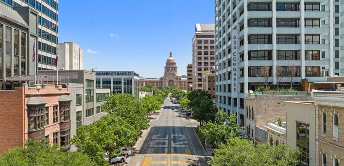
I do love to look at the Capitol building because I love pink granite, so this is actually good to me. What is less good is the entrance to this house:
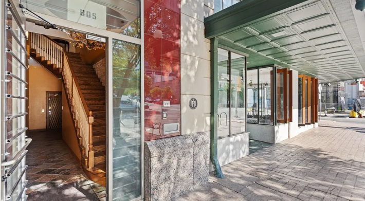
We have a lot happening here already. It's clearly a historic property, which is sick. I think that's an old elevator back there behind the stairs. I am too afraid to go in it, but maybe one of you can go and report back. I'm fascinated by how close together the poles on the railing are. I wonder if that's because these stairs seem to be steep as hell.
According to the listing, what we have here is a four story building with 10,050 square feet of space on the top three floors. There is also 3,975 square feet of unfinished space on the ground floor, which we could use for activities or something. Maybe we could put in a bowling alley. It's hard to know what we could do with it because there are no photos of this mysterious first floor. So, up the terrifying stairs we go.
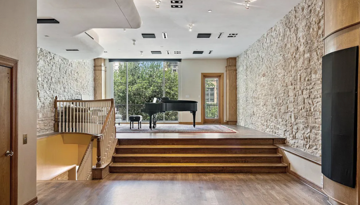
I think, though am not sure, that the stairs from the first floor go up to this floor, which is kind of sick. This is a cool piano, and I love that it's up these few steps. I have recently begun piano lessons, so this is perfect for my aspirations of being able to play everything Lydia Tar plays in the movie TÁR. Apparently, this location used to be a music store that sold Steinway pianos, hence the pianos. I assume it is almost impossible to get those pianos out of this house, so maybe they are included.
If this space were not used as a piano studio, I think it could be a nice art gallery space? I'm not sure what you're supposed to do with 10,000 sq/ft. That's like 8,000 too many sq/ft.
The balcony outside looks out over Congress Street, so that's scenic. What else is on this floor?
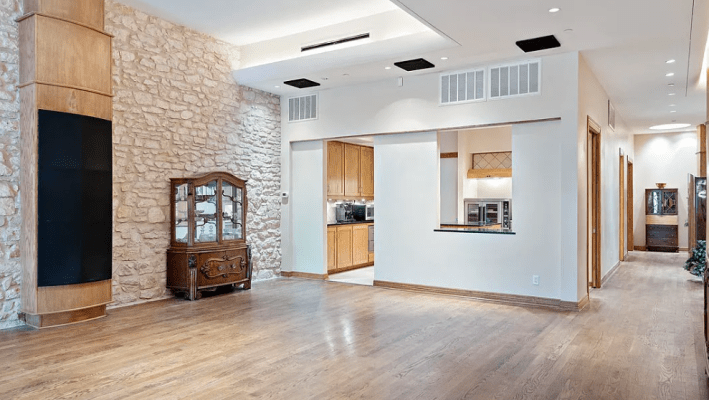
Huh. Okay. These are some of the weirdest vibes we've had in a while. We have industrial uplighting on the ceiling, but the ceiling is a flat, boring white. There are soundproofing panels stuck seemingly at random, over this wooden column and, uh, whatever those ones on the ceiling are doing. I guess this middle space is supposed to be a living area, but they haven't bothered to stage it, so it's hard to understand. And there's a little kitchen back here.
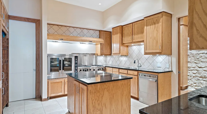
According to the listing, "the second floor boasts an entertainment hall equipped with a commercial kitchen, stage, bathrooms, and other rooms." This does explain one question that Kara sent in her first email. The listing boasts three bedrooms (remember there are 10,050 square feet) and EIGHT bathrooms. My guess, after looking at this listing for no less than 500 years, is that the bathrooms on this floor must be individual stalls and made for events, so maybe there are four or five of them on this floor. But those shouldn't be listed as full baths if they don't have a tub?
What's weird about this though, is why would you want an industrial kitchen to be open-concept. If you were going to use this second floor as an event space, wouldn't you want the kitchen to be hidden?
Also on this floor, we have a room to have meetings in.
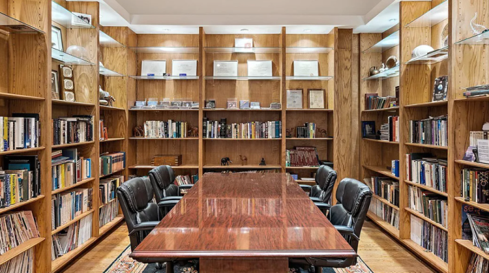
If you removed this table, which looks like it is set up to handle a divorce settlement, this could be a cool office! I like all the shelves, but I don't like that there are not any windows.
Moving on to the next floor, we have another piano!
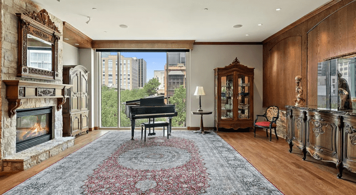
I was having a really hard time understanding the layout of this house, but luckily Kara found a site just for the house that has a video. Unfortunately, the video is cut like it's an advertisement for the concept of houses, so I could not understand anything from it. We will have to go on vibes.
I do like this stupid Star of Texas mantle, but I hate that there is a fake fireplace here. You barely ever need a fireplace in Texas, but having a fake one is literally useless. It is also making me very uncomfortable that the lamp on that side table seems to be leaning toward the piano. Why is it so unstable?
If we turn around, we are in this room:
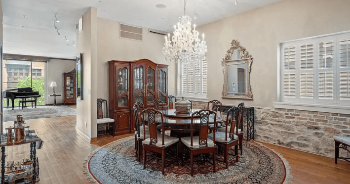
Wow. Wow. Wow. This looks like, uh, every suburban white person's house where I grew up, which is to say, it does not look nice at all. Why are there all of these strange feminine flourishes and no continuity of design. Why is all the furniture red wood while the floor is more gold? Why do you need white wooden shutters on the third floor, when the window behind the piano remains wide open? Why is this haunted Pottery Barn mirror here? Which Disney princess had to die for this chandelier to hang here?
So many questions we will never know the answer to, because I am concerned that if we stand here any longer, someone will ask us to join hands in prayer.
Let's escape into this room, which seems to be the "home theater" promised by the listing:
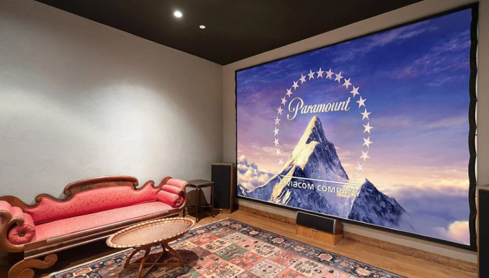
Absolutely not. Since I have a Zillow alert called "celebrity land" for houses listed at over $4 million in Los Angeles, I know for a fact that this cannot be deemed a home theater. The couch isn't even facing the screen, which seems to be a cheap screen you could buy anywhere. The speakers aren't even on stands! They're just sitting on the floor! By this measure, many people's backyards in the summer are "home theaters!" No, it should not be considered a home theater unless it has reclining seats, sconces on the wall for light, and curtains around the screen. At a minimum!
Up yet another level, we enter into what seems to be a primary suite. The living room on this floor has a wet bar and is also open to the only bed in any of the photos.
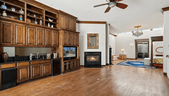
Weird. Here's a better look at the bedroom portion:
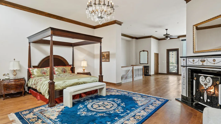
All of these pieces of furniture look expensive and like they were bought by entirely different people. This fireplace somehow looks like the animated movie Hercules. Everything about this is making me feel stressed. "I think I would make a good-faith effort at trying to salvage but would quickly run out of time, money, and interest," Kara told me. "The layout needs a massive rework -- there's a ton of space, but the noise from all the open areas would wreak havoc on my sanity." I think she's right. The open areas here do feel lofty and are filled with natural light that seems to come from the front of the building, but I imagine you could hear a sneeze in the entryway from this bed.
Into the bathroom we go:
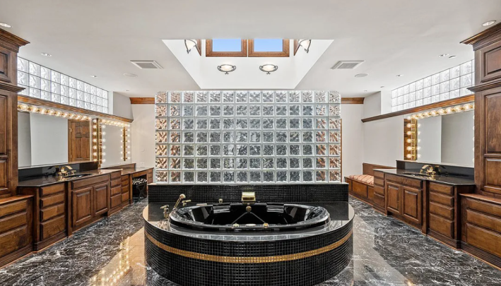
I cannot possibly explain this, but I'm obsessed with this. This is so deranged, and has so many unfathomable decisions, that I would keep it. I like the tiny tiles on around the tub. I love that behind those glass bricks is a huge walk in shower. The marble on the floor is so cool. It looks like what I imagine Elvis would have wanted. I would paint these cabinets, because I don't like the tone of the wood, and I would put some decadent wallpaper on the CEILING, and then I would lose my mind very, very rapidly, which seems exciting. Of everything in the house, this is the only room that has any personality.
"Perhaps it's because my one bathroom has zero cabinets, but I am mystified about what all of that storage would be used for," Kara said. But it makes sense to me because there was no other storage shown anywhere else in the house. I'm not sure this house has any normal closets, so I assume this is functioning as a walk-in closet and bathroom.
Finally, we must go up to the roof:
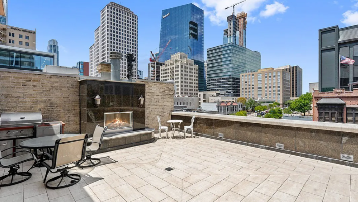
I have not stopped laughing since I looked at this picture. I would put the over-under on days you could comfortably spend on this patio at around 20. This stone would get so hot in the summer that it would make your shoes melt! There is absolutely no sun cover, so you are going to get burned to a crisp, and the fireplace doesn't even look warm enough for a cold snap.
I do think with enough money and time and creativity, we could make this house nice, but it would be an uphill battle the entire way. Plus, as Kara said, "I keep getting the sense that there is some giant blind spot that the photos and the video are trying to intentionally hide." I also get this sense. Maybe if we had seen any other "bedroom" or "bathroom" or whatever was happening with that elevator, it would have felt less ominous. But as it is, $18 million seems like a terrible deal.
This week's house has been listed on Zillow for $18 million for 179 days. If you buy this house, I would like to come visit on one of the few days a year that I could sit on the patio.
