The Lorain–Carnegie Bridge opened on December 1, 1932 without any fanfare. “No ceremony is planned,” a United Press report noted at the time. Bridge engineer A.M. Felgate would just have the barricades removed keeping traffic off the bridge, which connects Lorain Avenue on Cleveland’s west with Carnegie Avenue to the east.
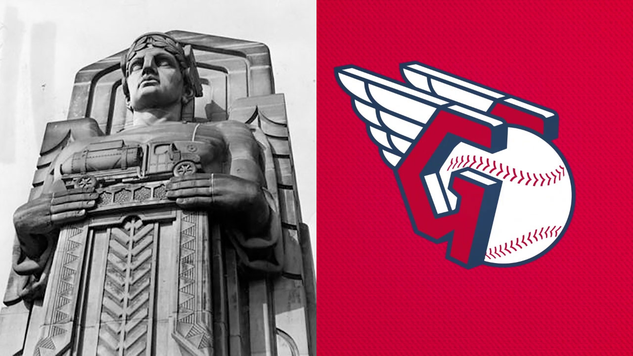
It wasn’t until the 1970s that it became a local cause célèbre. The Lorain-Carnegie Bridge is no ordinary bridge: The pylons are carved into Art Deco masterpieces, the type of art you see on buildings from the 1930s. They are often called the “Guardians of Transportation”—but they are officially named the Guardians of Traffic, Case Western Reserve professor John Grabowski said in 2018. Either way, over the 40-plus years after the bridge was built they had become covered with soot from steel mills, sulfur from coal furnaces, and car emissions. About 50 years after they were built Cuyahoga county engineer Albert Porter called them an eyesore and planned to tear them down in order to widen the bridge. “Those columns are monstrosities and should be torn down and forgotten,” he said. “There is nothing particularly historic about any one of them. We're not running a May Show here.” (The May Show is an annual art contest for Northeast Ohio artists.)
It turns out people thought there was something historic about them. The bridge was added to the National Register of Historic Places in 1976. Porter—who was dealing with a scandal where he wrote an insulting letter, to a little girl, filled with misspellings that called residents of one neighborhood “moochers, scroungers, chiselers and parasites”—was voted out of office that year and later convicted of forcing his subordinates to kick back two percent of their salaries to him. The Lorain-Carnegie Bridge got a renovation in the 1980s; workers cleaned the statues with 4,000 pounds of black walnut shells. It also got a new name—Hope Memorial Bridge, which was named after Harry Hope, Bob’s father—and Cleveland got some new city icons.
“They went beyond just building a bridge,” county engineer Thomas Neff told the Akron Beacon Journal in 1983, when it reopened. “They built something of strength that would last, but also something of incredible beauty.”
Grabowski said in 2018 they are Cleveland’s only representational art of monumental size. By that year the Guardians of Traffic had become a real symbol for the city, used by artists and sports teams and cheap t-shirt sellers. You can see why! They are cool, unique Art Deco sculptures on a bridge, a place where you usually don’t see great art like that. My favorite Cleveland art is probably Claes Oldenburg’s giant FREE stamp, but these are No. 2 at worst.
I report this history today because the baseball team currently known as the Cleveland Indians—they of the Chief Wahoo caricature—are changing their name to the Cleveland Guardians. The switch will take place this offseason; Cleveland’s six games out of the Wild Card, so probably starting October 4.
Together, we are all... pic.twitter.com/R5FnT4kv1I
— Cleveland Indians (@Indians) July 23, 2021
“Cleveland has and always will be the most important part of our identity,” team owner Paul Dolan said in a hilariously no-shit sentence in a press release. “Therefore, we wanted a name that strongly represents the pride, resiliency and loyalty of Clevelanders. ‘Guardians’ reflects those attributes that define us while drawing on the iconic Guardians of Traffic just outside the ballpark on the Hope Memorial Bridge. It brings to life the pride Clevelanders take in our city and the way we fight together for all who choose to be part of the Cleveland baseball family. While ‘Indians’ will always be a part of our history, our new name will help unify our fans and city as we are all Cleveland Guardians.”
Yeah, OK. That’s a bit much. But I like the name! In June the team announced they’d whittled it down to about 1,100 potential names, and I guess it only took them a few more weeks to eliminate 1,099 of them. Dolan said the team held focus groups and local fans liked the new name, but wanted to keep the team’s current colors.
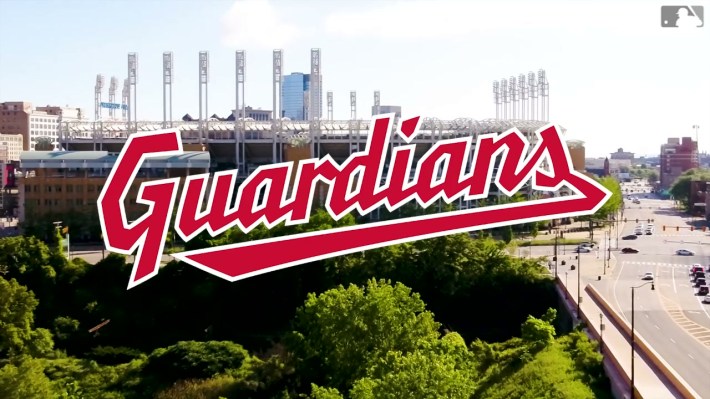
In baseball there are multiple teams known by the color of their socks, one is just a color, one is called the “Athletics,” et cetera. Everyone hated the Nationals when they were named; somehow their World Series win was not tainted by the bad name. Now that I think about it more, most baseball team names are pretty bad. Guardians is already one of the better ones, in many ways. It has a connection to the city and it isn’t some dumb rock-n-roll pun or a reference to an 1890s team that set a record for baseball futility. And it sets up plenty of interesting future logo marks—the faces of the statues of the Guardians, bridge motifs, more Art Deco flourishes—even if the current wordmark kind of looks like the Milwaukee Tool logo, and the winged "G" baseball (the "Guardian’s Fastball," per the team) reminds me of Windows 95. Whatever! It’s new and it’s not Indians.
Just maybe don’t read the explanation of it from the team: “The Guardian’s Fastball embodies what it means to be a Cleveland Guardian in its strong, yet simple design. It is inspired by the helmets and wings of the Hope Memorial Bridge’s Guardian statues and the G purposefully wraps around and guards the baseball. The split-finger design is a tribute to our strong pitching heritage.” This is how I’m going to present my ideas for the Defector merchandise store from now on.
