I met my friend Jess in my neighborhood for a drink last week. I did check the weather app on my phone before I left because it had been drizzling all day. It said there was a 30 percent chance of rain. I am vaccinated, but I am still not emotionally ready to eat inside a restaurant. Plus it was nice outside and the restaurant had put up the kind of square tents you see at tailgates over their fancy patio. We would sit there, under the tent.
I felt the storm roll in before it arrived. In photos I saw later online, it approached ominously, dark and mammoth and full of spite. The pressure dropped and I felt it in my body for just a second before the cloud unzipped and gushed water. The woman behind me got drenched when the small sliver of space between the two tents gave way to a couple gallons of water. The tent bucked a little in the wind, restrained. The waiter came to check on us. Were we okay? We looked at each other. The couple next to us had already left.
Jess is from the same town as me. We are prairie girls. Later, the TikTok algorithm would grant me a video of a girl saying, "I mean, yeah, I grew up in the South but I don't think it had any impact on me," followed by her, a blanket draped around her shoulders, going to stand on the porch and watch the storm. I did not know until I saw this video and sent it to my sister who promptly said, "Wait are we not supposed to do that?" that this was a cultural predilection.
Jess and I stayed on the patio as the cloud dumped water. We ordered another drink. We watched as long strokes of lightning, thicker than you'd think, split the sky in two. The lightning was in a hurry, streaking down to the ground fast as it could. We counted between the bang and the flash. The storm was further away than it looked.
There is an art installation in New Mexico that I am dying to see called The Lightning Field. It's made up of a bunch of metal poles always waiting to be struck. In her essay about it, Laura Raicovich describes watching a storm roll in there like this:
"Some single bolts, striking straight
down, linking clouds to earth.
Others sprawled,
crinkled and irregular, crackling in
various directions,
a web across the sky.
The first scene I wrote of my novel was a storm sequence that later moved to the middle of the book. Two girls stand on the flat prairie, watching a storm approach. It's a metaphor, I guess, but it's also an experience had so many times they all became one. Now, three weeks out from publication, I feel like I'm watching the storm roll in so slowly, begging it to get closer. I have never been much good at waiting. The stress of anticipation is filling my brain so that it's difficult for me to focus on much else except for panicking and calming myself down. I want the cloud to break already. I want it to begin.
All of this is to say that the storm was good for me. It reminded me that I am small and the earth is big, that my little fears aren't so grand after all. It also made me miss the sky. So I did what any dummy with five million Zillow keyword saved searches would do and I turned to my "mountain view" keyword search in the southwest for houses over a million dollars. This will help us relax a little. We can imagine our storm rolling in from the lap of luxury.
This week's house is $1.1 million and 3,000 square feet. What is more important is that it has 1,900 square feet of patio! Perfect to watch for storms! The house is located in Cave Creek, Arizona, which is in Maricopa county, a place you might remember for... uh... reasons. I learned from Wikipedia that it is in the Sonoran desert and hot as hell in the summer. It also has a beautiful sky and a fire danger warning, so everyone be careful. It has so many windows that are all glowing orange in the photos. I like that it is all one level because I prefer all houses to be long rectangles either tall and thin or long and flat.
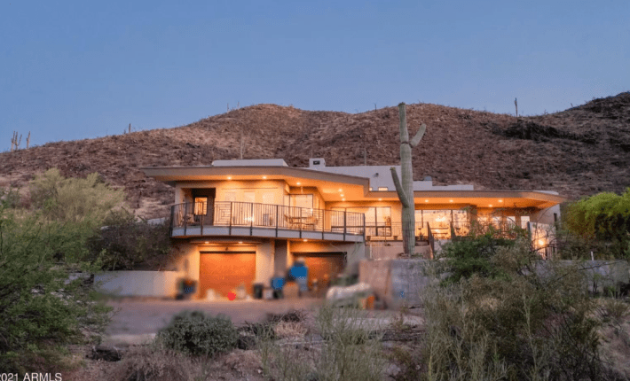
At first glance, it's a gorgeous house. But let's look a little closer, shall we? The description says "AWESOME & UNIQUE COOL CONTEMPORARY Frank Lloyd Wright-Inspired Design~" These are all words, for sure. This is pretty funny to me because there are actual Frank Lloyd Wright houses in Arizona. Specifically Taliesin West is the most famous. My favorite Frank Lloyd Wright desert house is the Norman Lykes House. Please take a look at these, as we will be doing some comparison.
This house we are looking at today is Target brand Frank Lloyd Wright. There is no design on the outer walls. There are so many windows. The concrete patio has water stains that, to me, read as a more Corbusier-like drainage problem. But there is a lot to be learned from knock-offs. Like any mimicry, a knock-off tells you more about the person who made it than the item they wished to recreate.
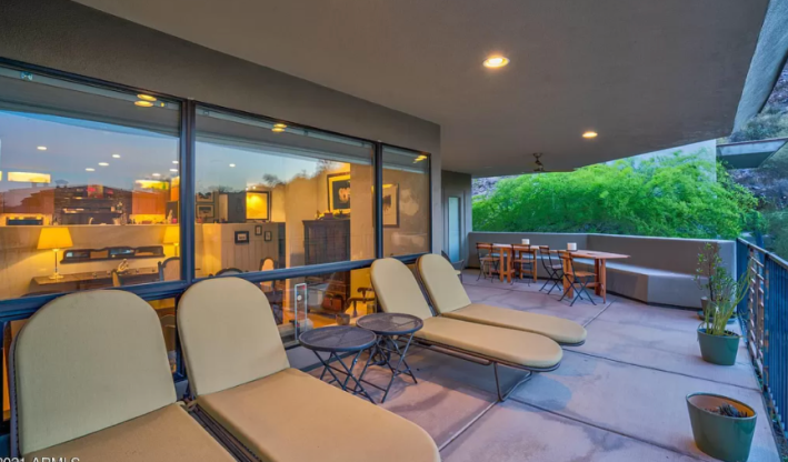
The first thing I notice about this house is how open it is. The giant patio greets us before we ever get inside. The windows to the house face us from the street. We can see the chairs and the garage and even peek inside a bit. I imagine, at night, you could see right into the kitchen form outside. What this house is trying to do is mimic the windows iconic in Lloyd Wright's work: these expansive, long windows, that peek out on one side and glow at night. What's interesting is for a million dollar house, this has been done fairly cheaply. The windows are large, single-paned without woodwork. The fence on the patio is made of iron. In a Lloyd Wright house, that wall would be made of stucco. It would provide privacy. The roof would be curved instead of angled. The large cactus in the front, however, is beautiful, and I would do whatever it takes to keep it alive forever.
Let's try and find our way inside. From the driveway, it's unclear where the entrance is. Do we go up the stairs and over the porch and in that way? Or is there another door somewhere?
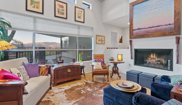
Inside is where things really start to go wrong. The front door, it turns out, is off the patio and leads us into a living room that is having an identity crisis. The fireplace is electric. The sofa is suede. There is a cowhide rug on the ground. All the walls are white (an actual crime against Frank Lloyd Wright) and the art is too big for the walls. I do not always love the Lloyd Wright's interiors, but one thing he understood is that a house should not just be a blank canvas. This truth has been forgotten by developers gutting beautiful homes and replacing them with white walls and gray floors and steel bannisters on the stairs, making everything as bland as possible in order to sell it at a profit. The house is supposed to have a personality on its own. It is supposed to greet you.
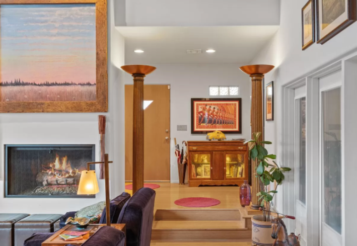
From another angle, we can see a couple of half-hearted attempts at this. There is a window in the front door that is a fun shape, but the door itself is bland. The prairie house movement came right on the heels and in conjunction with the Arts & Craft movement. That movement is all about INTRICACY. It is not about flat, public school-ass doors!! There are some stairs over here that are clearly meant to look beautiful and carefully made but also the floor seems to be laminate? There are two columns (?) with lights on top (?) in a passageway (?) illuminating the ceiling (?). Over here there are also some glass bricks. Glass bricks (we went over this last time) rule. But this is a strange choice. Not only are these bricks not ornate like they should be, this window isn't centered on the wall and doesn't extend far enough to create any kind of visual break. The designers seem to have understood that "horizontal lines" are part of Prairie Style but not exactly what they are supposed to do.
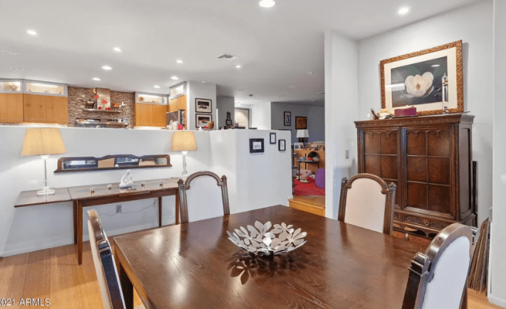
Heading to the kitchen we encounter approximately 6,000 half walls. These walls remind me of midi length skirts, which are the perfect link to chop your body into square pieces and make you look squat. A half wall, in theory, should highlight something above it. For example, a beautiful ceiling (not one with overhead museum lights) or an interesting cabinetry work. These walls don't do that and they also don't segment rooms into their own spaces so I don't know why they are here. There are steps between every room, but none of the spaces are distinct from one another. I can just imagine how many times I would try to go up the stairs between the dining room and kitchen only to be thwarted by the dishwasher which is right in the path.
The backlit frosted glass cabinets at the top of the kitchen actually do resemble Frank Lloyd Wright windows. The cabinets are awful. Why do they look like they're made of clapboard? Why are they two different colors? Why is the gray of the bottom cabinets neither the same gray as the backsplash or the appliances? The island is fake wood, the long bar does not even face a window with a nice view, the microwave is inset to the wall. All of these photos seem to have been taken at night when half the point of a good house is how the light falls. Whatever let's move on.
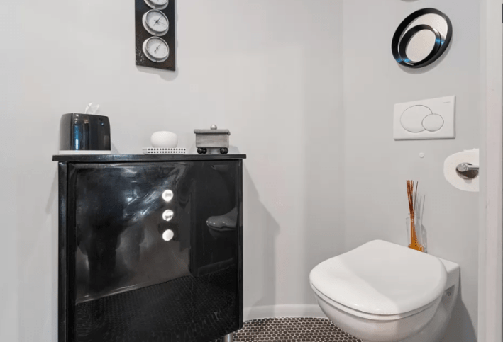
I don't know what's happening in the space bathroom but I do NOT like it. Where is the tank for the toilet?
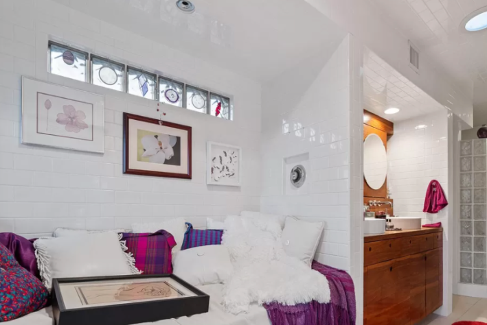
The bedroom with the purple wall has terrible furniture but the shape of the room is quite nice. There are doors out onto the porch and a little seating area carved off of there. Purple walls are... uh... not very prairie style, but then again neither is the daybed that is in the entirely white bathroom. In here we have the real metaphor for the whole house. Above the daybed are glass bricks again. They seem to have little decals stuck to them. Instead of paying for intricate glasswork and something beautiful, we have cut corners. It looks, frankly, like shit! I do, however, really like the double wood vanity with the sinks. This is very pretty.
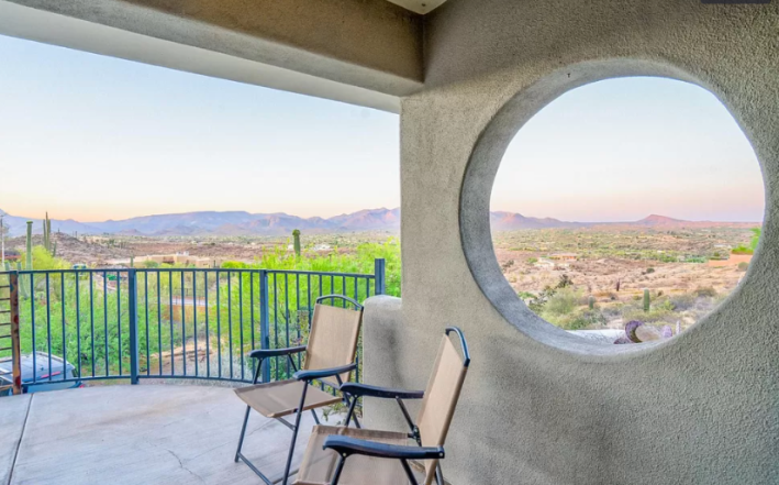
On the porch, the photos want you to know, there is a circle cut out in one of the walls. Don't look too closely or you'll see that it's not quite round. The view, however, is lovely.
There is another room that is bright green. Where? That's not clear. It has what looks like a stage for children in it. This makes no sense. Whatever. Let's go back outside.
Oooh here is a walkway to the guest house. The guest house is very cute. It has a curved wall in the bedroom unlike the main house. The shelving isn't built in and we have the same terrible lighting and half walls here, but it's a perfectly nice guest house. I would stay in it for a few days. There's not much else to see over here, though, so we are almost done.
Before we conclude, there are two egregious flaws in this house we must address. The first is the roof. In mimicking Frank Lloyd Wright, this house has many levels on the roof and lots of stepped sections. Normally, this would be for light. The roof would be stepped up and there would be little windows at the top there so that the sun could come in. The height of the house would also correspond with the height of the ceilings inside, which would add to the feeling that each room is distinct and special despite any kind of open floor plan. Here we have an aesthetic roof. In only one room (the living room) are there windows in the step leveling. The ceilings in 90 percent of the house are the same height.
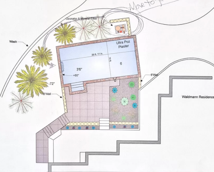
The second is that there is a big deep pool out front (?) that has not been finished. This is untenable. The pool must be finished. Imagine how nice it would be to swim in the pool. Imagine the lightness of your body as a storm you've waited years for through the drought of the desert builds on the horizon. Imagine it creeping toward you, trying to stay in the pool, to stay calm as long as possible, as it approaches. Isn't the waiting okay? Isn't it nice to have a few more minutes to swim before it arrives? The waiting is the hardest part, but nothing stops a storm. It will arrive. And we will dry off and stand on our porch with the blanket around our shoulders and smile as it rumbles in.
This week's house has been listed on Zillow at $1,150,000 for 8 days. If you buy this house, I have a lot of ideas for you on how to redesign it to make it not suck so please invite me to stay in the guest house.
