When the Edmonton Oilers began Game 7 on Monday night, they were hoping to end an era. For over three decades, the Stanley Cup had evaded Canada, succumbing instead to the charms of the coastal elites, Midwest proletariat, or even the dreaded Southern hockey insurgency. But when the clock ran down and the gloves and helmets came flying off, the Oilers were the ones still sitting on their bench, spectators to glory. The epoch of the Canadian Cup drought would continue.
What did end, though, was another era—one contractually obligated to finish no matter the team that won. With the end of the 2023-24 season, the NHL's seven-year deal with Adidas is no more. Gone are the three stripes that have sat at the neck of each player's jersey since 2017. In their place will be another logo that sports fans have become all too familiar with—the insidious, waving, F-shaped flag of Fanatics. Starting with the 2024-25 season, Fanatics will become the official outfitter of the NHL, kicking off what is currently a 10-year agreement.
The deal, originally announced in March 2023, was immediately met with vitriol, and not without reason. While NHL fans don't know exactly what the official on-ice product from Fanatics will look like when donned by their favorite players, they can already make a fair judgement through all the fan apparel the brand has produced for the league. There are too many photos out there of buyers opening up their latest purchase, only to find a Nico Hischier jersey with Jack Hughes's numbers or worse.
The widespread cynicism was obvious enough that even then-Fanatics Vice Chairman Doug Mack knew that fans were preparing themselves for disappointment. In 2023, he tried to smooth things over with an ESPN interview, using the company's deal with MLB as an example of its experience.
"This isn't the first time we've done performance product, but this will be the most visible we've ever been in making that performance product," Mack said. Fanatics also informed ESPN that it would be using the same factory Adidas had used to produce player uniforms, a sign of continuity.
In retrospect, that reference to the MLB is no reassurance. Nike and Fanatics debuted their newest jersey this season and immediately scandalized the sport with its poor quality. We saw more balls than usual, and I'm not talking about the kind with red stitching produced by Rawlings.
Supposedly, MLB is going back to the old uniforms next season, but a lot of fans and players have already lost faith in any kind of Fanatics product. One hopes they'll tread more carefully around the NHL, but initial signs are mixed. On Wednesday morning, the league gave fans a first look at what the new Fanatics jerseys would look like, complete with a hype video. Teams also began tweeting pictures of their respective jerseys with a telling emphasis on the word "classic." This Auston Matthews ad goes to great lengths to put Fanatics in seamless continuity with the most nostalgic aspects of NHL fandom, almost as if it's scared of how much serious hockey fans are scared of it.
The same people who made the @nhl jerseys that inspired @AM34 career are now making the jerseys that will inspire the next Auston Matthews.
— Fanatics (@Fanatics) June 26, 2024
Introducing the new Fanatics Authentic Pro NHL On-Ice uniform ⬇️ pic.twitter.com/MpAkCPD7ze
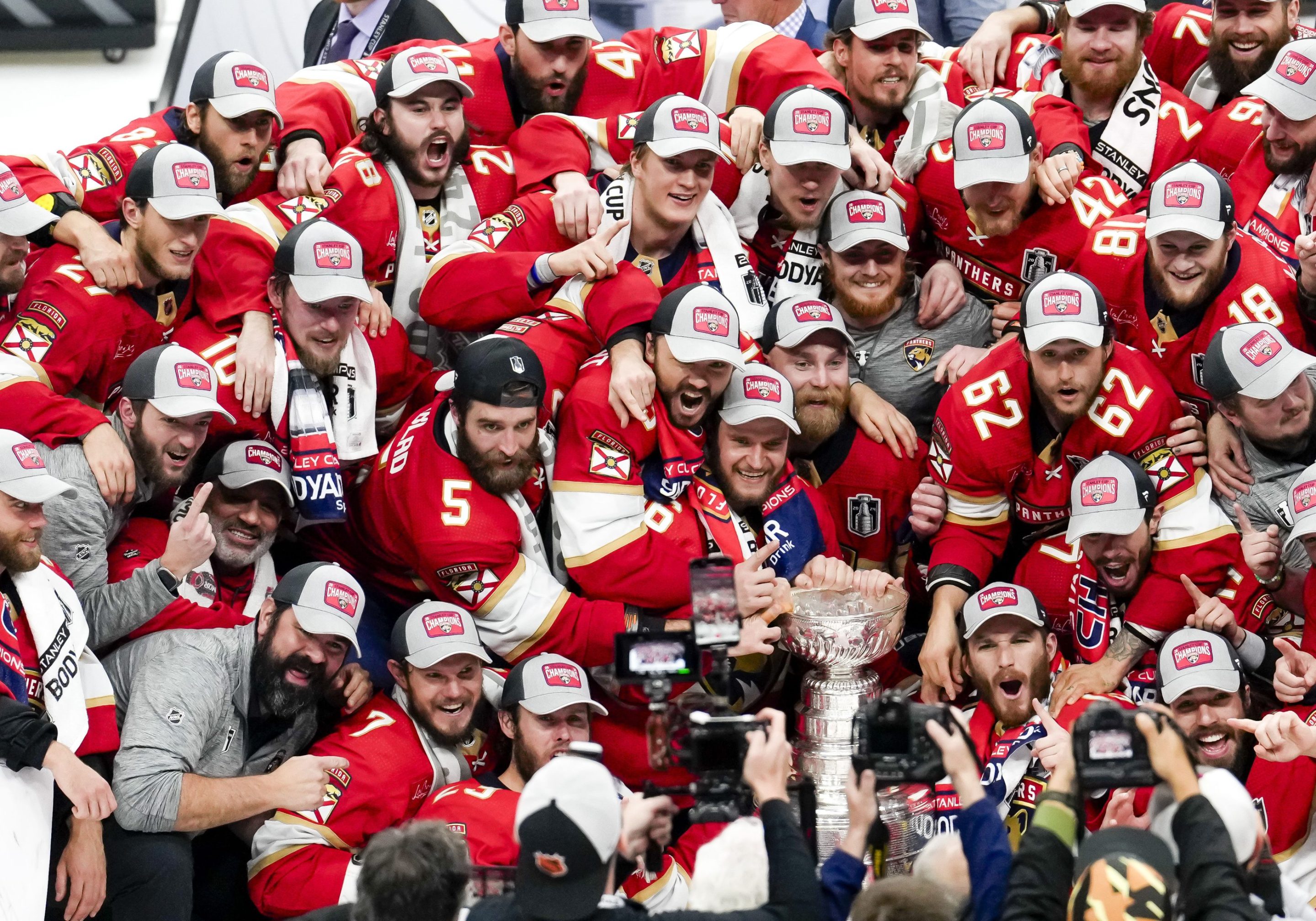
However, despite all the content that's been dropped, we haven't actually seen what these jerseys look like on an actual person yet—it might be one of the most suspenseful parts of the draft on Friday. There's also a backlog of bad designs to look back on. Take a look at these Fanatics-branded hats that dropped after the conference finals at the start of the month. That dusty-gray trucker cap with the pathetic patch is a reminder of the creative potential that is being squandered at the hands of this company. And it's not even like these hats are cheap; they usually sell for around $35.
Some fresh arrivals at Pantherland 😮💨 pic.twitter.com/wdpY6ekBOl
— David Dwork (@DavidDwork) June 4, 2024
In their monolithic magnitude, Fanatics churns out designs left and right, most of which has this corporate simplicity to it. They're flat with minimal coloring and the most boring fonts imaginable. When Abercrombie and Fitch is putting out better sports merchandise than "the ultimate sports apparel and Fan Gear Store," you know something has gone wrong. I'd much rather go to eBay and wear something made decades ago than buy a new shirt from Fanatics.
I don't think simplicity in a design is bad. Competitors like New Era often sell some pretty standard licensed apparel too, and some of the best vintage sportswear is fairly uncomplicated. The difference, however, is the pure lack of creative consideration Fanatics seems to have adopted so they can expedite the manufacturing process and maximize the number of things they sell, even at the expense of occasionally ironing on the wrong team name. There's a sinking feeling in my chest that we're going to be cursed forever by the kind of logo-slapping drivel Fanatics has been perfecting over the last two decades—a kind of minimalism in merchandise that drains all the history and goodwill stored inside each logo. We're losing the recipes for the prime stuff because the biggest cooks in the kitchen are more interested in pumping out as many cardboard-tasting TV dinners as possible than making anything of quality.
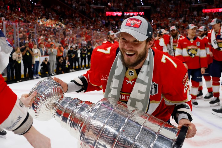
When the Panthers lifted the Cup on Monday night, the haunting specter of Fanatics was there too. The players predictably donned gray hats with simple red patches, the Adidas logo on their backs. An era was ending, and in the one ahead, I couldn't see a winner besides the bottom line.
