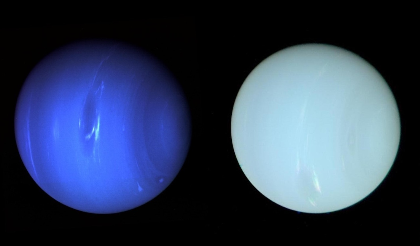
We've been lied to! For decades, the popular image of the eighth (and last; go kick rocks, Pluto stans) planet has been of a deep blue world. An inviting cobalt. A deep mountain lake at dusk. Interplanetary Klein Blue. Well, that's a big honking fraud. Neptune doesn't look like that. Neptune looks ... well, it looks a lot like Uranus. As seen by the human eye, Neptune is actually a pale greenish-blue (above, right), according to a new study published this week in Monthly Notices of the Royal Astronomical Society.
The misconception dates to the Voyager 2 probe, which visited the Neptunian system in 1989 and sent back stunning images of the ice giant. But Voyager was never intended to create "true" color images—they're just not that important for science. Voyager could only record single-color images, and a series of those images were recombined by scientists in order to create the pictures we know and love and got fooled by. For most planets, the Voyager team strove to recreate them as they actually look. But Neptune had some interesting things going on: clouds, bands, swirling winds. Those features didn't show up so well in true color. So they turned up the blue to emphasize those lighter details.
“Uranus, as seen by Voyager, was pretty bland, so they made it as near to true color as we can,” said Patrick Irwin, a professor of planetary physics at the University of Oxford and an author of the study. “But with Neptune, there’s all sorts of weird things,” he said, that “get a bit washed out” with proper color correction.
New York Times
The alterations to Neptune were noted at the time, but that fact has been lost over the decades, as the Voyager images of the deep azure ball—the only truly detailed images we have of the planet—became ingrained in the popular imagination. Astronomers have always known this: If you look at Neptune through a telescope, it's cyan, nearly the same as Uranus. But us normal folk have been fooled. Frankly, I feel like an idiot!
The researchers of this week's study used the Hubble and the excellently named Very Large Telescope in Chile to take new images, and utilized 66 years of old observations, to capture Neptune's colors as accurately as possible. Once they had the colors down, they reprocessed the old Voyager photo with new filters to create what you see above: Neptune as it actually appears.
It's still a slightly deeper blue than Uranus, which after being reprocessed for this study is itself slightly paler than its traditional depiction, but unfortunately I'm going to have to downgrade Neptune in my planetary rankings due to a lack of originality. (Even Pluto is more interesting now!) The new rankings read as such:
- Earth
- Saturn
- Mars
- Jupiter
- Venus
- Uranus (weird axial tilt gives it the tiebreaker)
- Neptune
- Getting hit by the New Horizons probe
- Mercury
Please update your records.


