Defector has partnered with Discourse Blog to bring you a taste of their work. They write good shit that we think you’ll like—and they’re offering Defector readers 25% off all annual subscriptions. Click here to get yours.
This piece was originally published on Discourse Blog on Aug. 12, 2021.
The pageantry around state pride is somehow both endlessly fascinating and completely stupid. We use seals, mottos, gems, trees, birds, and so much more as markers of regional identity, and while they’re functional, I guess, most of us almost never think about them at all. Take state flags. I, like you (I assume), almost never think about state flags, but they’re everywhere! And like it or not, they carry with them a lot of largely toxic and/or boring symbolism. Our national flag has its own damn day! Flags are a force that must be reckoned with—hence this list.
In creating this ranking, I went down countless rabbit holes, like the historical and revolutionary flags of Texas, for example, and if you have any interest in the practice of bureaucratic iconography, I kind of recommend it! The official government descriptions of flags? Unbelievable in their specificity.
Anyway, flags are serious shit, but this is an unserious post so please calibrate your outrage accordingly. Yes, I’m waving my white flag preemptively because this was extremely difficult! And if the number 56 below is throwing you off, it’s because we’ve included U.S. territories and Washington D.C.
Now, let’s do this:
56. Massachusetts

When I initially eyed this flag and saw a Native figure at the center, I thought “good!” but upon closer inspection, oh my god. I’ll let the Boston Globe take it from here:
The 19th-century seal, which appears in the center of the state flag, depicts a colonist’s arm holding a sword above the image of an Algonquian warrior. Circling the man’s figure is a Latin motto that translates, roughly, as: “By the sword we seek peace, but peace under liberty.”
I don’t really have the words to convey just how shockingly offensive this is, but I’m happy to report it’s currently up for revision and redesign under a state committee.
55. Hawaii

The Hawaiian flag exemplifies the way in which flags often serve to represent the worst of what humans have to offer the world: politics, nationalism, and war. Here we have the Union Jack and eight horizontal stripes for Hawaii’s eight major islands. Sorry, but it’s ugly and has nearly nothing to do with the place itself, and almost completely erases the people and the land. If Massachusetts can redesign, so can you, Hawaii!
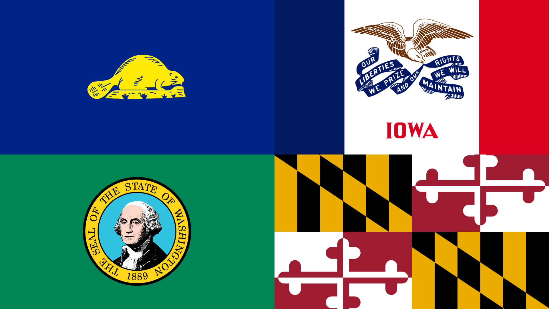
54. Maryland

I’d like to say that this was a difficult decision, but it wasn’t. Incredible chaos energy and taken from the coat of arms of Cecil Calvert, 2nd Baron Baltimore. You should have left it there, Maryland!
53. Arkansas

Absolutely not, ARKANSAS.
52. Alabama

Funny, a red X is the same symbol I’d put over this flag. This is no ordinary cross, but the cross of St. Andrew, something you also find on the Confederate flag, albeit in different colors. I rest my case.
51. Florida

Adding a seal does not help.
50. Ohio

I really respect a sincere effort to remix the form, but I detest this remix. Looks tattered!
49. West Virginia

This is honestly serviceable and the seal is pretty standard fare (liberty, agriculture, guns, blah, blah. blah), but the blue border is making me totally nuts.
48. U.S. Virgin Islands

This is a riff on the United States coat of arms, with the letters “V” and “I” for Virgin Islands, and arrows representing the islands of Saint Croix, Saint Thomas, and Saint John. It’s fine!
47. North Carolina

We’re entering into the red, white and blue section of the list here. Do I know how to design a good flag? No, but this really lacks a creative spark.
46. Georgia

Like…sure, okay.
45. Wyoming

In this house we stan the American bison, but we do not stan this flag. The placement of the seal within the bison is killing me.
44. Missouri

In this house we also stan bears, but this flag is not doing them any favors.
43. Tennessee

The three stars here represent Tennessee’s “Grand Divisions,” which are the three, distinct geographic regions of the state. The blue bar is purely a design choice, which I honestly love.
42. Rhode Island

I don’t hate this, it just feels a little boring. Not visually striking or evocative.
41. Washington, D.C.

I’m less interested in the inspiration behind this one (something about George Washington—who is like the frickin’ patron saint of state flags—and a coat of arms) and more interested in its boldness. I don’t even think it’s particularly nice looking, but damn if it isn’t striking.
40. Illinois

Bald eagles, like ol’ Georgie W., get a lot of play in state flags, and despite being an overused patriotic symbol, I don’t really mind them in this use! Bald eagles are cool birds, and we here at Discourse Blog love birds.
39. North Dakota

Oh look, another bald eagle in a very similar rendering! Cool. I like it.
38. American Samoa

There he is again! He’s in war mode this time, which I don’t love, but there is a nice sense of movement happening here.
37. Iowa

Look, the font and the illustration here are cool. Divorced from the actual words or imagery, this looks like a graphic tee.
36. Nevada

This is the navy-ish-background-with-a-seal-at-the-center section (not a perfect description for all of them, but an apt enough umbrella category). This section was difficult for me because it includes my home state (Michigan) and for the most part, I love them all! It’s simply a solid design aesthetic. It reminds me of the design on National Park signage—it might not light your brain on fire, but it’s classic and unassailable. Many of these rankings would change if I’d done this on a different day, that’s just the truth. This Nevada one only kind of counts, and I don’t really understand why they put the main feature in the corner?? This is a flag, hon. Don’t shrink yourself.
35. Kentucky

This flag shows a “pioneer” and a “statesman” embracing, and while I like the illustration, I can’t really get behind such an unholy fellowship.
34. Pennsylvania

Okay honestly, a lot of these are worse than the ones above, but I wanted to group them so here we are. The way these horses are shaded and highlighted makes my eyes hurt.
33. Connecticut

I’m actually kind of fascinated by how weird this one is. The grapevines are nice, and it kind of looks like a flag that would be in a video game like King’s Quest, which I mean as a compliment, though it probably isn’t one.
32. Minnesota

This is pretty unintelligible as a design but I like the energy.
31. Utah

I like this one because you’re like “yes okay, bald eagle and American flag, got it,” but then there’s a damn beehive at the center (it’s a Mormon thing).
30. Idaho

There’s a LOT happening inside that little circle, but it’s pretty classic I suppose, and I like the banner at the bottom. This flag in particular brings up a common mistake in many of these flags which is that it is not at all replicable by the average person. Don’t you want a third grader to be able to draw the state flag?? This ain’t it!
29. Virginia

More of the same, yes, but this weird one shows virtue vanquishing tyranny, and has the only instance of nudity in a state flag so…
28. Northern Mariana Islands

This design—featuring a star representing the United States, a latte stone representing the Chamorro people of the islands, and a decorative wreath called a mwarmwar (decorative wreath) representing the Carolinians—is great in that it honors the unique identity of the place, but the message gets a little lost in the art. Again, do I know how to design a flag? No.
27. South Dakota

Another flag that looks like a graphic tee. Unfortunately, I’m into it.
26. Wisconsin

I have to admit that this ranking is purely because this flag makes me laugh. Wisconsin said, “WISCONSIN 1848” and left it at that without peeping any other fonts.
25. Nebraska

Perfectly nice! Are you reading this list and thinking, “These aren’t really getting that much better…”? I know!!
24. Kansas

I’m obsessed with a sunflower (literally, I have one tattooed on my body) but I don’t know that I LOVE the sunflower on this flag. Still, I do like the serene vibes in the landscape and the state motto here.
23. New Hampshire

This is nice and “feels” like New Hampshire, somehow??
22. Vermont

The Northeast apparently got together and said, “What are you doing for your flag?” and then did variations on a theme.
21. New York

It is admittedly very cool that this doesn’t say “New York” anywhere, which is very New York.
20. Maine

Yes, I’m getting bored of ranking these. Here’s another one, I don’t know. It works!
19. Montana

This design has a clarity, simplicity, and boldness in color that makes it superior from the ones above as a flag design. And similar to the Wisconsin flag, I enjoy the self-assuredness of the MONTANA font.
18. Oklahoma

For me, this is an example of a good idea with so-so design. The art features a traditional Osage Nation buffalo-skin shield and two symbols of peace: a ceremonial pipe representing Native Americans and an olive branch representing European Americans. (If only actual history were anything like this flag!) I like this in theory, but I wish I liked the resulting flag more.
17. Indiana

There’s a similar thing happening here! (I’m including this one in the broader navy background category even though this is a slight deviation.) I think this is a fantastic design, but I kind of think it’s better in close up than it is on a flying flag.
16. Washington

Alright, let’s break up the blue block for a minute, shall we? My eyes are starting to hurt and the Washington flag is bringing them new life. This is the only U.S. state flag with a field of green (appropriate for “The Evergreen State”) and the only state flag to depict an American president, or any actual person. This flag, along with the next two, are extremely of a kind in that they all push the boundaries color-wise, but stay very (too) traditional (1776) in their imagery.
15. New Jersey

This is sort of ugly, but after writing this list I am now a huge sucker for any flag that commits to an unconventional color scheme, even if the beige and blue here represents the colors George Washington chose for New Jersey regiments during the Revolutionary War (??????? okay). The seal itself is cool and depicts the figures of Liberty and Ceres, a shield, a helmet, and a horse, among finer details.
14. Delaware

OK, again, I loved this deeply odd flag for the colors, until I read that the blue is known as “colonial blue” and that the broader color story is again meant to mirror hues in the uniform of General George Washington. The state seal is slightly less militarized and pays tribute to the state’s agriculture, its waterfronts, farmers, and (sigh) soldiers. Is this flag actually better than some of the blue ones above? Probably not, but we’re grouping for thematic purpose!!
13. California

OK, so: this was going to be ranked quite a bit higher, because…look at the flag! It’s objectively hall of fame as a design. But then I found out that, as my editor Jack wrote to me while editing this blog, his home state flag is “Problematic with a capital P,” so I had no choice but to bump it down.
Back in 1911, the bill to adopt the flag of the California Republic as the state flag was cosponsored by Sen. James Holohan, a member of the Native Sons of the Golden West. An issue of the group’s magazine (the Grizzly Bear) in which the bill was announced also included this: “Close the public school doors to Japanese and other undesirables NOW! Close the doors through which aliens can legally own or lease the soil of California NOW!”
The Bear Flaggers, in short, were not good people. They were thieves, racists, con artists, and they murdered countless Native people. And while there are certainly good reasons for wanting to retain the positive connotations people have with the flag, to honor the majestic animal humans wiped out, and to retain the flag’s undeniable aesthetic strengths, there is also a strong case to be made that the legendary California flag is due for a reconsideration.
12. Texas

Okay, so. The “Lone Star Flag” is undoubtedly an icon, but it also has some unfortunate, Confederate flag energy. It does, however, share a distinction with the Hawaiian flag: They are the only two state flags that have also served as a national flag.
11. Colorado

This looks like a logo to me and that’s brand cultivation for you, baby. Good job, Colorado.
10. Mississippi

The main feature of this BRAND NEW flag is a white magnolia flower instead of a Confederate battle emblem, and I can’t be mad at that.
9. Michigan

This is nepotism.
8. Arizona

Okay, now we’re getting somewhere. The rays in Arizona’s flag represent the state’s picturesque landscape and the thirteen original colonies (fine, sure), and the center star signifies copper production (Arizona is the largest producer of copper in the United States apparently?). It’s clear, bold, unproblematic, and uses an unconventional color. I’m sold.
7. South Carolina

The South Carolina flag is wild. It features a white palmetto tree and crescent, which I originally thought was a moon, but is in fact a design feature that is meant to echo the silver emblem worn on the front of the caps of South Carolina’s Revolutionary War soldiers. I don’t care for that so I will be interpreting it as a moon and enjoying those vibes.
6. Guam

This flag manages to do a ton with a very simple design. In the center of the flag is the Guam coat of arms, which depicts a proa sailboat in the territory’s Hagåtña Bay. The almond shape of the emblem is meant to evoke the slingshot stones used by ancient Chamorro people, and the land in the background is Two Lovers Point cape. Significant, calming, and not too fussy!
5. Oregon

The Oregon flag already had a high ranking on this list (it’s another flag simply made for a soft, $25 T-shirt!) but then I learned of an incredible twist: It has a BACK and it’s a BEAVER.

King!! Perfection!!! If the Oregon flag was simply this image would it be No. 1 on this list? Probably.
4. Puerto Rico

Similar to the Texas flag, the flag of Puerto Rico is one of the few on this list that is actually recognizable and in wide, meaningful use. It was designed in 1895 by the Puerto Rican Revolutionary Committee and was designed to be similar to the Cuban flag (not the U.S. flag, as commonly believed). In broad terms, the red stripes symbolize blood, the white stripes symbolize victory and peace, the blue triangle represents the sea and the white star represents the island. Also, unlike many other flags on this list, the Puerto Rican flag has had a significant and complicated history—it was briefly made illegal to display it in the mid-20th century because it was seen as a pro-independence icon—and although it was eventually adopted by the government, people are still finding ways to use it as a symbol of resistance.
3. Louisiana

I’ve said it before and I’ll say it again: Pelicans rule. I think it’s beautiful that Louisiana embraces these ancient beasts and this is a lovely extension of that!
2. New Mexico

This flag absolutely slaps. It simply contains the red sun symbol of New Mexico’s indigenous Zia people on a field of yellow. It’s only U.S. flag with no blue or white, and it’s fantastic.
1. Alaska

This flag is simple, exudes a kind of quiet solemnity, has nothing to do with politics, and is frankly beautiful. The eight stars form the Big Dipper/Ursa Major and Polaris, which represents the state serving as a guide north and is a tribute to bears, which are native to Alaska. I’m crying!!!


