
Welcome to the Scorebug Snuggery, that place we all know of and recognize, where we discuss the artistic merit of scorebugs on sports television broadcasts. Today, we look at NBC Sports Philadelphia's new Phillies scorebug.
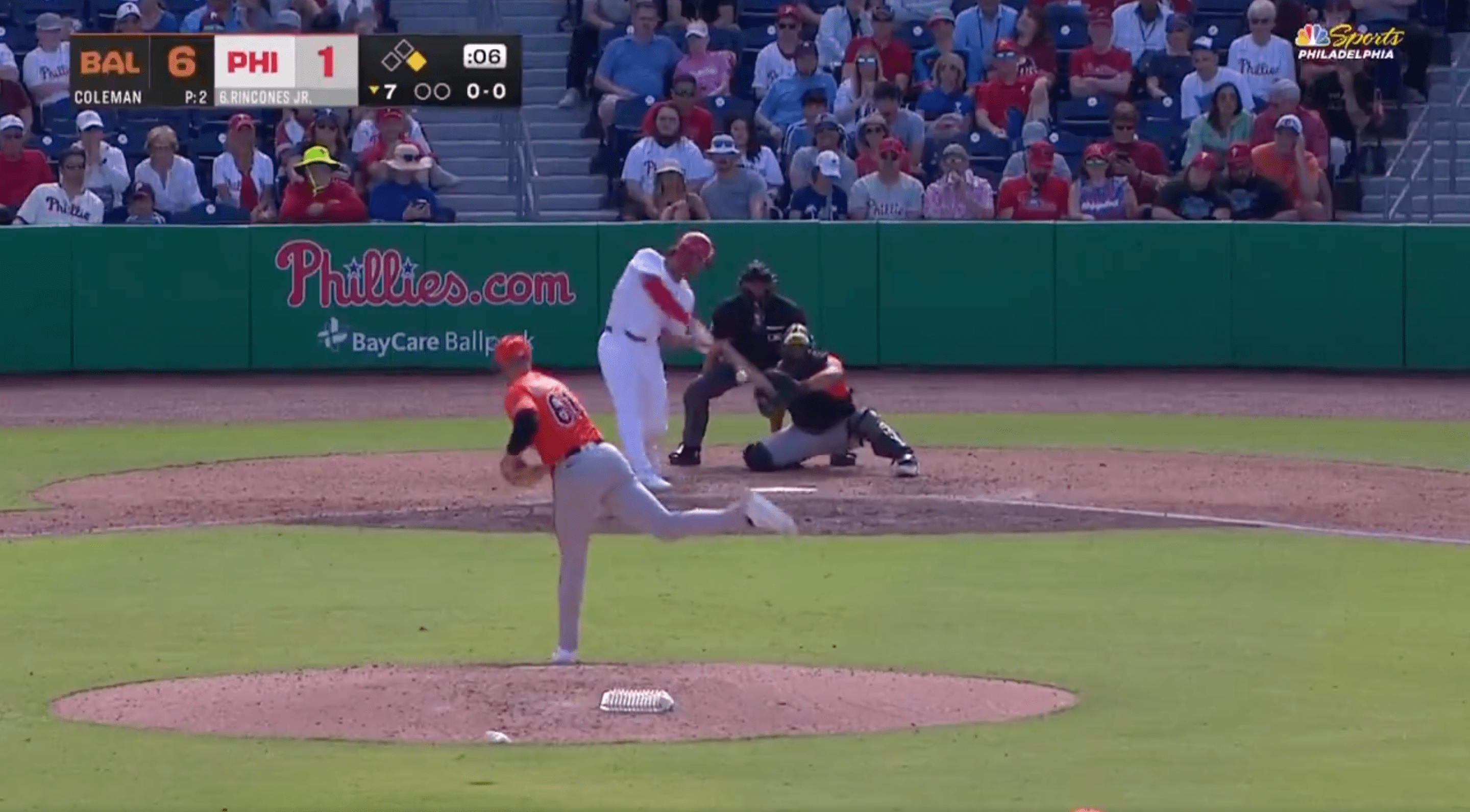
Baseball is still waking up. The players at spring training do not even have names on the backs of their jerseys. They are here to earn that right.
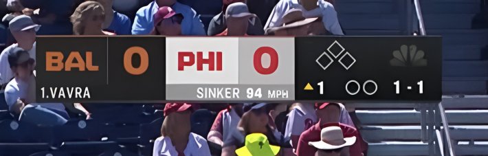
The play is atrocious. But what's worse is that my beloved NBC Sports Philadelphia has changed their scorebug. Above, you can see the image I was forced to watch all day yesterday while a bunch of spares tried to throw sinkers that never sunk.
Before we begin our dissection of the new scorebug, let's take a moment to mourn what we have lost. Here's the scorebug NBC Sports Philadelphia has used for years:

You may notice that the right third of the scorebug remains largely the same. This is true. I have no qualms with that part of the scorebug. But the portion of the scorebug that actually tells you the score is entirely new. The old version of the scorebug was colorful! It had the team logos! It looked nice and clean!
In this particular matchup (when the Phillies play the Pirates), the scorebug even spells out "poop," which is fun and exciting and beloved by fans. What little joy we can find in this world has been robbed from us in favor of a new, simplified scorebug that does not spell "poop."
Let's look a little more closely at this new scorebug:
To do so aesthetically and comprehensively, we will consider each of the principles of art and design.
Balance: There are only three types of balance: symmetrical, asymmetrical, and radial. Here, we see some symmetry: The Baltimore rectangle and the Philadelphia rectangle are kind of the same, in theory. The symmetry within the scores, however, is unequal. They are a repeating pattern (team name, score number), but symmetry requires a mirroring effect. See how in the old scorebug, the scores themselves were perfectly mirrored, with the numbers in the middle? That's visually very satisfying. It looks nice!
Emphasis: The major goal of a scorebug is to show you the score. Emphasis, then, should be on the scores. But because equal visual weight is given to the names and the numbers, it is harder to see the scores at first glance than it was in the old scorebug. Because of the strange three-color problem within the Philadelphia score, the main thing being emphasized are the letters PHI, which is not good!
Movement: In visual art, the path that your eye takes through a piece is called its movement. What you want, ideally, is for the eye of your viewer to move around within a piece without ever getting stuck. When the scorebug contained logos, the shapes of the logos created a more dynamic visual appeal. Your eye could curve around the P, hit a number, sneak over to another number, then follow the swoop of the other P into the side bar. With the new scorebug and its many straight, boring, unequal lines, the eye stalls. There's nowhere to go. You get stuck somehow on the barrier between the Baltimore score and the Philadlephia one. This sucks!
For sports broadcast purposes, movement is not just within the scorebug but within the entire screen. NBC Sports Philadelphia places their scorebug in the upper left corner, which works generally for baseball because not a lot is going on up there. But because of the color choices, the scorebug here has two equally difficult problems: The black of the Baltimore score becomes lost among the crowd, and the white juts out loudly. My eye continues to be drawn to the white square and then back into the game without consuming any other information. That's not what you want!
Pattern & Repetition: Theoretically, there could be a really nice pattern in this scorebug: black, white, black. But the three colors used in the Philadelphia square background, versus the black background everywhere else, makes the bug feel unbalanced and confused. It also ruins the possibility of a pattern!
Rhythm: Rhythm is the weakest of the principles of art and design, because you create rhythm by using patterns. Here, the failure to make the white square all white kills the rhythm of the piece. But also, stupidly, the rectangles that house the scores are slightly shorter than the rectangle that holds the outs and baserunners. This prevents an easy rhythm and instead replaces it with someone who can't clap on beat.
Proportion: WHY THE FUCK ARE THE NUMBERS ONLY SLIGHTLY BIGGER THAN THE TEAM NAMES?! This makes no sense at all. Either they should be substantially bigger, creating a fun disparity in proportions, or they should be of identical size in order to create better rhythm. Instead what we have is a space where nothing feels satisfyingly equal and nothing feels dramatically different. It's the worst of both proportional worlds.
Variety: Part of what I loved about the old scorebug—which you see in a lot of modern scorebugs—is the use of the team's logo. This is because the visual distinction of the logo, pared with consistent font and colors for the rest of the bug, creates a really satisfying shape and feel. The Super Bowl scorebug was pretty widely derided in part for this reason. As my Scorebug Snuggery roommate Lauren Theisen wrote, "The more important part of the stop sign, for a driver trying to take in a wave of visual stimuli all at once, is the red octagon, not the literal word 'STOP.'" She's right! A visual cue like a logo is always going to be easier for an audience to consume than letters.
Plus, using different elements can hold the viewer's attention for longer. You could argue that the scorebug is supposed to be an unobtrusive object that you glance at quickly, but in that case it would need to be stronger in repetition, equal in proportion, and heavy in pattern. It would need to be symmetrical and able to disappear into nothingness in the brain of the viewer. The problem is that the scorebug is most often used by people who are distracted. If you are extremely focused on a game, you check the bug less. If you are, say, walking through a bar, you might glance up and want to see the score. The new scorebug makes that task just a little bit more of a strain.
Unity: The ideal scorebug, I think, feels unified within itself and separate from the game. It is a gorgeous accessory that pops only when you need it to. This is why, despite their simplicity, the very contained rectangle scorebugs where one team's name sits on top of the other feel satisfying. The borders of the box are the same color! The whole thing looks like its fits together. Here, not only does the light-gray background make it very difficult to read the words under the team name from a distance greater than one foot, it also disrupts the unity of the bug to have a totally separate color shoved in the middle. This could be (theoretically) fixed by either having a unified border or switching the black of the Orioles score background so that it too is a different color.
Verdict: Like the level of play during spring training games, this scorebug has plenty of room for improvement. It's boring, and not in an interesting way. The scorebug is proof that sometimes doing the simple things well (like fielding a ground ball or displaying the score of the game) can be very, very difficult. But a scorebug should not look difficult. It should be both pleasing to the eye and very forgettable, because it creates no visual friction in its consumption.
Luckily, there are still many weeks before the season starts. It's not too late to change the scorebug back!