For the past two years, my New Year's resolution has been "More charcuterie." I made this resolution kind of as a joke at the beginning of 2020 because I was entering a really uncertain time in my life. More uncertain, really, than I even knew then, and more charcuterie seemed like an obtainable goal that would bring me joy. I succeeded wildly at having more charcuterie in the year stuck inside, but decided that I was too tired for a new goal in 2021, so I just carried it over for another year. Again, last year, I had a lot of charcuterie. I feel confident saying that this goal is now complete. So I've spent the past week trying to think about 2022. How do you make a goal for a year that feels uncertain at best? I had hoped that maybe this would be the year that broke me down enough to not feel like making a goal. Maybe, goals would be dead to me.
But I forgot about the mind game this dead week between Christmas and New Years always plays on me. I hate the end of the year because it is the season in which I am the most irrationally, enthusiastically, optimistic. No matter how good or bad the year before has been, and no matter how many times I tell myself that the end of the year is an arbitrary moment determined by almost nothing, the minute my little paper planner starts getting to late December, I become convinced that the next year, everything will be better. It always could be, I guess. That's the benefit of an unresolved future. Everything is still possible.
This year, I've been thinking a lot about how to improve my life in ways that aren't "optimization." Most New Year's resolutions I have made in my life are ideas like "become healthier" or "move more" or "[insert professional achievement]." We are sold New Year's and the New Year as a time to fix ourselves, to change the things we don't like, to treat our lives and our bodies like a machine that can be oiled and run more efficiently. It's a kind of work-first mentality I've been working hard to push back against, but one that doesn't change easily.
The good thing about this kind of meandering questioning of what I want this year to look like for me is that it has caused me to think a lot about what I prioritize, about what I've loved this year. How do you draw out a parameter for your year without making it a box you can't break out of? How do you envision a shape to squeeze yourself into without making yourself unhappy? I don't know.
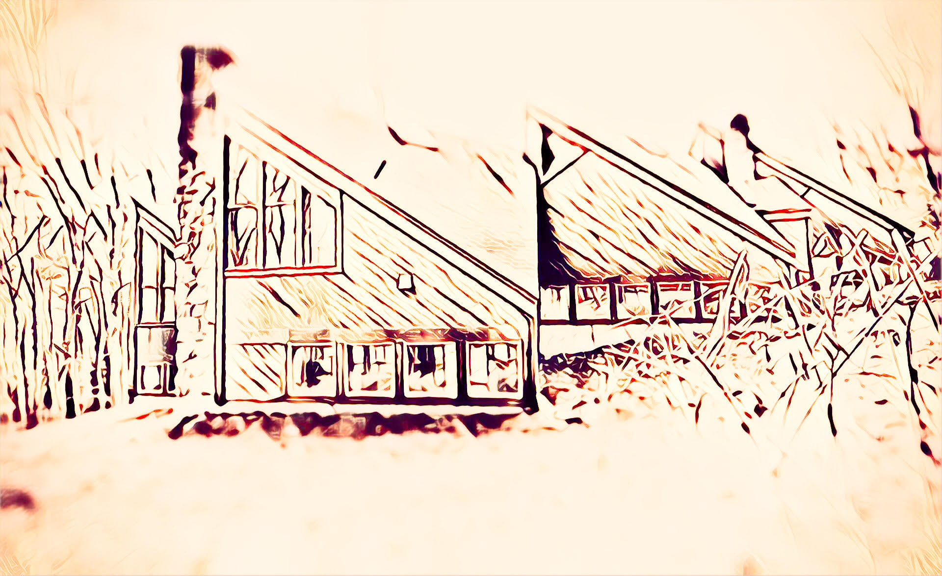
Luckily for me, this week's house is all about breaking out of squares, in that this week's house is all about TRIANGLES.
This week's house was sent to me by a reader who grew up in this part of Connecticut but swears he's not a rich jackass. "I know you've recently done one sideways house, but that was more like a square that turned into triangles because it got tipped over. This one, on the other hand, is all triangles right from the get go." Incredible lede, thank you. I am intrigued.
Alright let's see what we have here. Oh, shit! Look at this!
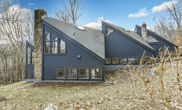
Wow, fuck yeah. Let's circle around the outside before we go in. Look at this angle!
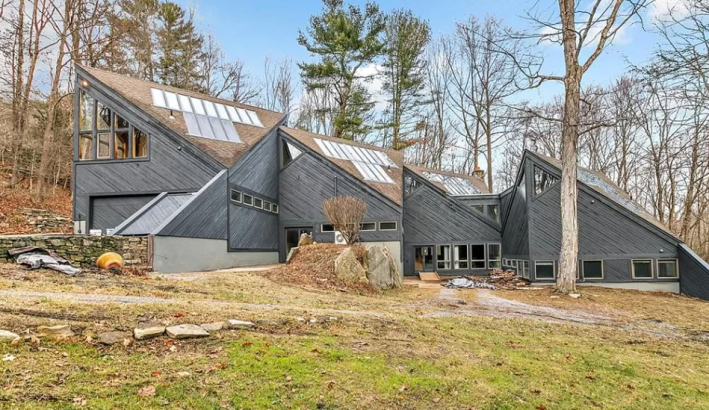
I am all hepped up already just looking at these two images. Y'all know how much I detest boring house and how uninterested I am in something that everyone could like. This is clearly special. This is a good house already.
The reader who sent this (very helpfully) provided a lot of clarity on where this baby is located. "It's a very quiet, rural, hilly part of Connecticut, largely indistinguishable from what's over the line in NY or MA, all together the southernmost part of the Berkshires and really quite nice," he wrote. I once went camping at Taconic State Park and had a lovely time, so I'm already very interested in this. "The house has a Sharon address, but the closest town (hamlet/village really) is Cornwall Bridge, which is as quaint as you'd expect a town named after an ancient covered bridge to be. The whole area is incredibly quaint and peaceful in that unfakeable old money sort of way," the reader said.
HAMLET/VILLAGE!? Hell yeah. I love this for us.
Alright, let's look at some stats, shall we? For $589,777 we can have this triangle house complete with four bedrooms (!), four bathrooms (!!), and 3,019 sq/feet (!!!!). According to the little description, this house has been in lots of magazines because it's a beauty queen, and also is passive solar! Eco-friendly triangular icon! It was built in 1989 just like Taylor Swift. Incredible. Let's go in.
Despite this listing conveniently providing floor plans to orient us, the floor plans confused me and I could not understand what they were trying to say. I looked at these photos for a good half hour, trying to understand where we entered this house, and which rooms went where. I am still confused. I am somewhat confident that you either enter through the garage (if you live here) or through the double doors on "lower level-Floor 2" which would put you right here, where we will start.
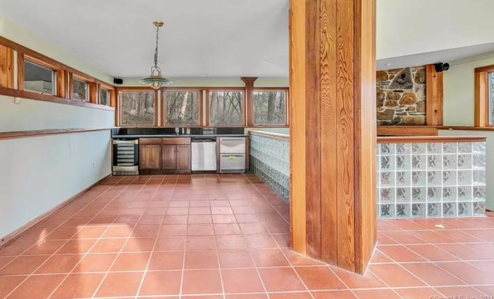
This room, I do like. I'm intrigued by this giant column and the problems it causes for flow and for design. Do you hang art on it? Do you add shelves? I like the glass bricks even though many people abhor them. In a house like this with so much light, I imagine they add rainbows and strange shadows that I would really enjoy. Again, though, the fixtures in here are outdated and easily fixable. Don't tell the other people at the open house how much a big rug and new overhead light could do in here.
This room has some appliances that confuse me. I understand that we have a wine fridge and a dishwasher but what is that other two-drawered appliance? What are rich people doing in their houses? They have so many appliances.
I would say that this is a terrible kitchen, but this is not the kitchen. This room is labeled "living room," which ... OK. So this is a bonus kitchen. Of all the things that luxurious houses have, the wet bar with a dishwasher, to me, is the most luxurious. Oh, you want a beer? Don't walk more than one room away. There are some right here!!!
Over top of these glass bricks, we have another part of the living room in which there is a fieplace
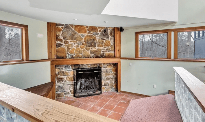
Already, I can tell that the occupants of this house have a clinical illness that makes them afraid of colors. This is bad. This nice built in U-shaped bench around the fireplace could be kind of cozy and nice with a better fabric and some big pillows. Instead it looks cold. Because this house is a little difficult to navigate, I must brief you before we continue.
There are two "floors" of this house. A lower floor and an upper floor. Each floor is divided into four sections, which are all on different levels. So between each of these rooms there are a few little stairs. This is why the floor plan is so hard to read.
We will go down the few stairs to the right of the fireplace first. Here we find two bedrooms, which are not pictured, and this bathroom.
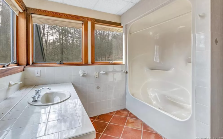
Would it have killed the realtor to wipe down this counter before taking this picture? Everything about this image is actually a little concerning to me. In the top left corner, you can see what looks like water damage on the drop ceiling (WHY). It also looks like there is some kind of water residue on the tiles near the tub. This room is also a great example, though, of why you should buy a house that hasn't been redesigned and upgraded. A few little changes in this room—new curtains, better fixtures, an accent tile, a shower curtain, and a couple knick-knacks—would make this look like a fancy bathroom pretty cheaply.
OK, this was rather boring. Back up the couple of stairs, past the glass bricks, up a couple more stairs and we find ourselves in a room called "foyer." There are no photos of this room. We must just believe it exists. Next to it, is this bathroom.
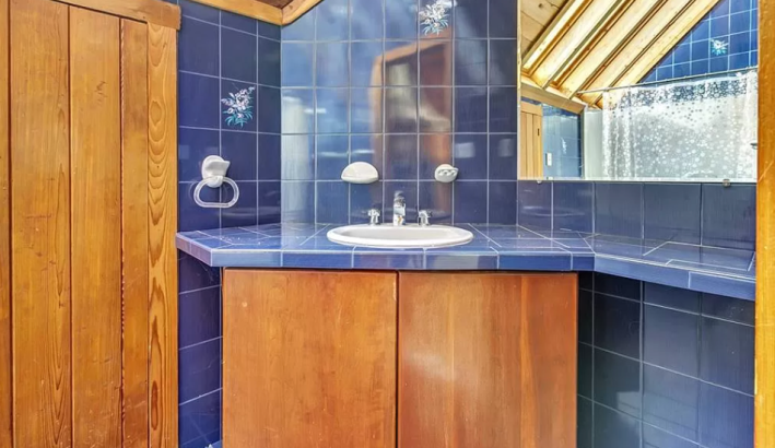
I would personally like to have a word with whoever took the photos of this house. The BEST thing you can do for a house is make the photos easy to navigate. I should get a sense of where I am in the house and how these rooms connect to each other. That is what makes me feel comfortable. It's what allows me to imagine myself living in the house. This house, does not have that. There is not even a virtual tour in 3-D or on video that I could watch to orient myself. Awful.
In trying to find a virtual tour, though, I did find something that made me love this house even more. It was bought in 1995 for $150,000 and then not sold again until this year, when it was listed at $599,777. When I did my usual creepy reporter research, I learned that this house was lived in and owned by a man who died in April 2021. In his obituary, it said that he "Built his dream house with his wife, raised two daughters and enjoyed collecting handcrafted furniture and great wine." That's really nice, isn't it? I forgive the fact that I cannot understand where the foyer is to get upstairs and instead we will just look at the nice photos of the next level and enjoy them.
Here is the kitchen:
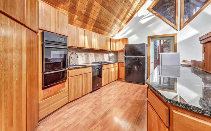
Wow, yes. This is cool. I do not love that the flooring chosen for this kitchen does not contrast the cabinets/ceiling enough, but I will allow it. The other bad thing about this kitchen is that the fridge does not really fit. A narrower fridge would look better here, or even one that was somehow built into the immense number of cabinets on this wall. There is also a strange appliance by the fridge that blocks entry to the this door (which I think leads to one of the MANY sunrooms in the house) What is that? Is it a wine fridge?
Here's another angle:

Oh wow. This is exactly the shit I like. Look at all these angles!! Look how you can see up to the next level but not entirely. Look at all of these shapes! So visually appealing, so mesmerizing. I love all of these sky-facing windows. That is very satisfying to me. I imagine my currently dying plants would be much happier. I do not know what the little box on the counter is for. It upsets me that it has a light switch on it. What is happening in there? My impulse says to put bread in there but then why would it need a light switch? They had electricity in the 80s so it's not like it had to be retrofitted. Let's move on.
Here is some kind of living room? Maybe this is a play room? I'm not sure.
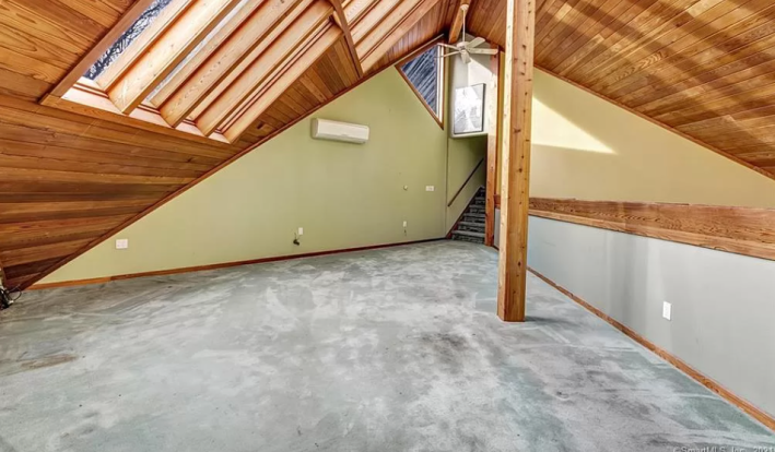
I usually hate all carpet because I think it doesn't look nice and it makes me all staticky, but it does look nice here to have the blue/gray carpet and the yellow walls and the vaulted ceiling. It's playful and beautiful. This is a good room. Here's another:

At first I thought that this room was the foyer, but it is not. I think this is second-level floor four, which is directly above the two-car garage. It has this adorable little balcony. Imagine being a kid and having this room. I would hand sparkle lights from the balcony. I do find whatever that baseboard level door is to be unnecessarily creepy. It really upsets me. What goes in there? Where does it go? It's not a laundry shoot, I don't think? It would be very inconvenient to have to drop your laundry all the way down there and the wall doesn't look thick enough.
Here is another room with one of those weird doors!
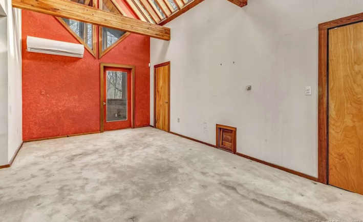
WHAT ARE THESE? Why are they here! Are these like little cat doors? Please, someone from the northeast help me. Are these a normal thing? Do you know what these are?
I also like this room with the red wall. It's the first colorful wall we've seen in the whole house and it really works! Look at that pop! Look how fun it is that they painted the door too. I wonder if this was one of the daughter's rooms who grew up in this house. I hope so.
Finally, this is the last area of the house to see. I think it is the main suite.
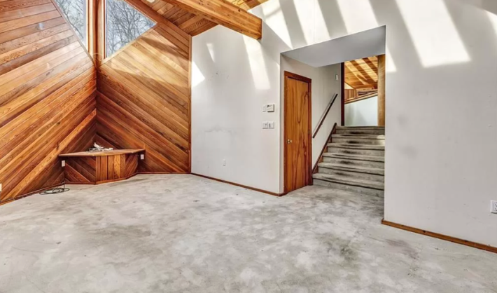
This all wooden wall is gorgeous. Imagine putting a sculpture there on that wooden platform. Or a big mirror. Imagine having such a nice, open house full of light and past love. This big room has an attached bathroom
Here it is!
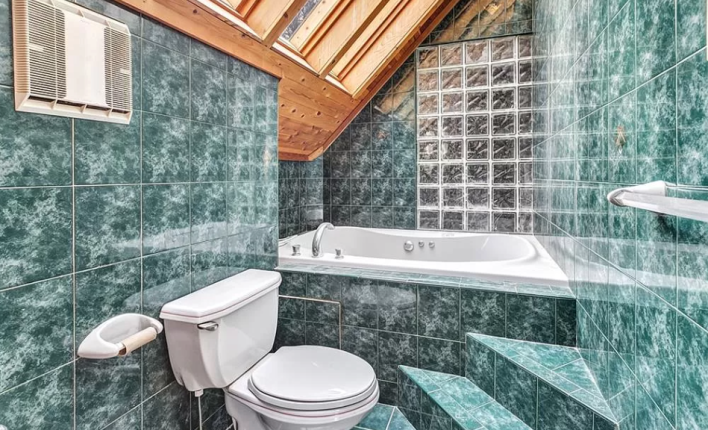
Wow wow wow. this bathroom has a bidet, too. Ooh-la-la. Beautiful. Someone definitely could have replaced the toilet paper for this photo, but I love this giant tub. Am I terrified of those slippy, slippy stairs? Yes I am! But I would die for this tub. It looks like it would cover my entire adult body!!! RARE AND UNIQUE! I also like the use of glass bricks for light in the bathroom. And I do like this green. I find it pretty and exciting. All of these tiles line up perfectly even as they change size toward the back of the tub, which is beautiful to me.
I'm glad the reader sent in this house, because it has really reminded me that what matters in our goals isn't what we are trying to change but the life we are trying to have, the version of our self that isn't "better" but is perhaps "happier." This house brought a lot of joy to this family for a very long time. You can see in its bones that it means something, that it's not just a space that exists and continues forward, but one that stands solidly in who it is. I want to be more like the triangle house in 2022. More silly and more welcoming and more relaxed and more focused on making my life happy and filled with light than worried about the small things. Or maybe the resolution should just be "more triangles." Only time will tell.
This house has been listed on Zillow at $589,777 for 18 days. If you buy this house, please take a video walking around it and email it to me so I can understand its layout.
