There is a lie that permeates artistic discussions about space. The theory, it goes, is that the artist needs infinite free time, infinite solitude, infinite room around their little brain in order to produce anything worthwhile. I understand where this mindset comes from. Part of it persists, I think, because there is always a moment—be it a minute or a few days— after return from a vacation where your creativity exists in heaps. Because your brain has had a moment to work in the background without your intervention, it is easier to move forward.
But a large part of this belief, whether people want to recognize it or not, comes from the history of art and who gets to make it. Many people believe that the only way to produce anything of value is to work very little because for a very long time the only people who got to produce anything creative at all were those with large amounts of family money. There is a distaste for what I will call, for lack of a better analogy, reps.
Everyone wants to believe that if given a house on a plot of land and an income and no other responsibilities (perhaps a picnic basket of lunch delivered to their door every day), they would be able to write the next great American novel. I think this is kind of stupid. Sure, it is nice to have space for your art, and definitely you need time (which is a luxury that not everyone has), but you do not need to be secluded in the woods. You do not need to separate yourself from society. You certainly to not need to focus only upon making something great.
When you do that, laser focus onto the idea of greatness, you lose all opportunity to reach something meaningful because you are so focused on what the art can do for you and not enough on what the art wants to be. This is a whole lot of theory to say that rationally, I do not believe that running away from my problems and the world would fix the creative issues I have been having recently. But emotionally, I still buy wholesale into the garbage cultural theory that it might.
Today's house was brought to my inbox by Emily. She said that Zillow has become part of her "self-soothing pre-bed time browses" (same!), but that this house is NOT bedtime browsing. It's a house for art, in theory, but no art that she (or I) want to see!
Emily found the house because she was browsing real estate in New Mexico because "it’s a blue state with Mexican food, so it’s nice to daydream about a state where the politicians don’t actively court my death by guns, disease, carbon monoxide, hypothermia, hyperthermia, or pregnancy misadventure." As someone who grew up in Texas, I feel this sentiment in the pit of my stomach.
New Mexico is also a great state to dream about. Maybe the sky could solve all your problems. Maybe if you went there and got a big hat and worked on your art all day long and never, ever had to read emails you could be the next Georgia O'Keeffe. Who is to say you couldn't?
Anyway, this house is a good reality check. The listing says that part of this house is being used as an art studio. It is in Albuquerque, and the blurb promises "soaring ceilings." At three beds, three baths and 2,994 square feet and listed for $678,000, it certainly doesn't seems like the worst house we've seen.
But Emily warned me. She said, "It feels like a dream house, in the sense that it was built based on plans made in someone’s dreams, when they couldn’t read or interpret measurements." Terrifying.
Let's see what we have here. Take a gander at this week's house:
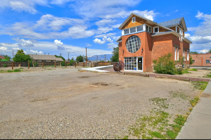
I gotta admit, it always freaks me out when there is a photo like this first in the slideshow. This is not a great picture of the house, but it also makes it clear that the house is surrounded by an empty parking lot. The lot says it is .31 acres, so I assume some of this parking lot would belong to us. But do we want it?
Before we go inside, I also want to acknowledge the football-sized red flag swinging dangerously in front of my face right now. Until maybe this month, the market has been a seller's market. Houses had been flying off Zillow before I can write about them because interest rates were low and people were snatching up houses left and right. This is no longer true. Houses are sitting for longer in a lot of places.
But this house. Hmmm. It was listed in May 2021. It did not sell. The price was dropped and it was relisted in September. It was pending sale within two weeks, but then, something happened. The sale did not go through. Again it was listed in December, and had a pending sale in January. AGAIN, the sale did not go through. Yet again, it was listed in early May, very quickly had pending sale, and then back on the market again the first of this month.
So something is very, very wrong with this house. It seems like many people have looked at her, been convinced they can fix her, and been told in no uncertain terms by an inspector that she is unfixable.
Here is the monster:

Wow. I'm not even sure where to start with this. There are some weird textural decisions here. There is brick on the floor and on the wall. There is some kind of terrible jail in the lower right hand corner. These stairs are ... a death trap. And listen, I live in a place with some death-trap stairs right now and they are not this scary. This is a great place to twist your ankle for sure!
I am also not sure how to feel about this opened ceiling. I understand the impulse to get rid of drop ceilings, but now look at this:
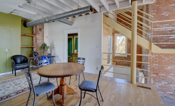
That pipe isn't even going anywhere!!!! It's just a like industrial-adjacent design in a space with a lot of softness. The metal stair banisters that are painted yellow are particularly upsetting to me. Who did this? Why! Who put this window into the stairwell? Why has god forsaken us? We'll never know.
I guess let's go in that little room over there.
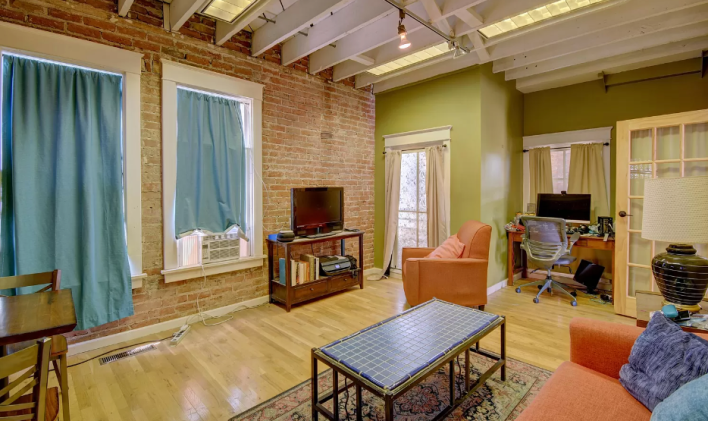
Oh, it's an office/living room/TV room/cafe! Totally normal!
I never like it when windows are covered in Zillow listings because it makes me afraid that some terror lurks outside. Could the windows not be open for one minute to take this photo? Scary!
I also do not like this window-unit air conditioner. New Mexico is hot! Soon it will have no water! Here is a place where so many ways to die come rushing at you from every direction
On top of all of this, the floors either look fake or are fake, and they look bad. Also, why does that lamp look like it contains the ashes of a relative that no one likes to speak about? The vibes could only be worse if this were that one house with the whole prison.
Let's go where I think is upstairs but where I know is definitely the kitchen:
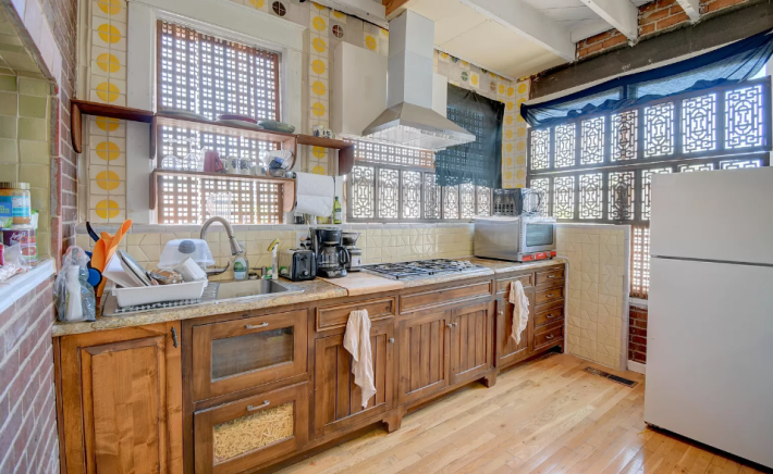
Ah yes, a kitchen. It has all the normal kitchen things like, uh, a drawer with a glass window full of noodles? Normal!
Again we cannot see out the windows, which scares me, but we also cannot see an oven. There is a stovetop and a toaster oven, but no regular-sized oven. Maybe it's too hot in New Mexico to cook in the oven. And call me old-fashioned, but I think an almost $700,000 house should come with a damn dishwasher.
I do really like these tiles with the yellow circles on them. That, I find enticing. But if you look closely at the green tiles on the left, you will see that they have been laid into the wall crooked. That does not bode well.
Moving on, we have a bedroom.
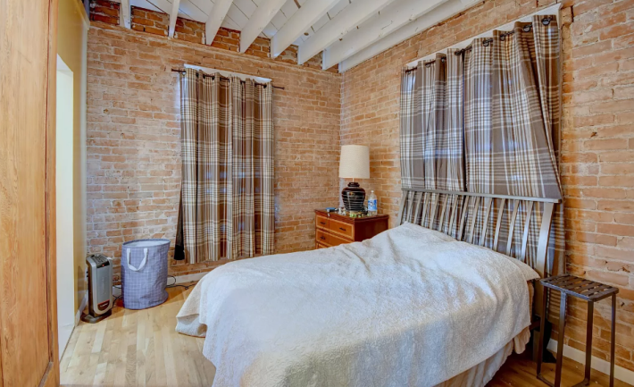
It's boring. I hate it. I do not like how the bricks are whitewashed only part way up the wall. I do not like this weird plywood wall. I hate all of this. I didn't even include the photo where someone has attached saltillo floor tiles to the walls. That felt like a step too far.
Here, let's see the basement.
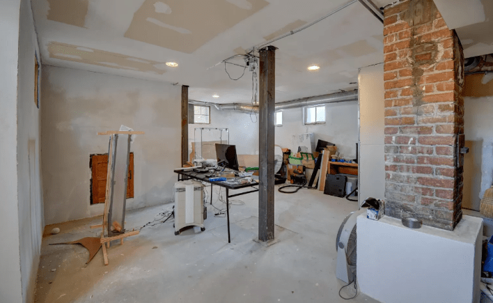
No. No. No. No. No. See that wet spot on the column? To me, that screams WATER DAMAGE. See that big fan right next to it? More water! That can't be good.
The description said that this space is being used by an artist, and I cannot imagine what kind of artist can work in a space this ugly. I do not wish to. Just like I do not wish to imagine what could come out of that small unfortunate door in the wall, or what that wooden contraption is.
It is hard to believe this is a space for creation, even though it does have some natural light, plenty of privacy, and enough terrible vibes to script an entire horror movie.
Oh! Here's the stove!
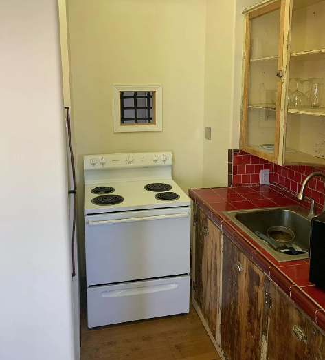
Where is this? I could not tell you! It's a different room. Is it upstairs or downstairs? How are you supposed to navigate things into that strange space? Does that cabinet open or is it blocked forever? These are the unanswerable questions of our age.
There are also some wine glasses down here, which is good I guess, but what's very concerning is that from here on all of the photos appear to have been taken on an iPhone. That is not good. That is a terrible sign for a house this expensive. Hire someone to take the pics! At the very least turn your damn phone to landscape so that the pictures will fill the whole screen. No, this is cropping something out.
Here's another iPhone photo:
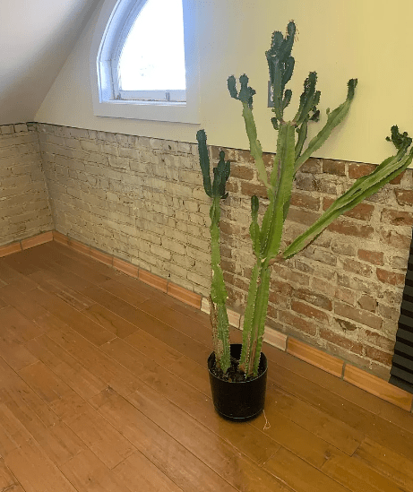
Wow, a cactus. Very ... informative. This photo does seem to highlight that not only is the baseboard made out of small sections of wood, but some of them have not even been stained the same color. What a mess! This also appears to be one of the only rooms of the house without tons of natural light, so I'm not sure how the cactus has survived this long.
There is one more thing we must see. Here it is:
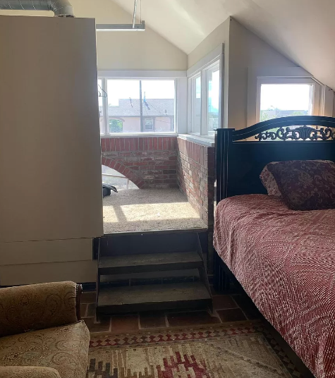
What a beautiful photo to encompass all of the problems with this house. Here we have a late-installed top floor that cuts off the big circle window that we could see outside. We have an aesthetically added brick wall that does not appear to be structural in any way. We have both a light fixture low enough to bump our head on and a sloped ceiling to bump our head on. These steps are ugly AND there is carpet. What a whirlwind.
This is a great reminder that the grass is not always greener. Running away to the desert will not reinvigorate our creativity if we have to live in this terrible house. This is where creativity goes to die.
This week's house has been listed for $678,000 for one month. If you buy this house, please keep me updated. I think perhaps the most creative person in the world could fix her.
