Whenever I am in a depressive episode, as I am unfortunately now, I cannot read any new fiction. Maybe it feels too much like my job or maybe I just want the pace of older books: how they take a hundred pages to build momentum, how the tension lies in a glance or a brushed hand or a memory drug up from the subconscious. The best books for this state, to me, are novels from the early 1800s until before the First World War. If you get too far past the First World War, the plots are too relevant. There is no separation. I guess I could also achieve this by reading any genre fiction, but I want the slow boil of a long family drama, the hot wit of a good satire, the anguish over love, always love.
This week, I have been reading Sanditon. It was published for the first time in 1925 under the name Fragment of a Novel, because it is just that: an unfinished Jane Austen novel. I didn't know about this book, somehow, despite taking an entire course on just Austen's canon, and was thrilled to learn it existed. It was the book she was writing when she died in 1817. There are only 12 chapters in the book and I am almost done with it, but something that I have been mulling over is the early 19th century experience of treating mental illness in rich people with a trip to the seaside. One of the book's characters, Mr. Thomas Parker, is obsessed with the idea that the sea is beneficial for one's health.
I love this because one of my favorite jokes to make is that I wish my doctor would prescribe me an ocean villa instead of "exercise" and "therapy" and "pills." But I also love it because I love Jane Austen. Every time I read one of her books I'm amazed by her in a new way. I found this really good article in the Jane Austen Society of North America (what a world) by a literature professor at King's College in London who, I shit you not, is named Jane Darcy. Sanditon and Austen, Darcy argues, are skeptical of the idea of baths that can cure you, of holistic medicine promoted by doctors who seem like hypochondriacs. Maybe the bath houses aren't always good. Maybe there is a reason to have your eyes wide open when you enter one.
I was thinking about all of this when I got an email from our reader across the pond, Jorma!
Oi! That's right! THIS WILL BE THE FIRST INTERNATIONAL ZILLOWING OUT! *airhorn noise*!!! You didn't think I was going to write about Jane Austen and then drop us in Delaware, did you? I would. I absolutely would. But not today. Today we will learn that not only are bad design choices international, but so is the use of the word "unique" to describe them. Incredible.
Jorma told me he's lived in England for five years and found this house while "trawling around Rightmove looking for English properties I can't afford, in the vain hope that I might stay here instead of moving back stateside one day." Rightmove is some kind of British cousin for Redfin, I think. It's unclear. "Apologies if it's a breach of etiquette to use realty sites other than Zillow," he said. Very courteous. But all housing sites are Zillow if you just close your eyes and click.
Let's get into it, shall we? This house is in St. Leonards-on-Sea. That's a British-ass name if I've ever heard one. I googled this town and it is at the bottom of the island near the channel. It is right near Hastings, a town I vaguely remember for having some battle I had to memorize for an AP exam and promptly forgot. I asked Jorma what this means and he told me, "Wouldn't necessarily call it the equivalent of the Jersey Shore (that's more Essex), but not too far off." Great. Love this vibe for us. He also described the house as "carny chic." Carny as in ... carnival? Yes. Carny as in carnival. But we'll get to that.
Here is the outside of the house:
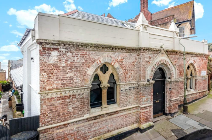
All right, hell yeah! We've got a house dating back to 1875. Sick. We've got some bricks that are nice and also some very cool window things. (Architects: What are these window decorations called? My Google search for "window decorations stone" did not work.) Rightmove very conveniently includes a HISTORY section for us, through which I learned that this was a Turkish bath house for six years before the abundance of bathhouses ran it out of business. Since then it's been a community hall, a church, and something called a "science glass factory." In 2013, it was purchased by the current owners, who rehabilitated it.
Here is the first line of the OVERVIEW section: "They say a picture tells a thousand words. So how do we attempt to describe the indescribable?"
If there is not a siren going off in your brain, I suggest you read the backlog. We can only be in for something very bad. Before we go in, though, let's look at this. Rightmove, very nicely, provides a blueprint of the floor layout for us to orient ourselves with! Wow. The British.
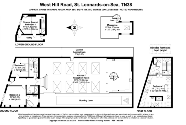
Already, I have a question and my question is: BOWLING LANE??? What. This is a very strange layout for a family home. We've got a giant reception room with two staircases. I can't even conceptualize what this is supposed to look like so I guess we are just going to have to go inside.
Here we are!
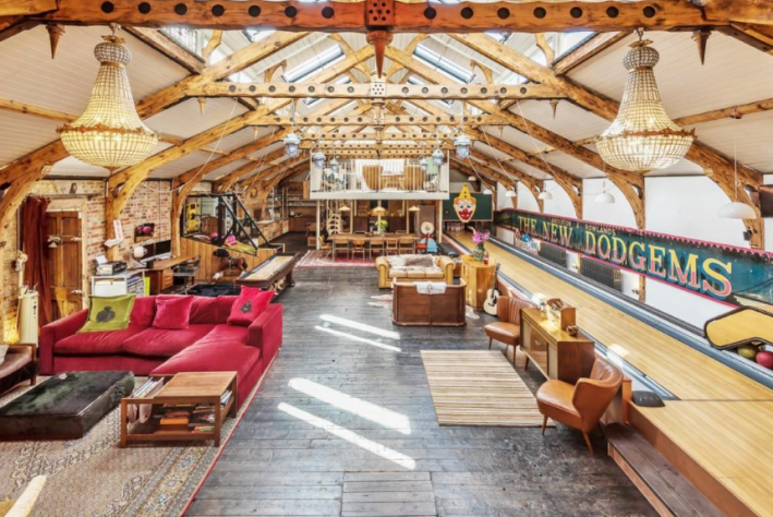
HAHAHAHAH! I hate it!!!! There is so much going on in this image. It is unclear where to start. This room is massive. High school cafeteria massive. Wedding reception hall massive. The floors are lovely, and honestly the bones of this room are not bad. I like the beams up to the ceiling and I love the skylights down the whole center of the room. I can imagine a version of this room that perhaps I would like: with its one brick wall and old floors. But instead what has happened is someone has tried to make some kind of Restoration Hardware goes to the circus event happen.
Looking this way, it's clear how much wasted space there is. That empty space with that sad little rug in the middle of this room is the size of my bedroom. (I'm using that chair for scale.) The room being so big does make it more understandable how they ended up with this bowling lane. Why does it have a clown on it? Why are there so many hanging lights above the bowling lane? Where did this giant banner with the name come from? God. Awful. The chandeliers make me want to stage a riot to tax the rich. What are these! They suck!
Let's spin around.
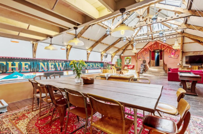
The giant table, I like. The rug, I like. There are many things in this image that I like and yet, it makes me want to gag. The light-up letters that don't fit correctly above the door. This house is £1.5 million! Can you not afford correctly sized vintage letters? There is something about the mint-green Warhol print that is really sending me over the edge. It's so bright. It's so ... boring. What's most upsetting about this "carny chic" design is that it's as if someone had a bad idea and didn't even commit to it. They wanted the palatable version of their taste, which, guess what? Still tastes bad.
The space itself is growing on me. The steps down from the entrance are lovely. I can imagine clearing all this stuff out and throwing a pretty good party in here. Let's go back to the other end and check out the kitchen.
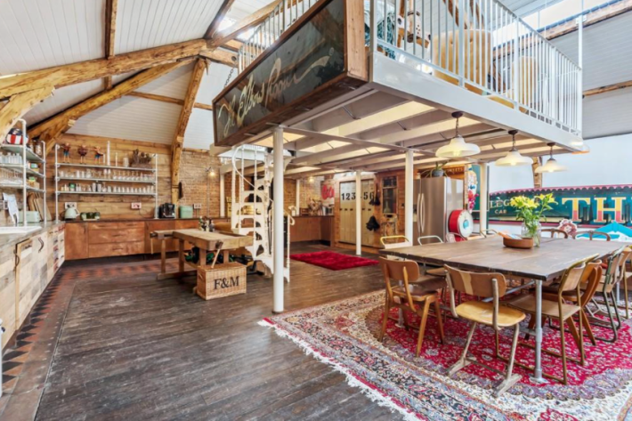
Ah. Here we have the classic nouveaux rich "hide your appliances" move. Except the cabinets look like some Joanna Gaines construction. They aren't bad, exactly, but compared with these old floors and old walls, they just look too shiny and smooth. They almost look like the "reclaimed wood" clapboard furniture they sold at Pottery Barn Kids in the mid-2000s. And we also have ... some lockers? My plan for an event space is evolving. These would be excellent for checked coats. But they are so small. And this is a family home? Did they have four kids? Where did they sleep?
Up these spiral stairs we have, uh, whatever this is:
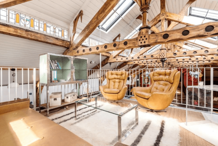
I have no idea what you could do with a space like this, besides turn it into some VIP lounge. Why would you sit up there? BUT! This does give us a nice view of the stained glass on the border of the roof which I couldn't see from the floor. That's really nice! I bet on the few sunny days England gets, this is really lovely. Shoved in the corner of the ceiling behind this is a little tiny room with a day bed. You could not pay me to sleep there.
There is also an uninteresting "cinema room" that is 80 percent couch somewhere in the corner over here. Next we have this:
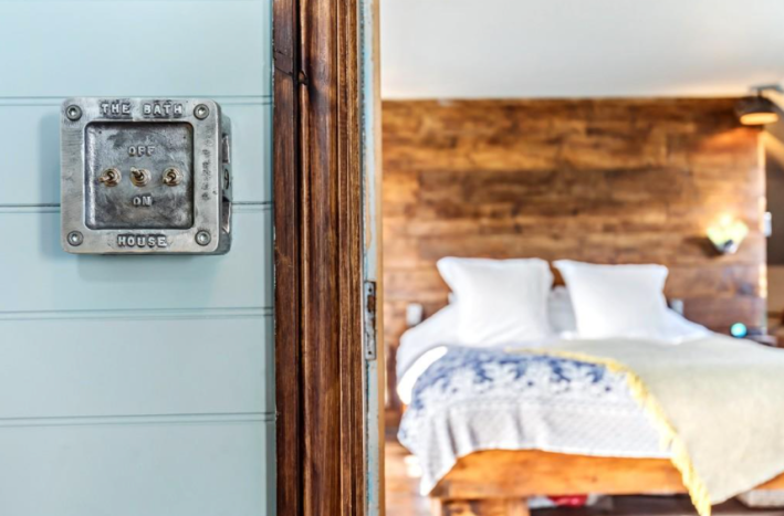
To be honest, I love this. I love that this switch was preserved. I don't know what it does now, but I find it very aesthetically enjoyable on the blue wall. The bedroom behind it looks like a fancy B&B room, which is a compliment. The ceilings are sloped but an illusion of height has been created with a tall, wall-like headboard made of not-terrible wood. There is a giant copper tub in this room that I personally would sacrifice several of my morals to have. It looks so deep. I want it.
Here is the other side of the headboard:
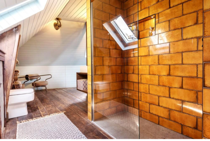
It's not ideal to have your toilet just sitting in your room without a door or anything, but I love the conceptual idea happening here with the shower behind the wall/headboard. I hate the tile, but tile can be replaced. What I don't understand is how this room exists in the same house as that terrible big room. The next bedroom is the same:
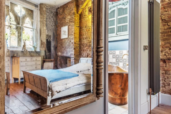
On top of being a very nice photo, this is another gorgeous room. Old brick! Old floor! Another giant tub!!! I chose this picture because from another angle, you can see that there is a cursed, Hobby Lobby-esque light-up cross above the bed. There are also some circus-font graphic design posters in this room that we will have to burn, but whatever!
The bathroom, as previewed, is lovely, with blue and white painted porcelain sinks. I have never considered the fact that porcelain can be painted and therefore a sink could be not boring. My eyes have opened. I hate my own cheap, ugly sink even more now.
Next we have a room with bunkbeds, and a boring shower for a normal rich suburban family. But then there is ... well ... what is this?

This is, hmm. What is this? It is not good, really? It's a tunnel? In the "key features" of this house there is a bullet that says, "Find the historic pool through the hidden tunnel." HAHA, no thanks!!! This tunnel is so small. I'm a pretty small person and I'm 99 percent sure I would not fit through this terrible tunnel. "Seems like if you advertise a tunnel, it should at least be able to fit a person inside it," Jorma said. Great point, Jorma!!!
Plus, what could be on the other side? What "hidden pool?" Does it hold immortality? Immortality does not interest me. In fact, I can't really think of anything I would go through this tunnel for. Maybe Jane Austen was right. The sea towns can't save us from ourselves. Or at least, this one certainly can't.
This week's house has been listed for £1.5 million for 138 days. If you buy this week's house, please invite me to every single party you throw there.
