Recently I have become very self-conscious about my apartment. The idea of someone coming over and seeing it fills me with terror. Our homes are a projection of us. They show who we are. You can tell so much about a person by the colors of their walls, the art they choose to hang, the styles they prefer.
I think part of the vulnerability I feel towards my home is related to the pandemic. I used to have people over to my apartment all the time! I thought nothing of it! But in the same way I have become hyper aware of the way I present my body out in the world, I am also more aware of the way my home presents me. There are lots of treasures here. There are so many things that I love. But there are also pieces of furniture I would never buy now, that I have had for a decade and never remembered to replace. None of the art is evenly spaced because eventually I just smash a nail into the wall to keep my own canvases off the floor. There are parts of my apartment that represent a version me I don't feel like any more, things I would never choose today.
Still, I love my apartment. The design style is: stuff I like, which is the design style that populates the home of everyone who doesn't have a degree in design. But because my taste has been consistent for the time we have lived here, most of the objects in my apartment are cohesive. They look cohesive to me because I chose them. They look like they all belong together because I like looking at them.
In reality, this is not cohesive design. This is chaos. Were I able to remove the rose-colored glasses I see my apartment through, I would see that most of the walls are the terrible color Renter's Cream, and all of the beauty hinges on the objects I have added. This week's house really opened my eyes to how the things that we love and the design decisions that we make can be absolutely inaccessible to someone else.
Reader Mark sent me this house earlier this week. "You think you've seen it all," he wrote, "Then you get to the last couple photos..."
Ominous! Terrifying! A perfect teaser.
After looking at the house and realizing he was correct, I asked Mark how he found it. " I’ve got a search on for places in the Hudson Valley, mostly as a curiosity at this point. I’m in the NYC area but just want to see what the market is like," he said. This is very relatable. I too have dozens of alerts for various areas of "the woods" and " the mountains" where some other (richer) version of myself might have a weekend home or some much different (less lazy) version of myself would move to to escape it all.
But none of my alerts are for houses above a million dollars because I hate remembering they exist, which is why I hadn't seen Mark's submission even though it has been on and off the market since October of 2019. Knowing how wild and profitable the real estate market has been during the pandemic, any house that has sat on the market this whole time should make us wary. I feel especially wary of this one, because not only has this house been listed forever, it started at $2.8 million. It is now listed for $1.5 million. That is quite a drop.
The pricing history is even weirder than that. This house was priced as low as $1.3 million at the beginning of January. It was then removed from the market and re-listed for $1.5 million this month. If this isn't an example of arbitrary price inflation, I'm not sure what is, because in my research, I couldn't find a single thing that is different now than last month.
This house is located in Wappingers Falls, NY. The listing says it is off Metro North, so I asked editor-in-chief Tom Ley, who lives off Metro North if there was anything to know about this town. He said it is "v tiny but kinda cute." Okay.
Let's gaze at the house for a moment.
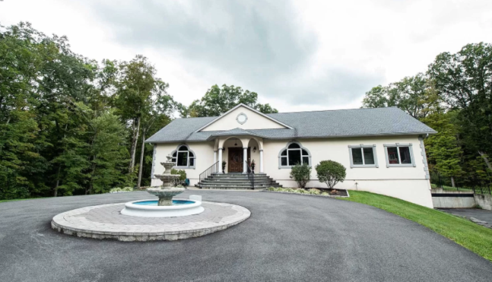
From the outside, this house looks like a regular suburban house if I built it on the Sims. My sister and I used to play the Sims every day and our favorite part was building the houses, but because we were bad at it we always did things like this: making one side of the house too long so that the windows aren't evenly spaced or placing a fountain in front of the house that looks off-center even though the game swears it is not.
This house looks fine, if boring. That road you can see in the corner of this photo goes to the three-car garage. This is luxurious. I do not really understand garages because I don't understand using square feet for your car. Perhaps this is because I have never had a nice car, but to me garages should be used for band practice or art studios or something. But I guess the people who own this house don't need the space because this house has...wait, that can't be right?
This house has 9,437 square feet!!! NINE THOUSAND!!!
That's too many square feet. Guess we should go inside and figure out what they are doing with them.
This is the view from the front door:
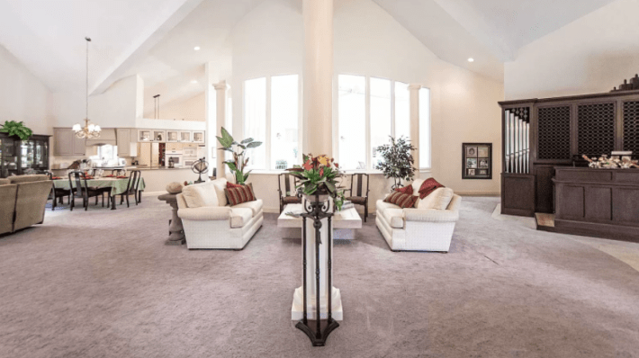
From this photo alone we can tell one thing this house is not spending square feet on: walls. This is just one big ballroom with cathedral ceilings. This is my personal nightmare. I hate carpet, but in this situation, I understand the decision. Imagine how bad the sound would ricochet across this room, bouncing back to you so that you couldn't even hear the person next to you, were there not all of this carpet to absorb any noise.
On the whole, this room isn't awful. At least there is enough space to make each section of the great room feel separate instead of a table just in the middle of your living room. I do love all of the natural light streaming in from these windows, though I don't understand why they don't match the shape of the cathedral ceiling. Isn't that the whole point of a ceiling like this?
Let's wander over here to the kitchen.
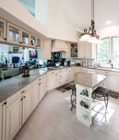
The fact that this photograph is taken vertically was very alarming to me. All photos of real estate listings are taken horizontally. Always! I'm not sure why really, but they are. This vertical photo looks like someone took it on their phone, which is never a great sign for a $1.5 million listing.
The kitchen, though, is pretty innocuous. The cabinets are not my preference, but at least they look nice and sturdy. This seems like the kind of kitchen that would have those drawer catchers so that you can't slam anything. That seems nice. I'm a little concerned about where the oven is and why the dishwasher is so tiny. This is a 9,000 square foot house! Why does it have a dishwasher the size of one sheet pan?
What's really concerning, though, are the windows. From the window above the sink we can clearly see trees. Through the far windows in the living room, we can also see trees. So why, in the main windows from the first angle, could we only see blinding white light?
There's something weird happening here. To understand it we must first look at this drone photo of the backyard:
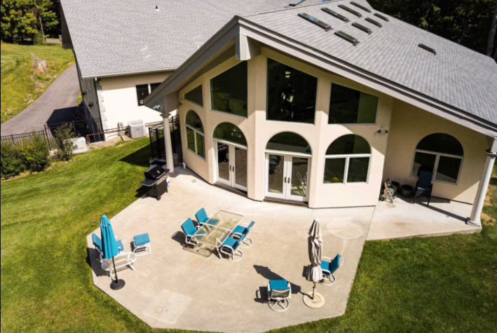
This is a fine backyard. The patio is extremely large and has very weirdly cheap furniture, but I like those two big double doors that could be opened and I like that someone decided to make the top of this patio octagonal instead of squared.
But those two sets of double doors are not present in the photo of the living room. The windows don't match.
I did not figure this out on my own. "When you look closely you can see how it sits behind the living room, so those big windows that might look onto trees actually are looking onto the walls of the pool room," Mark said in his email. And then he provided a very convenient diagram which I will share with you:
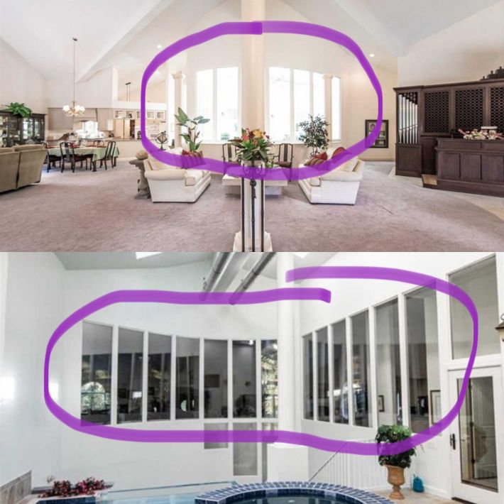
There is a pool... in the middle of the house. Mark sent some other pictures that show that the primary bedroom has a door that leads to the pool, the kitchen has a door to the pool, the outside has a door to the pool. Every room leads to the pool. The pool is the heart and the rooms are its arteries. The pool is the only thing that matters now. Look at the pool:
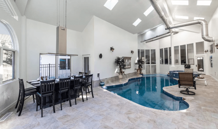
For a pool that is so central to the house that every single room leads to it, it's... kind of small. This is not a pool you can play volleyball in or a pool that you can swim laps in. It looks pretty shallow. I do not like that it is so wavy. This seems, to me, like a waste of perfectly good pool space. I am all for designing things so they are beautiful, but this wavy pool isn't beautiful. It's like a terrible amoeba. My editor Justin said: "this pool is shaped like an ill kidney."
This house, unlike others we have seen, at least has some ventilation. Someone has considered the fact that steam and humidity and mosquitos are not very appealing house amenities. But the result of this is a room that has a cathedral ceiling, an industrial open-air ventilation system, tile floor that looks like it came straight from an early 2000s McMansion and a pool and hot tub perfect for a 1970s party home.
Why is this table here? Why waste valuable pool space on a table?
Oh my god.
It's not a table.
It's a HIBACHI GRILL!!!!!
That's why it has this ridiculous smoke vent above it! That's why there are only chairs on three sides of it! "Pool area hosts a Hibachi Grill for your personal dining needs with a dog kennel temperature controlled adjacent," the listing reads. What kind of personal dining needs require a hibachi grill! Will you cry if you cannot have a stack of onions spurting steam from a hidden pat of butter aided by the spatula of a chef saying "choo choo." Is it really a NEED to have someone flip peppers up into their chef's hat and pretend to have lost them!?
Let's go in this door over here.
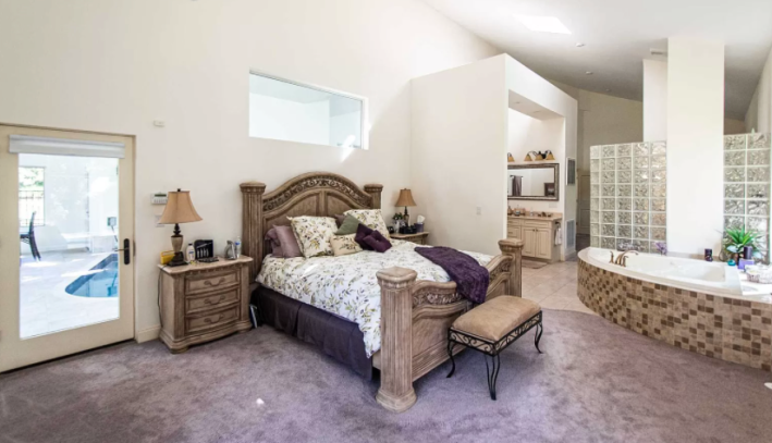
Okay. It's a primary suite. I am not necessarily opposed to the "adult hotel" vibe of having a giant quarter circle tub right next to the bed. But if you are going to make something so objectively kinky, you cannot attempt to tone it down to the sterile sad hospital vibes happening in this room!
The first problem is the carpet. This bed is between two bodies of water: the giant tub and the indoor pool. Why would you install carpet here? There are few worse feelings than walking on wet carpet and this bruise colored carpet is almost certainly going to be damp.
Here again we also have a huge design cohesion problem. You have a modern window above the bed and a modern bathroom partial cube to hold the vanity. But you also have a tub that looks like it is from 1990 and a glass brick shower! Glass bricks can be cool but you need to commit! You cannot just throw glass bricks around willy-nilly like they are throw pillows. Glass bricks are a centerpiece! You have to help them shine! Somehow every aspect of this room looks terrible because none of them are given any support.
Also, it looks bad because this bed is a sin against god. I hate the bed. I cannot be in here anymore with this upsetting bed.
I guess we will be forced to go back to the pool to find our way somewhere else.
Oh look! Here is a stairwell.
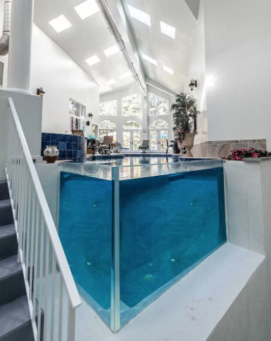
This vertical photo is taken from the stairwell landing. This is upsetting. Imagine how hard it is to clean that glass. Imagine how distorted your lower body would look in this. I would never get into this pool knowing that someone could see my funhouse mirror wavy legs if they dared to come up the stairs. Absolutely not.
Down we go! What do we have here?
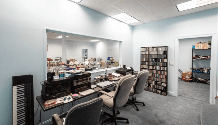
Oh it's a whole... music studio.
Yeah, of course. That makes sense.
At this point in the listing, I stopped looking at the photos and began doing my journalism (stalking adjacent public record combing). Who lives in a house like this? What do they want? Are they happy? If you build this kind of house that is so specific, why would you leave?
What I learned is that the people who lived here were a musician and professor at The Juilliard. I personally did not know that Juilliard paid well enough to get you a $1.5 million house and am now questioning all of my life decisions. But at least the music studio makes sense.
In an article for the Poughkeepsie Journal, the owners explained that they built the indoor pool because they wanted the house to have an "aloha feel." Apparently they had been living in Hawaii and wanted to bring Hawaii with them to upstate New York. I respect this. And respectfully I must ask: Where is the aloha feel? Is that what the hibachi grill is for?
The pool and the music room I begrudgingly accept. But what comes next, I cannot. Here it is:
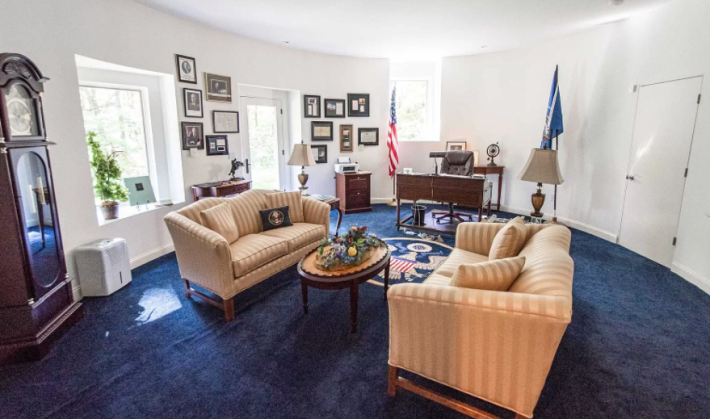
This, as you may have noticed, is a 2/3rds size replica of the Oval Office. Totally normal, right?
WRONG! This is ridiculous! On one level, I love it: curved walls are cool. But on the other hand, I have so many questions.
Have you ever been to the White House? I have and it is a piece of shit. The people who work there are sometimes working very hard but the building itself hasn't been renovated substantially since Roosevelt was president! When we toured it Trey (who is a structural engineer) kept pointing at cracks and making a face. It is not a bastion of American architecture. It is, if anything, proof of how short a president's tenure is and how little they are able to accomplish. This is nothing to emulate!
I respect, however, that everyone is allowed to do whatever they want with their house. If you are going to have an oval office, however, you should also get a Resolute Desk replica. You should get the moulding. You should get the long, lush curtains. You should get oil paintings. Go big in your home! If you're going to be a wonderful, presidential-level weirdo, don't half-ass it!
What is confusing is that every element of this house made me believe it was older than it is. It looks like a house that has been renovated so many times that it has forgotten what it was built to be. Or maybe a house that was once loved and later re-staged in such a boring way that it robbed the place of any heart? Instead it is a house that perhaps never knew who it was from the beginning. Or maybe it's just a house I don't understand because I don't want it. I hope it is beautiful to someone.
This week's house has been listed on Zillow since October 2019. It is currently listed for $1.5 million. If you buy this house, please invite me over. The property seems really nice.
