Every once in a while, I try to convince myself that I have changed fundamentally. I want to believe that over time I have not only grown or shifted as a person, but changed in substantial ways. I'm not sure if I want to believe this because I want to be a different person, or if I want to believe this because I want to believe I could be. Of course I've changed. I grew up. I learned new things. I stopped voting the way my parents did. I renounced the religion we grew up with. I moved.
But all of these things could be attributed to growth, to exposure to the world around me, and not to actual fundamental shifts in my person. Maybe that's better. Maybe there's some relief in believing that who we are at our core is solid or, at least, gelatinous. I'm thinking about this a lot this week because I have always had this terrible habit of sending myself future emails. I can tell you exactly when I started doing this because the site I do this from (futureme.org) always sends the emails from the same address and I have had the same gmail account forever. The first email I sent to my future self I sent in 2002, which (I think) was the first year Futureme existed. We did it as a class assignment where we wrote ourselves letters for graduation and they arrived to greet us the week before. In mine, I said I hope I was going to Yale. Yale, the bastards, had waitlisted me, but the email was still nice.
There are some things in my life that the minute I have tried them once, I know I will do them forever. This was true for painting and for writing and for taking very long walks. It has been true for other, less virtuous, things, but let's not get into that. Sending that first email was one of those things. I loved it, and I've sent myself a lot since. One of them arrived a few years ago (fortuitously) in the midst of a very bad depressive episode and was prescient and helpful enough to convince me to keep sending them. Anyway, I got one a few days ago that was just a link (now dead) to the Vine videos of the lawnmower flying away into the sky that said, "Don't forget her." I had forgotten her. What a shame, too, because I love those Vines. They are perfect to me. I cried laughing at a compilation of them. I have only changed some in the last seven years, I guess. I've only changed some in my lifetime. Even as a baby, I loved old ladies who read and chain-smoked. I have been 87 years old since birth.
Anyway, all of this has been to say, that maybe taste is innate. Maybe what we like is built into who we are. Maybe the filter for how we consume the world around us is hard to break. I do not like industrial design and never have. It is one of my greatest trials as a Zillow browser, to see an old beautiful brick wall gummed up with new, shiny pipes laid on top. It is painful, to me, to see machinery inside homes. I do not like it. I want cozy. I want old. I want nice, goddammit!
But I will try for y'all, and this week, we will look at something a little more industrial. This week's house was sent to me by a reader named Jessica. They sent this to me, I think, through the Zillow app and it arrived in my inbox with this note: "I don't know whether this would be on your dream or nightmare home list, but (what we can see of) the bathroom leads me to think nightmare."
Hm. I sent Jessica an email back, but they did not respond to any of my very important questions like "Is this haunted?" and "How did you find this monstrosity?" so we will simply have to look at the house without their guidance and let it speak for itself, I guess.
Here we go. For starters, we have a $1.2 million price tag for, uh, one bedroom, two baths, and an unspecified number of square feet???? If you're like me, your first thought might have been, well is it on a bunch of land? No, it is not. It is on 1.45 acres. If you bragged to me about living on this much acreage I would laugh in your face. Well, we might think next, is it new? Is it made of rare angel wings? Is it handmade by God? No, no no. It was built in 1945 and does not appear to have been made by anyone interesting.
Here is our house:
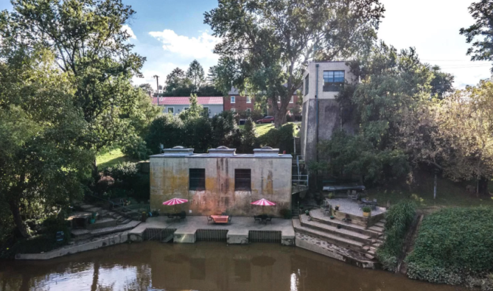
"What?" you may be whispering to yourself, and that is the correct response. Here we have a, uh, concrete cube that is very water damaged or covered in mold or something, and what looks like a prison lookout tower (ugly). There are some poured concrete steps on the right that make it look like someone might stand and recite Hamlet's soliloquy. I would advise them not to do this because this water looks like poop. Why is it so brown? Why does it look like it's not moving? I have already died a death by mosquito bites once in this column, why must it continue?
Someone has set up patio furniture with red and white striped umbrellas that look like the free mints you get at a Denny's. This does not work aesthetically and it does not fool me. I hate it. Let's go in.
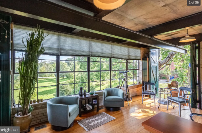
Uh. What?
This is nice! I am confused! I like these floors, and I like these barn doors that open up outside. These nice big windows do not face the terrible water which I have learned is a river. Usually, as mentioned, I do not like industrial design, so this concrete ceiling with steel I beams and metal lampshades is not exactly my style, but I do really like how many different textures are happening in this room. We have brick, wood, barn door wood, steel, concrete, plush fabric, a rug that is so small it is useless! That's fun, okay. Things are looking up.
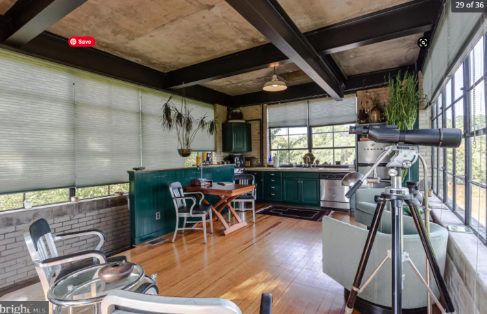
On the other side of this room there is a whole kitchen. It has a dishwasher and fridge and some cabinets, but it's nothing to write home about. Shouldn't a $1.2 million house have a better kitchen? Is that the oven tucked over there so tiny? I think it is.
I thought this telescope was cool until I realized it is pointing toward (I think) other houses, which is creepy and bad.
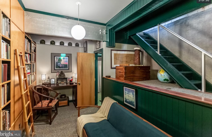
Wow. This is another not terrible room. It doesn't have any windows, which is not ideal, but I still like it. It reminds me of study rooms in the library. The built-ins are not a wood color I love because it reminds me of cheap clapboard, but I do like this wood paneling that has been painted this nice dark green. That's pretty, don't you think? The bulb inside this trendy restaurant orb light is way too bright. It's bright enough to make the green look like two different colors. This must be changed, but that's an easy fix. There is a hidden little plush(?) globe behind the stairs. Whimsical. Maybe I was wrong. Maybe this place is okay. But through the door is the bathroom.
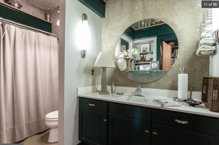
Hm. This must be the wrong bathroom. This is not great, but it seems fine. This lamp must be removed and these side lights would show every single pore in my face so they also must go, but I do like this big circle mirror. The toilet is normal? Whatever. Let's move on.
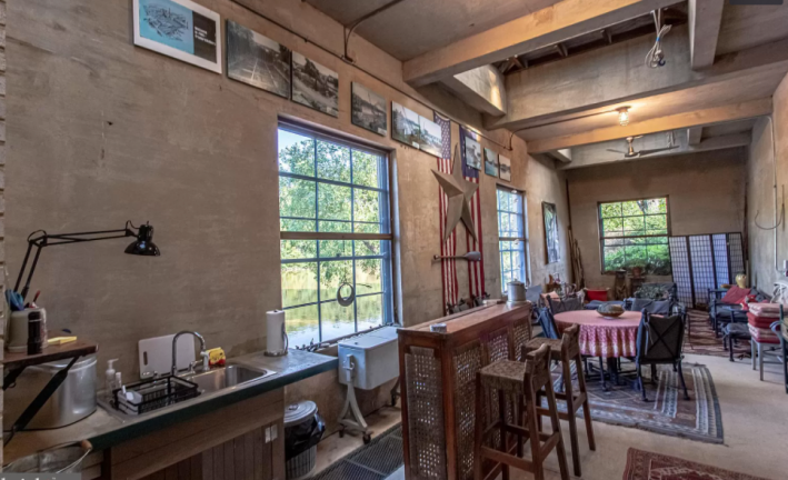
Hm. This is definitely not good. All these walls are the same color as the floor and the ceiling, which is a big mistake. The room is big and has nice light, I will give it that, but everything else about it is screaming for help. This is some of the most inconsistent design we have seen in this column, which is really saying something. These big rugs look terrible with these outdoor ... patio ... chairs? There is a desk lamp above the sink. Is this supposed to be a kitchen sink? It's sized for babies!!! I never do my dishes so I need a sink big enough to fit more than two plates and a mug. Are those ... tiles on the ground? We need another angle.
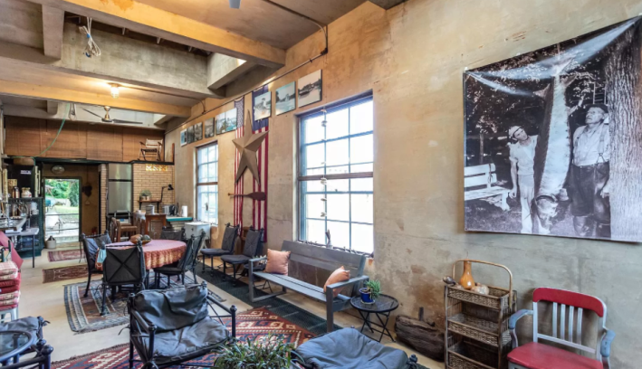
Oh my god. It's a grate. Like a grate for water? Why is the water going to be in this room with the rugs and outdoor furniture. Why is the refrigerator three feet off the ground!? I am short! I can't reach that freezer! How am I supposed to get my popsicles? Oh no, is it off the ground because of the potential for water? Let's look and oh, Jesus, this house is on the floodplain. No no no. This is not good. I do not like this. What's out this window?
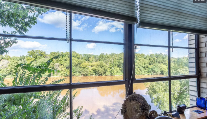
Wow it's the poopy river. Awful.
What else is there to see? Oh no.
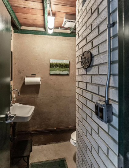
Here is the dreaded bathroom that Jessica warned us about. She's right. I HATE IT. I do not like these walls. I do not like the cell-like nature of it. I do not like that the toilet is hidden like that around the corner. I do not like that there is presumably a shower in here somewhere and I don't know where. And I do not like that the painting of the river is doing some revisionist history to make it look blue. We know better than that. RUN AWAY. Down some stairs? OK. Down some stairs.
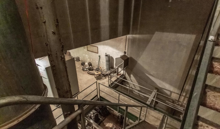
Hm. This does not feel good. This reminds me of the time I went on a solo tour of a port vineyard, and the man who was guiding me asked if I wanted to see something not on the tour. I did because I'm nosy and pride myself on being able to read when someone is bad (see also: false sense of security). We went down some stairs like this and I did not like it. But at the end there was port and it was actually really cool. This is the reward that leads us to continue. Not to turn back.
There is no port down here.
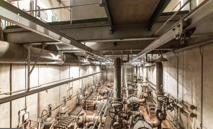
Instead there is, uh, this? What is this? I guess we should read the description. "Originally a water intake pumping station," it says. "All of the original water pumps and electric motors are still there, untouched from the day in 1979 when they were turned off." Wow. Every girl's dream.
Why would someone want this! This is not a selling point! This is junk. Industrial junk. The description also says that this is a good house to be a party venue. What kind of party? A murder mystery where we do a real murder in this terrible scary water pump factory? Do they think people are going to get married in here? What is going on?
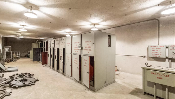
Oh good. Just what we need: some person-sized boxes to lock people in. This is a HUGE no from me, so it is time to go. What are these giant cogs doing? Let's get out of here.
Back upstairs we go. The real moral here is that I haven't changed. I do not like this house. I do not like how much concrete there is. I do not like the metal stairs. I do not like that it doesn't feel cozy and that any attempt to change the house to make it cozy would not work with the fundamental bone structure of who the house is. I cannot even imagine how to turn this into a place I wouldn't hate.
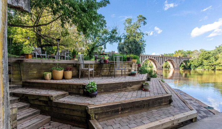
Oh thank God, we are back outside again. Now we can see that there is a cute bridge to see from the tiered patio and that these steps are not made of concrete, but of brick stones. That's nice, I guess. If you only look at this photo, with the blue sky reflecting on the water, maybe you can even convince yourself the river isn't the color of sewage.
This week's house has been listed on Zillow for $1.2 million for 388 days. If you buy this week's house, please invite me to the first party. Thank you.
