A few years ago, I took a stained glass class in north Philly, and the teacher was bemoaning his lack of apprentices. If you loved the class, he really encouraged people to stay and learn with him. Windows, he said, were breaking all the time, and he had more work than he could handle. I loved the class, but I have a job. So instead of becoming a stained glass artisan, I just think about him every day. I hope he has found someone.
There is a soapbox that I love to stand on so much that I carry it around with me from place to place. I hop up there when given any opportunity to say that we are losing artisans. People know how to work on computers (kind of), but very few people are left who know how to carve wooden staircases, or make a suit that fits you perfectly, or craft a special ring for your beloved. Even if you wanted to learn how to make a piano, for example, there are so few people to train under. We are, as a group of humans, quite literally losing recipes for things we knew how to do and did consistently and beautifully 70 years ago.
It makes me feel insane! I hate it! I love beautiful things!
And nothing will force me to pull out my soapbox faster than any mention of The World's Fair! This week's listing says, "This architectural gem boasts exquisite stained glass windows crafted by World's Fair artisans." So buckle up, baby. Let's imagine a future where nothing was optimized and everything is beautiful.
This week's house was sent in by reader Kevin, who said that he encountered it in a very normal way. He lives in an expensive city, and a lot of his family lives outside St. Louis, Mo., so he was torturing himself by seeing what kind of nice house he could have if he were an entirely different kind of person (one who wanted to live in the suburbs). This is a kind of masochism I am entirely familiar with.
"While I couldn't handle suburban living, South City St. Louis typically offers charming brick bungalows with neighborhood character and if you're lucky, you can snag a spot near a corner bar with lovely parks and shops," Kevin said. And oooh baby, that does sound nice.
But then he zoomed out. And one of the houses was not like the others. In a sea of $300,000 homes, there was one listed at a whopping $1.2 million. Here it is:
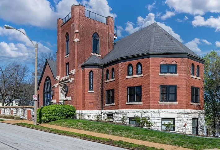
It's...a church. Wow.
Now we are no strangers to churches here at Zillowing Out, but this one looks like it has been loved very well. It is more than 120 years old, but look how someone has taken the time to re-point the bricks. Look how clean those stones are. Someone has loved this big old church, which is encouraging.
According to the listing, it was previously used as an "income generating B&B," which makes sense because it has a whopping six bedrooms, eight bathrooms, and more than 7,800 square feet!
Here it is at sunset:
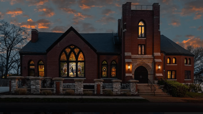
HELL YEAH!
I love this shit! Look how spooky it is!! Look how beautiful it looks all lit up. This is what churches should be for: looking cool and spooky as hell! All my homies hate the modern church with its drop ceilings and stupid big auditoriums with NO PAINTINGS! What's the point?
I could easily be come a reverent for shit like this house. Let's look closer at the front door:
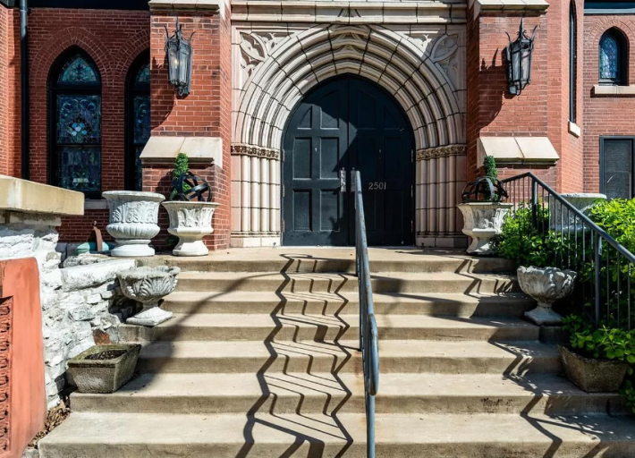
OK, I love this stone work around the door, but if I had infinite money and this was my house, the first thing I'm doing is finding the only bronze worker left in America and getting some insane modern version of Rodin's Gates of Hell. People should feel awe and fear to enter a church. What is the point in having money if not to do the stupidest shit with it imaginable.?
Let's go inside:
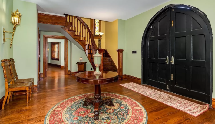
Hmmm. OK, this is a real missed opportunity. I do not like this strange runner in front of the door, and I do not like that this seems to have once been a sweeping tall atrium that has been cut off by the floor above it. The only answer to this ugly low ceiling is to GILD IT! Get up there! Slather it with gold.
Great floors in this place, though, and I love the stairway. I just think this is the room color of a Midwestern primary bedroom. It is too soft of a green for me. Give me darkness!
Here is the main room:
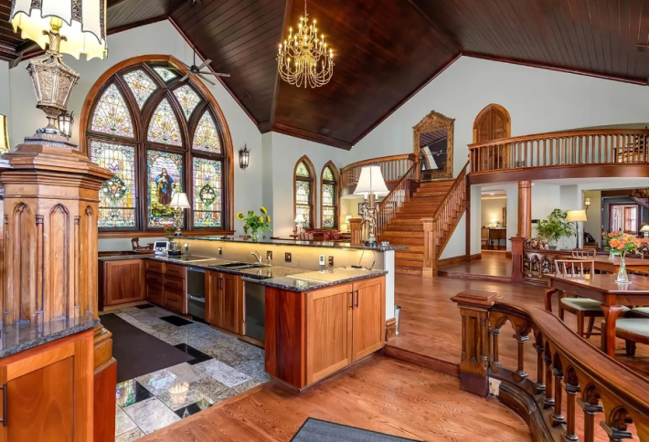
Hmmm, OK. Let's see. I love that the furniture in this space is giving library, and I think you could lean into that a little bit aesthetically. Maybe add those green lights to the tables.
The stained glass is phenomenal, and so is this big wooden ceiling, but I really am put off by the kitchen. Why do those cabinets open up into the walkway? Why is the bar height higher than normal so no one could even sit there? Why is the wood tone of the flooring not the same as the cabinets and the stairs? I have more love for natural wood in homes than everyone, but wood tones need to either be identical or wildly variable.
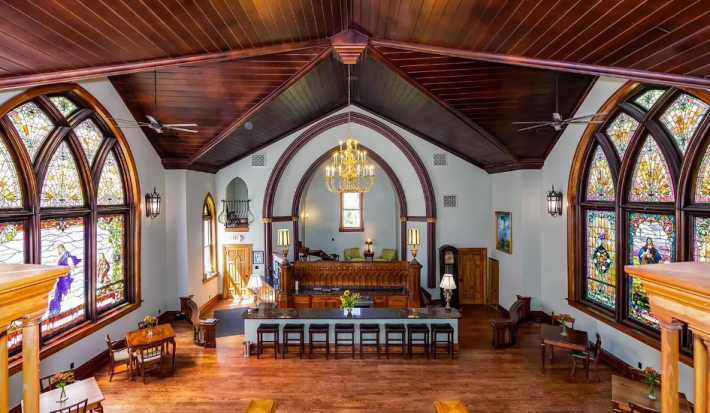
Here's a view from the top of the stairs.
Seeing that beautiful built-in wood-carved piece that I assume was part of some pulpit in the past, I hate this counter part of the kitchen. Ugly, waste, hateful.
Here's a bedroom that looks totally normal:
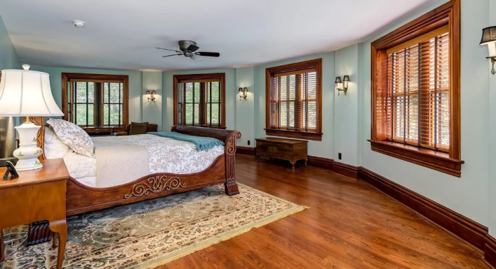
It's always surprising to be in a house with as much history and weird shit going on and then to be confronted with a room that looks like it could be in any new build. Here's the bathroom connected to that room:
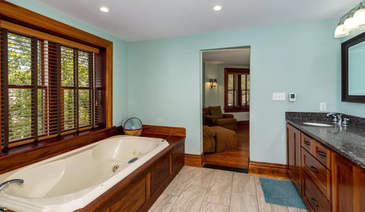
I hate the shape and color of these tiles. I extra hate that they are cream, while the counters have white and black in them. But I absolutely love this soaking tub! I love that it's built in! Christians, theoretically, should understand that being submerged in water is a very key aspect of their faith, and the people who built this seem to get the assignment. Six of these bedrooms have en-suite bathrooms, and all of those bathrooms that I see in the listing have soaking tubs.
It's John the Baptist hours! It's time to get dunked!
Here are some fun doors:
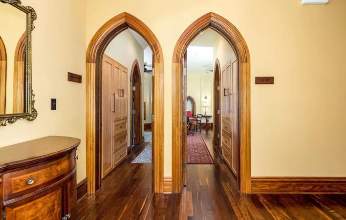
I love many of the things happening in this photo: the doors, the door frames, the wood floors, this Art Deco piece of furniture. But again, the wall color is making me crazy. This is the color a sad office place is painted. Do not bring that in here!
Let's observe another bedroom:
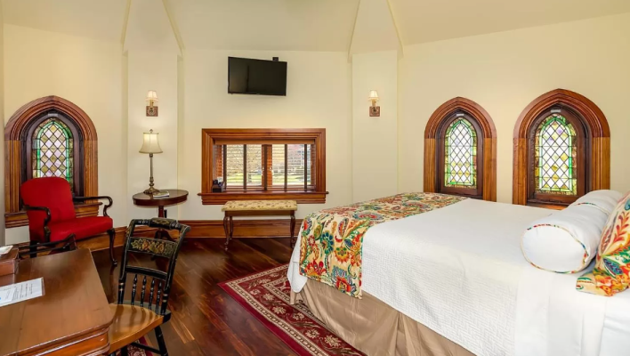
This one is more interesting because it has stained glass. I love stained glass.
Here is the bathroom attached to it:
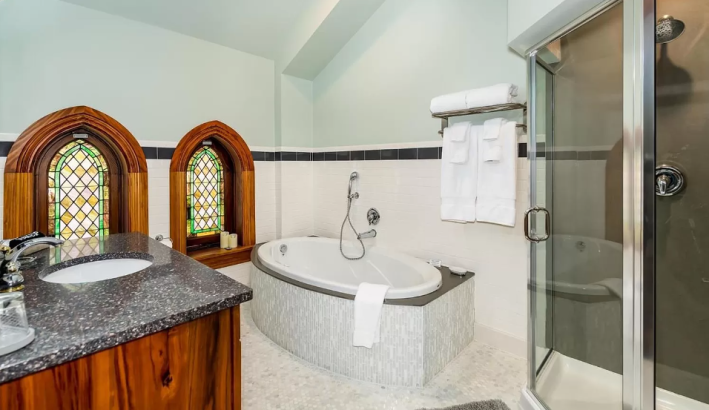
Again, awful tile, awful color pairing, awful boring white everywhere. See how the space is losing power and beauty instead of gaining it with every renovation? Doesn't that depress you?
There are many more of these bedrooms with en suite baths, but we don't have time to go through all of them. Here is another kitchen that exists for some reason:
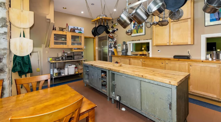
Seeing this space, which is clearly industrial, and made for working, I realize that the problem with the kitchen upstairs is that the house doesn't quite know what it wants to be. If it's a bed & breakfast with a cool restaurant and a visiting chef on the first floor, what is currently the kitchen should be a check-in desk and host stand, and the cooking should happen down here. That seems like the most reasonable and exciting way to use this space to me.
But if this is to be a single family home, I think the instinct on display is that you cannot force people to only cook down here in the industrial kitchen. And that is where people are wrong. On account of my affiliation with the No More Great Rooms lobby, I am forced to remind everyone that we do not all need to be in the same shared space all the time. It is fine to let a beautiful room remain beautiful and not shove a kitchen into it. This is a great working kitchen. That is a gift in itself.
I've had enough! Let's go poke around outside:
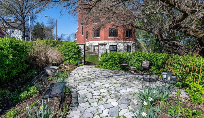
Ooooh. A garden. Stations of the Cross core. I love that this is walled off. As a child I loved The Secret Garden, so of course I want to cover that gate in ivy immediately. But otherwise this is very cute and I like it. Let's see what else we can find!
Oh! Here's the whole church house! It really is lovely! We could use that patio out front for outside seating. If this were a cool boutique hotel with a chef, I would want to visit it for sure, but I'm not sure that I want to live there.
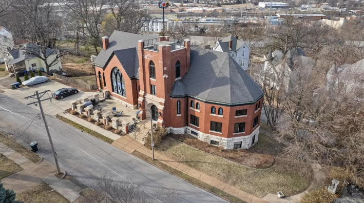
But wait a second... what's that?
Could it be?
Oh my god!
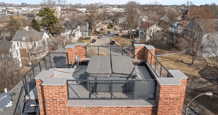
It's a rooftop hot tub!
Guess what? I am recently hot-tub pilled, so I love it. Imagining watching the sunset up there with my little cocktail, on the top of my beautiful church house which has problems that I can fix. It feels nice.
This week's house has been listed on Zillow for $1.2 million for 16 days. If you buy this house, please invite me for the weekend. I want to be in the hot tub.
Thank you to everyone who sent in houses while I was too busy doing the podcast to do Zillowing Out. I am looking at them slowly, I promise.
