
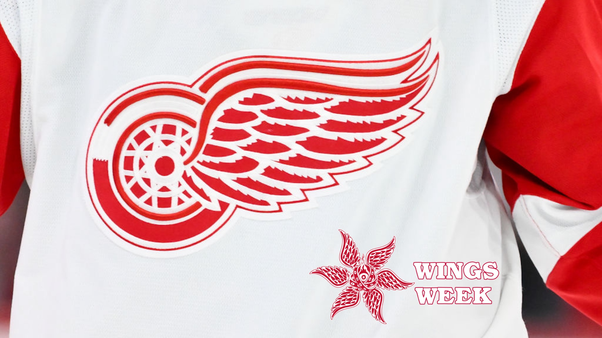
Whatever else you may learn this week is secondary at best to this central truth. This is why we thought this was a good idea.
I mean, look at how we decided to delineate this week. Several ideas were pitched, including Whinge Week, but when we realized that we whinge on a pretty regular basis we modified the idea and sent it to Defector Art And Imaging, and they came back with the thing you see atop this screed. We took that very wing, multiplied it by six and attached it to a biblically accurate angel, or as we know it, Comrade Ley.
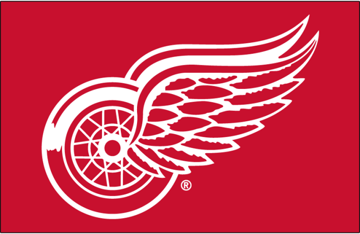
But it starts with the wing, which is celebrating three quarters of a century as the most perfect logo in all of logodom. Not because it represents the Detroit Red Wings, mind you. Nobody but Comrade Theisen cares about them one way or another, and she cares about them with an unsettling fervor.
No, it's the logo—the idea, simply and perfectly delivered so well that it has held up with only subatomic modifications since 1948. It doesn't need any words to explain what, where or why it is, like this. It doesn't have an angry cartoon character, like this. It isn't changing every three weeks from something terrible and lazy to something lazy and terrible, like this. It has no socially unsettling antecedents, like this. It doesn't even try to anthropomorphize itself, like this.
It's a wing, attached to a wheel, and needs no elaboration. It is evocative, simple elegance that does not task one's patience the way this does, make you think the designer stopped for lunch and never returned, or annoy the entire concept of the sport.
Mostly, though, the Red Wing is perfect because it stays constant. Most teams submit to a rebrand every few years because the owner's cousin's kid took a drawing class in junior college and wants to justify it. Some teams, most of the minor league baseball teams, change their entire name to fool folks into thinking they are wacky, fun-loving, out-of-the-box thinkers rather than the borderline plagiarists they often are.
And a few teams have tried to recreate/reinvent the wing with indifferent success.
But all those logo designs are falling out of fashion, and not just because repetition is the weakest form of flattery, or because of the silent scrutiny of the winged wheel. The newest trend in logo design is ... wait for it ...
... nothing. Sweet FA. The void. Like the Professional Women's Hockey League, which didn't give any of its teams nicknames, logos or team crests, and just slapped the town or state names in a diagonal line across the jerseys in a nanosecond of thought, presumably because anything else would require paying someone to think of them. Like the Washington Football Team, which needed two full years to go from offensively racist to blandly nondescript. Like the Oakland A's, who will drop the Oakland when they move to Sacramento next year and replace it with, well, Not Sacramento. In a parade of stupid, lazy, unthought-out notions, this is among the most telling because an increasing number of knowledgeable people think the team will never leave Sacramento because Las Vegas still doesn't want them. This added to the fact that the A's collective brainpan couldn't fit the front of a shopping cart into the back of another shopping cart if you gave them six tries and someone from the market to help guide them, and you see why Sacramento was necessary to begin with.
And then there's this:
True, the team was just gifted to Salt Lake City three months ago because Alex Meruelo, who had the team when it was the Arizona Coyotes, couldn't figure out how to make a fiscally conservative state give him multimillions to mismanage his franchise. Still, new owner Ryan Smith, who ruined the Utah Jazz by thinking this was a good idea, thought a state shaped like a stepstool couldn't handle such a radical design a second time and dumbed it down even further. The plan, he claims, is to have a statewide referendum for a nickname, but as Utah is 41st in population density and Salt Lake City holds more than one-third of the state's humans, this should have taken about two and a half days. That still leaves about 13 weeks to find some starving artist at the university to think up a name that has three or more Z's, and then draw up a design that makes the Brooklyn Nets logo look like a Jackson Pollock mural.
All that because people don't understand what a proper logo should be, which is the winged wheel. There are others that do the job nearly as well, like this, or this, or even this, but this isn't Bolt Week, or Note Week, or Sox Week. This is Wings Week, and this is the reason for the season. Deal with it, or face the consequences, like this.