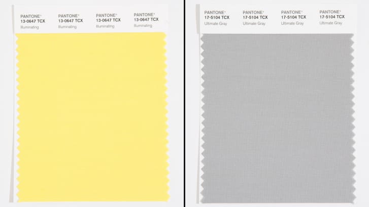
Yesterday, for the 21st year in a row, the color company Pantone began its annual press hullabaloo by revealing the Color of the Year for 2021. Or in this case, colors. The colors, if you are curious, are a pale buttery yellow the company calls "illuminating," and another called "ultimate gray," which very much resembles the color of the sky on the thousandth day of March in a terrible fucking year.
It is unclear exactly what the Color of the Year is supposed to be. Representatives for Pantone told CNN that the first color (2000's "cerulean") was chosen to "help alleviate that fear [of Y2K]. But the blue sky denotes that there's a future out there... there's something to look forward to." This implies that the Color of the Year (which to be clear is meant to be for the next year) is predictive of tone and setting. But a Pantone representative told The New York Times that it was hard to choose this year's color because no one could move around and, I don't know, see the colors around them?
Is the Color of the Year the color (in this case colors) meant to define the year we've had? Is it a predictive color for what might come in the next year? Is it supposed to be some kind of optimistic foreteller? Pantone doesn't specify because to Pantone the internal logic of their made-up marketing stunt doesn't really matter. What matters is headlines.
And boy did they get them. The New York Times, CNN, USA Today, People Real Simple, Time Magazine, Fast Company. All of these stories say the same thing: There is not one but two (!!) colors of the year. They are supposed to be optimistic about next year while aware that this year has been fucking awful. This is not political. These are just some colors.
These are just press releases, and they are eagerly spread around by publications solely because Pantone has figured out how to bait the people whose jobs require them to hustle through the content economy. Remember when there were five million stories earlier this year about Pantone's new "period red" color, which got a swanky New York Times writeup that described the color as "a nod to menstruation"? We do need stories that aren't only about death and disease and our crumbling democracy, but we don't always have to be such easy marks.
I am not trying to say that colors are bad or that design doesn't matter or that there isn't something inherently interesting about how color theory and color trends define an era. I went to a fine arts high school! I'm a sucker for color theory. In fact, I have a little book full of tear-out Pantone colors in my box of art shit that I have had for a decade and use for crafts sometimes.
But "company announces advertising campaign" is not a story, no matter how easily that campaign can be metabolized by the publications it's aimed at. We see this phenomenon over and over again, when Spotify releases its end-of-year wrap lists, or when a sports team starts selling some horrendous food item at one of its concession stands. These become stories for no other reason than they are extremely easy to write again and again.
Journalists don't have to do this! They can just look at the colors and say, "these are fine," which they are. They are fine.


